Categories
Uncategorized

Blog Assignment #24 (Spring #8)

For this weeks blog assignment we are reflecting on the phrase, “freedom to express, freedom to explore, freedom from expectation.” We were asked to write about how we might depict each of these three concepts.

Freedom to express. Freedom to express for me seems to deal with the relationship of one to themselves, at least in regards to the other two concepts. I would try and consider that as I explored depicting this concept. One route I may think about is the idea of an introspective journey. An example of this type of story might be into the wild, which touches a lot on themes of self and society. I think that I would try and tell a story ultimately focused on one perspective trying to make sense of the world.

Freedom to explore. Freedom to explore feels to me like it involves kind of abandoning the self to embrace outside perspectives. This story might take the form of travel, or journalism. Exploration at its core seems to new experiences. I think I would maybe consider a story about animals and domestication- maybe goats. Goats exist in the most hostile wild environments and also in very domestic settings. They are wicked climbers, which seems to be a good metaphor for exploration I guess.

Freedom from expectation. I see this as a story about placing something or someone in a world of routine. I think the most compelling way to tell a story about expectation, ironically, is to tell a story about the most basic routine- everyone listening would probably realize how little we actually stick to a routine.
Categories
Uncategorized

Blog Assignment #21 (Spring #5)

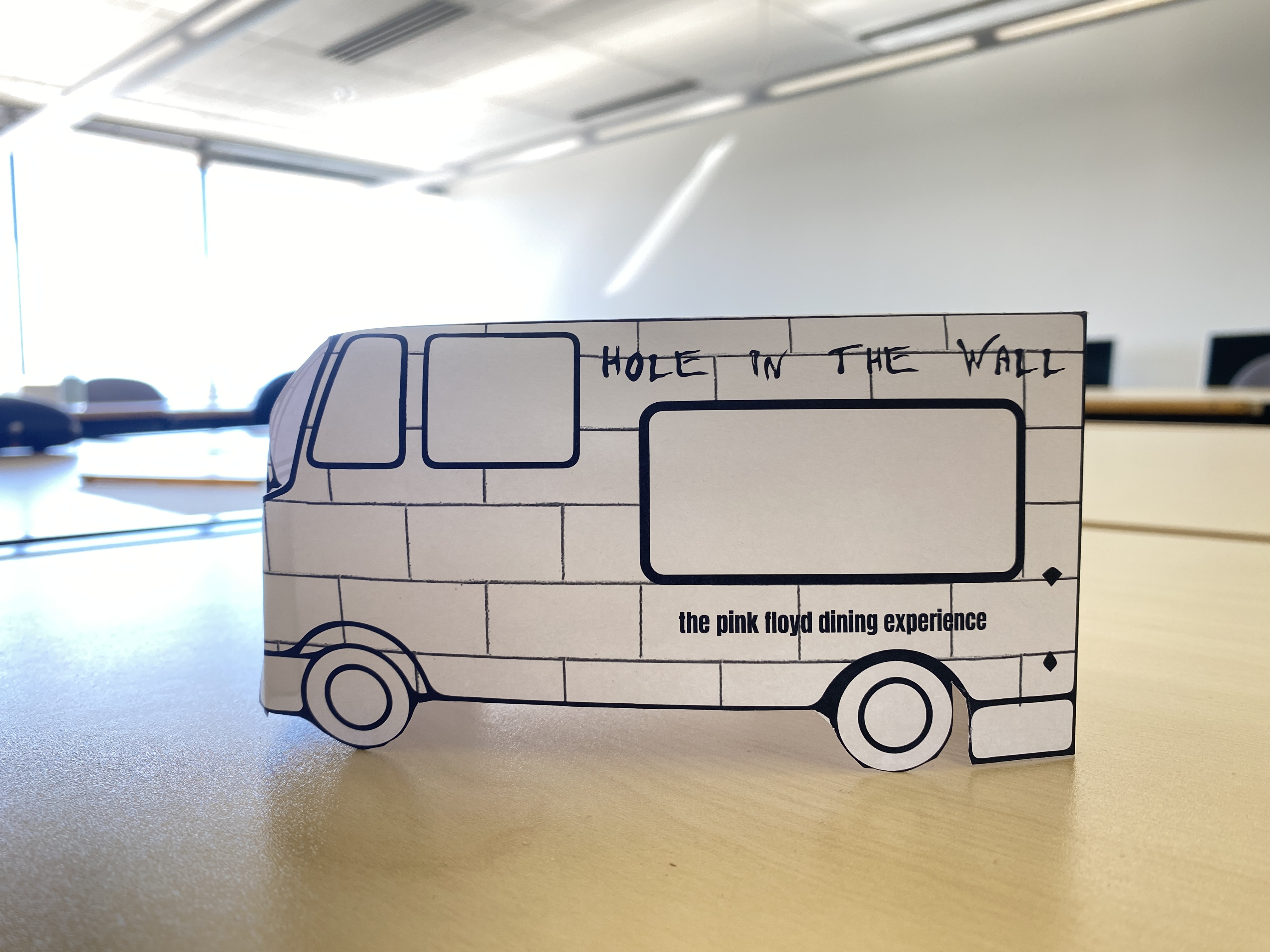
This week for our blog assignment we are designing miniature food trucks! My food truck is for an imaginary Pink Floyd themed pop up restaurant called “Hole in The Wall.” I envision it having a pretty fun gimmicking menu. Perhaps it will reference song lyrics or it will be all foods with holes in them like donuts, bagels, or swiss cheese. Some potential options include: Pigs (Three Different Ones) in a blanket, Learning to Fry, Another Brick in the Wall-nut brownies, or Run Like Kale salad. I went simple with the design, just sticking to the subway tile like it is on the cover of The Wall album. The hole for the service window is kinda a fun nod to the name hole in the wall.

Categories
Uncategorized

Blog Assignment #20 (Spring #4)

This week for our blog assignments we are reflecting on our Blender Projects videos. My team made a commercial of sorts for an imaginary cheese stick brand, “Dave’s Cheese Sticks.” My teammates were Diana and Patrick. The original three sticky notes that we drew for our project were a stuffed rat as a prop, a car crashman safety specialist (wtf is that?) as a character, and “I love cheese sticks,” as a line of dialogue. The dialogue and the stuffed rats luckily were a natural fit and that kind of led the direction that we went as we began to brainstorm ideas for our project. We were all very excited about ideation at first. We discussed ideas such as stop motion, a godzilla type video, and a commercial in the style of snickers “you’re not you when you’re hungry.” We ultimately went the snickers direction. We chose to use the character we were given to set the setting in a boring office environment, but have all hell kinda break loose to turn a stale environment into an interesting space. We decided to have a stolen lunch trope turn into a type of werewolf (wererat) type destruction scene, and have cheese sticks be the antidote to the problems in this universe. Everyone did a great job contributing to the storyboard, and coming up with ideas for setting and costume design. When the day came to film, we had to be adaptable because our camera person groupmate had gotten in a bad bike crash and couldn’t be around. Everyone was really flexible and we were able to redistribute tasks to keep a fair share of work. Filmers became editors, etc. Overall I think we ended up making a pretty compelling movie. It had a nice balance of drama, humor, mystery, and suspense.

Categories
Uncategorized

Blog Assignment #19 (Spring #3)

If I randomly had $25,000 of spare cash on hand that I had to donate to a local non-profit, I would give it to the OutdoorsForAll Foundation. I’m biased because I used to work there, but I think it is a really great organization that provides opportunities for folks with disabilities to enjoy a wide range of outdoors experiences such as skiing, mountain biking, rock climbing, hiking, snowshoeing, or kayaking. They also run outdoor summer camps for youths and adults. While working there, the biggest bummer was that many of their programs had financial barriers to participation, and grant funding was only able to support a small number of participants, meaning that many of the people who got to participate in this nonprofit’s great programs had to come from families with enough disposable income to afford. That is especially a bummer because it is clear that experiences with different outdoors activities have an incredible impact on folks with disabilities and it would be really amazing if everyone who could benefit from these services and programs could access them.

It seems like many nonprofits kind of exist to fill a social need that really the government likely ought to provide, depending on your point of view, and in this way I think OutdoorsForAll is particularly special. While I believe that everyone deserves the opportunity to participate in outdoors experiences, it doesn’t feel like a most essential need for life in the way that housing or food security does. There are nonprofits doing their best to try and meet those needs, but it’s my opinion that the government should be structured to meet all of its citizen’s most critical needs like healthcare, housing, or food security. For that reason I’ll be giving my hypothetical $25,000 to OutdoorsForAll, and keep hoping for a more progressive government.

Categories
Uncategorized

Blog Assignment #18 (Spring #2)

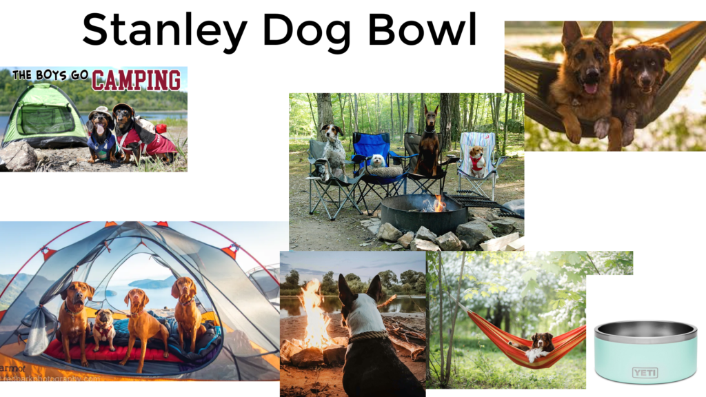
Stanley Dog Bowl Moodboard
The stanley 32oz dog bowl is the perfect bowl for the healthy, happy, social, hydrated dog. The robust bowl is built to travel, and has plenty of room to share with friends and stay hydrated all day.
The moodboard I created for the stanley 32 oz dog bowl is meant to reflect that of a happy, healthy, social, and hydrated dog. It highlights images of dogs acting like humans, taking a camping trip and hanging out.

Categories
Uncategorized

Blog Assignment #17 (Spring #1)

For this week’s blog assignment we are looking at design systems.

I chose to begin by looking at Google’s material design system. This system is packed with information. Some things I focused on was their emphasis on accessible design, adaptive design, and interaction states. I appreciated them saying that accessible design is not at odds with expressive design, I agree. The material design system recognizes that products need to work in a variety of different devices, so components easily adapt for designers- cool. I think the focus of interactive states was interesting. It’s clear using a product with interactivity how that increases the intuitiveness of using that product.

The second design system I looked at was Apple’s Human Interface Guidelines. This felt very similar to material design; they seem to agree on many principles of UX design. Some interesting take aways from this site included: embrace simplicity, ensure that buttons clearly communicate their purpose, and to replace colloquial expressions with direct plain language.

The third design system I looked at was Mailchimps. This system was a lot more straight forward. It was more a collection of the components they used to build their site rather than an extensive course in UX design like Google and Apple’s systems. Maybe kind of interesting, their brand just has 2 typefaces, doesn’t apply rounded corners to their data visualization, and uh.. name their colors after fruit.

Categories
Uncategorized

Blog Assignment #16 (Winter #9)

This blog assignment is about using video to talk about a project that you’ve been working on. I created a video talking about the album I worked on for my typography class. I will let the video speak for the rest!

Categories
Uncategorized

Blog Assignment #17 (Winter #10)

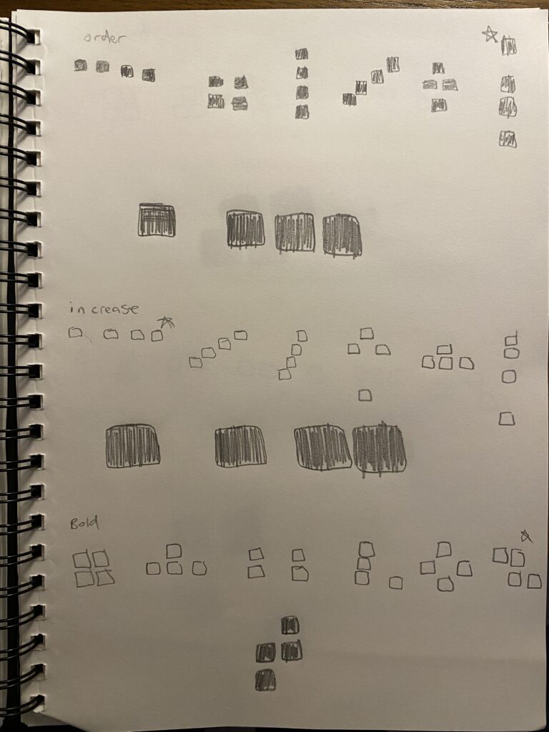
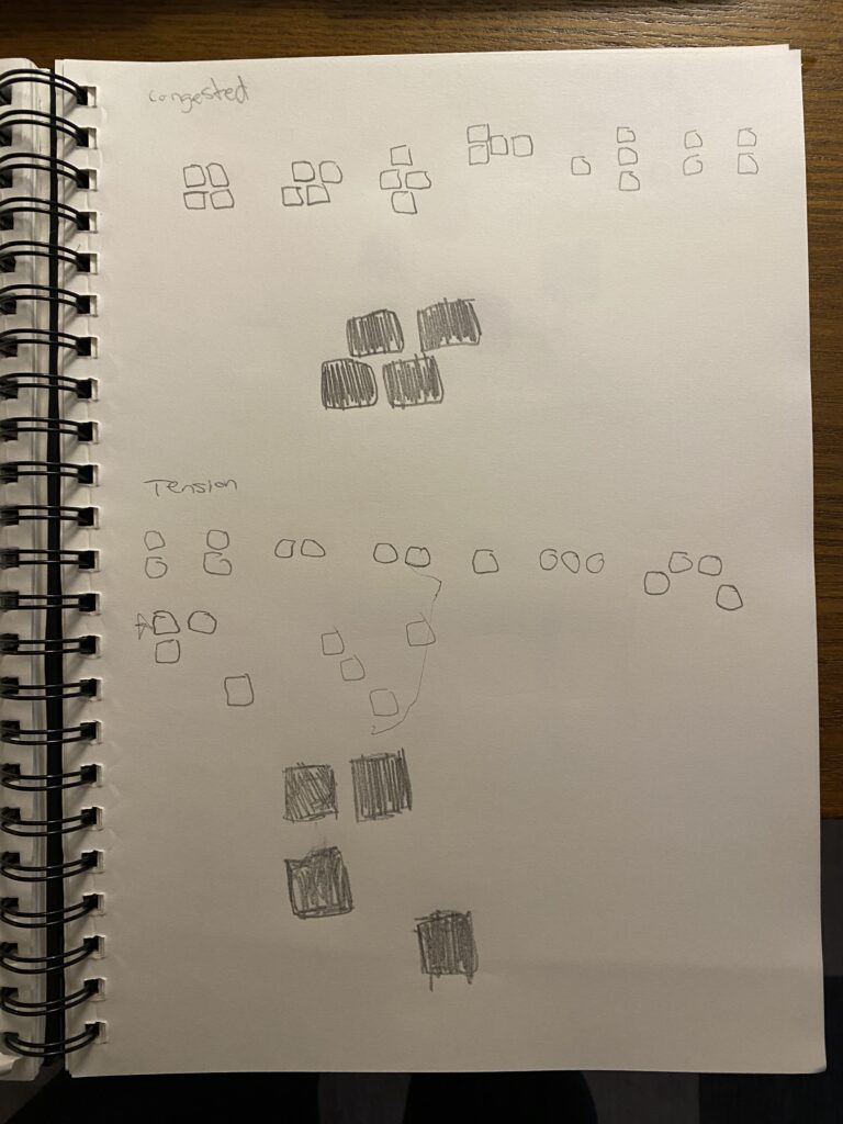
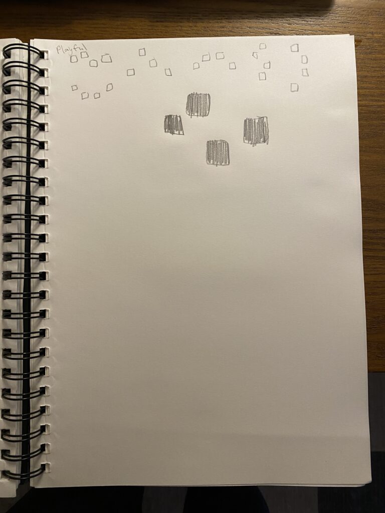
This weeks blog assignment involved creating a graphic representation of 6 words, using only 4 black squares. I did all my solutions and sketches by hand- here they are.

For order, I was thinking about standing in line and ordering at a counter, everyone stands close, except the person whose turn it is.

For increase I was thinking about frequency.

Bold I was thinking about a group that breaks the form of the square while having a strong, angular, upward movement.

Congested I wanted to kind of look like a bunch of squares struggling to move left. This one was hard to show the closeness without the squares merging and becoming another shape.

Tension is represented by one square drifting away from the group, or vice versa.

Playful is shown with this up and down movement.

Categories
Uncategorized

Blog Assignment #15 (Winter #8)

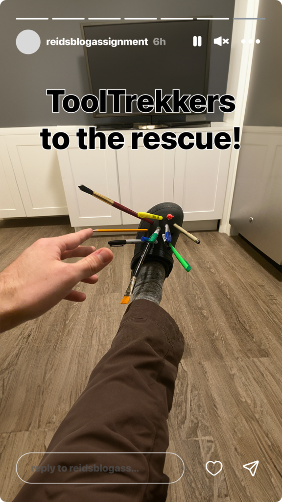
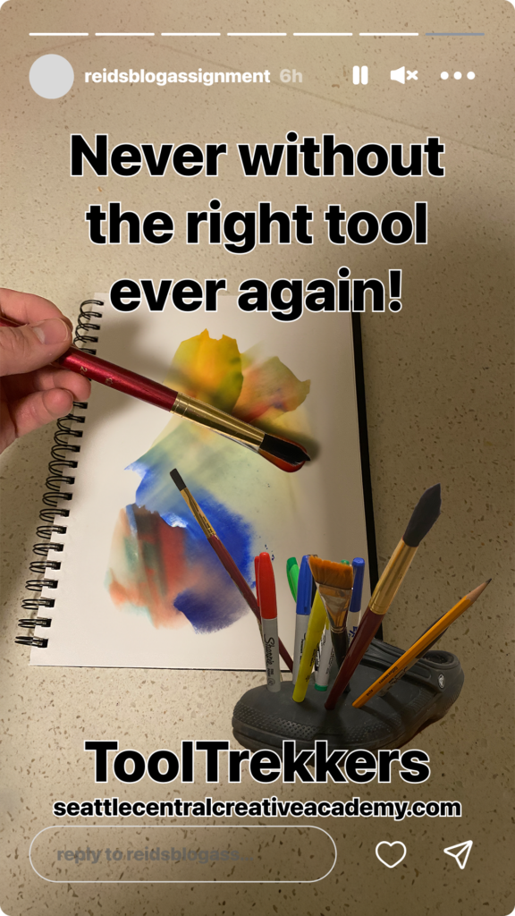
Inventing Shoes – ToolTrekkers

For this weeks blog assignment we invented shoes! These shoes have a superpower for design students. Introducing ToolTrekkers, the shoes that will never leave you stranded without the supplies you need for your next great design.

Categories
Uncategorized

Blog Assignment #14 (Winter #7)

Creating Little Worlds / Telling Stories

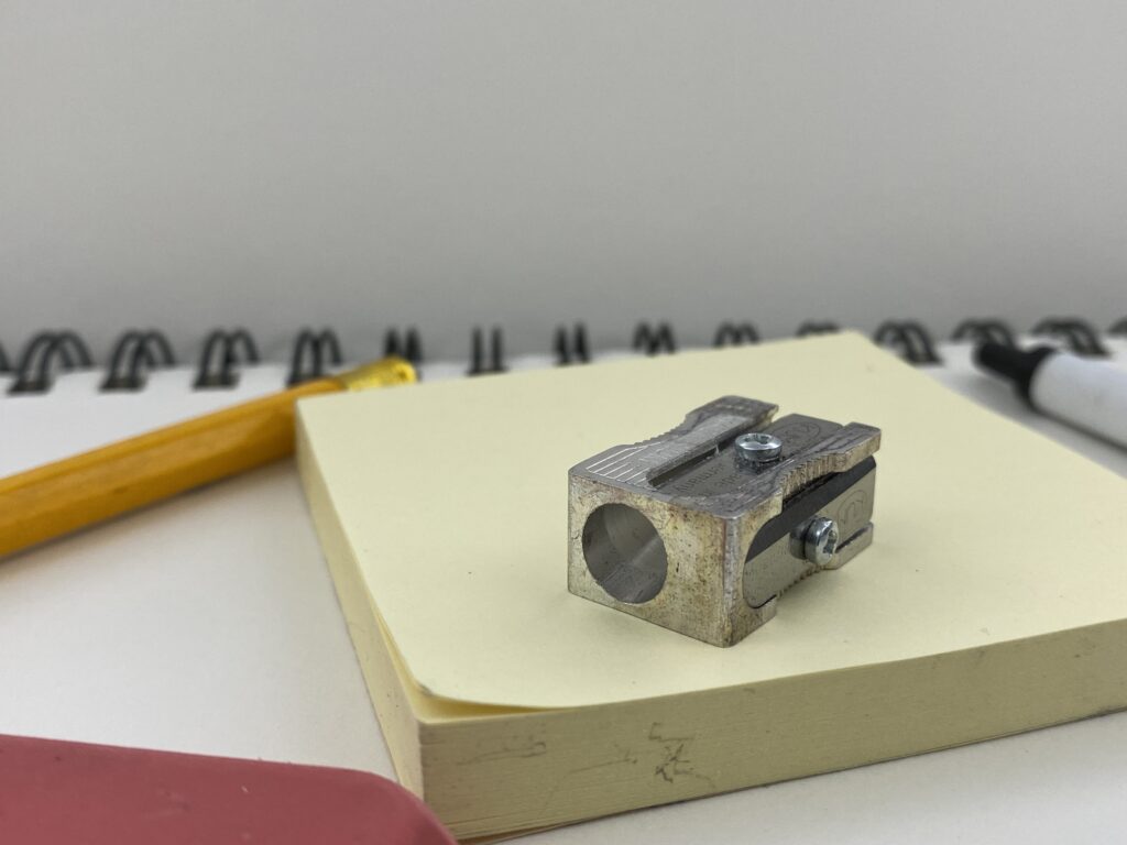
The scene I chose to create and photograph for this week’s blog assignment is a macro landscape of school supplies. The primary subject of this photograph is my metal pencil sharpener that has been incredibly reliable and long lasting. The photo highlights the pencil sharpener’s use and age by detailing the patina, and positioning the product on a pad of sticky notes, as if to give it a stage to shine. I chose to use my large sketchbook to act as the main background of the scene as the spine adds texture, and having every single set piece being some sort of school supply amplifies the whole effect of the image. The other supporting pieces include a pencil, eraser, pen, and the pad of sticky notes as mentioned earlier. All of the supporting pieces beside the sticky note “stage” mostly exist outside of the frame to make sure that the sharpener gets the attention it deserves. Each element pokes into the frame just enough to be recognizable, but not too much as to distract from the main point of the image. I was trying to highlight the greatness of this cheap pencil sharpener with this image, and make the audience consider the craftsmanship and value a small and affordable item like this can possess. I took this photo with my iphone 11’s standard camera at 1.4x zoom.