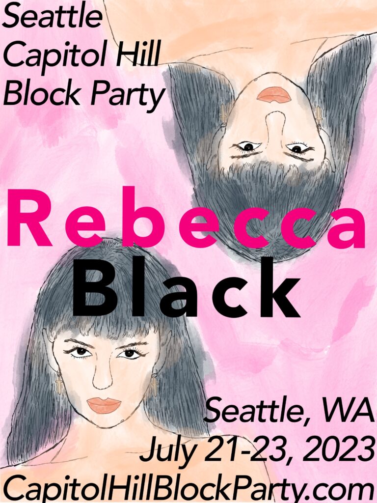
I was assigned to create a poster for Rebecca Black. I thought this was funny at first because I only knew of Rebecca Black from her famously terrible song, “Friday.” She has since grown into a pop singer hardly reminiscent of her early viral debut. “Worth It for the Feeling” is one of her recent hit songs.

I used Procreate for the iPad to create my poster. I used Rebecca Black’s official Capitol Hill Block Party promotional graphic as a reference photo, and drew a portrait of her for the background. I used a watercolor style effect to add color to the poster. The typeface I used was Avenir. I wanted to keep the color palette relatively small, and used pink as the primary color of my design. My design really emphasizes the analog (looking) mediums used, but clearly harness digital technology to further add visual interest. The portrait is duplicated and flipped, and the text is assembled with symmetry heavily considered. Originally I had only intended to have one portrait on the poster, but the negative space did not create a good space to insert text that was interesting and easy to read. I couldn’t not take the opportunity to emphasize Black’s last name in bold black text.