Categories
Uncategorized

Blog Assignment #13 (Winter #6)

For this weeks blog assignment, we are to talk about super bowl commercials. I didn’t watch the super bowl, don’t have cable, and use ad blocks as much as possible. When I was looking up the commercials on YouTube, I was surprised by the quantity of commercials.

The commercials I watched included the Christopher Walken BMW, the Budweiser clydesdales, Google Pixels blindness accessibility feature, the Michael Cera one, and the Pickleball babies.

I’ll talk about two in more detail.

The Michael Cera one was for cerave lotion, and basically it’s him pretending to be really into skin care and generally just being overly ridiculous, and then it flips to a conference room of him pitching the idea to Cerave and then cuts to saying “developed with dermatologists, not Michael Cera.” I think it did a good job at presenting an unexpected bit of humor, though the celebrity pun is a little tired (most recent example I can think of is Michael Buble promoting Bubbly water). I also think think this commercial probably recognized how to market its particular product to this particular audience. I think the choice to stray from more traditional cosmetic industry marketing for the Superbowl audience was appropriate. Something I think they missed was that the value of what they were selling wasn’t very clear, and I’m not sure Michael Cera is the most reliable spokesperson for this brand. I also think that the joke isn’t very funny but I’m sure a lot of boomers thought it was funny.

The premise for the Budweiser commercial is that in a big storm where many services are lost a beer delivery is made the old school way with the team of Clydesdale horses. The commercial basically nails the nostalgic masculine western Americana vibe it’s going for with the western looking bar, town, guy, labradore retriever, beer, and horses. I think they did a good job summoning this emotion with the imagery and music, and providing this grand sense of heroism in a beer delivery. The presentation made Budweiser look like a super elevated heritage brand. Something I think they could of done better is maybe tone down the dog. The dog was a big part of the commercial but I think wasn’t super important. The relationship between the bar / community and the beer delivery guy felt more important. I think the other thing was it wasn’t super clear why the horses were necessary for the delivery. It seemed like just the power went out and there was a light dusting of snow.

Overall the commercials seemed alright, pretty similar to in the past. I’ll look forward to seeing them on repeat in random places for the next few weeks.
Categories
Uncategorized

Blog Assignment #12 (Winter #5)

This week we are talking about personal projects.

I randomly got very inspired this week during Brit’s color theory class, though I don’t suppose it’s that random considering that class is really delving into creating art and experimenting.

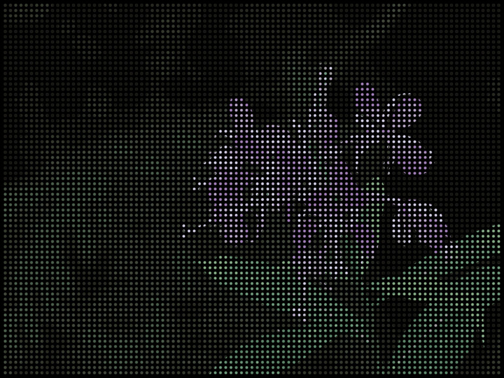
My idea is to create a 3d stippling painting using dowels, (at least) 1″ plywood, color, illustrator, and math. Let me include a photo to help explain.

Basically I’d drill out tons of holes on a grid on a wood panel (painted black in this example) canvas, then fill each hole with a small dowel, and then paint each dowel.

Here’s a detailed list of notes / steps I plan to take to do this. Don’t take this idea please. Just kidding, steal it if you want, IT’S A PERSONAL PROJECT. I’m sick of people monetizing their hobbies. Does anyone do anything for fun anymore?

Process / Tools:

  1. Create Digital Mockup
    1. Create Grid
    2. Mask Image on Grid
      1. Decide how wide / narrow pallet is with image trace feature
    3. Decide on Background Color(s)
    4. Fill in each grid component with corresponding color using eyedropper tool
    5. Figure out which colors are used
  2. Find paper / paint that will work to match digital mockup
  3. Create grid on wood (likely 1” or thicker plywood)
  4. Punch where each hole will go
  5. Drill out each hole (get equal depth using a “drill bit stop collar”
    1. Skip 3, 4, & 5 and use a CNC if you have access to one. That’ll save so much time.
  6. Paint background
  7. Get dowels equal size to holes, Cut correct number of dowels to correct number of size
  8. Glue dowels into the holes
  9. Paint dowels if desired
  10. glue paper to dowels or paint dowel tips
  11. frame
  12. enjoy

I feel like this would be a good experience because it would be fun, It’d be an excuse to buy more tools, I’d get to practice with a bunch of tools that are new and interesting to me (Illustrator, drill bit stop collars, squares, rulers, guides, etc), and I could show off how cool and creative I am.

I think a big skill I’d like to learn with a project like this is using CNC software and hardware. I took a CAD class in high school (roughly 10-11 years ago) and I haven’t used shop equipment like that since. I have worked as a bike mechanic though, so I’m pretty exceptional with tools. Bike mechanics are especially crafty.

Categories
Uncategorized

Blog Assignment #11 (Winter #4)

For this week’s blog assignment we are talking about past work that we are proud of. I’m specifically going to talk about design work, and a project I did last term in Stephanie’s AR module.

https://youtube.com/shorts/pUiHnSnReSI?feature=share

The project was an augmented reality experience which displayed information tied to a geographical location on translucent panels. My group chose to create guides to Seattle neighborhoods and each of us made a unique augmented reality neighborhood guide for the area that we live in. My guide was for Beacon Hill. The augmented reality experience was associated with a notable landmark in each location, so the idea with mine is that it would appear when you scan a sculpture at Jefferson Park. Each guide contained three panels, a center, left, and right panel. In my guide the center panel was a welcome message including a short informative description about the landmark you just scanned to make the guide appear. The next element was a map which was associated with the information on the other two panels. The left panel gave a short description of Beacon Hill’s history and culture followed by locations and institutions important to the culture in Beacon Hill, this included El Centro de la Raza, the Library, the Beacon Hill Food Forest, and some Street Art. The right panel gave a brief description about entertainment and what a visitor to Beacon Hill may be interested in doing while they are there. Some spots that were included were a sample of restaurants (Che Bogs and Cafetal Quilombo Cafe), a music venue and bar called the Clock Out Lounge, and the Jefferson Park Golf Course.

This project involved learning and practicing many new skills. I learned about some augmented reality software, practiced animation, and integrated designs created in Photoshop. The project also involved collaborating with others to create a uniform presentation of a larger concept that would include a city guide associated with multiple augmented reality experiences.

As a result of the project, I am interested in pursuing further learning and potential work in the extended reality field. I find it to be a very interesting field that has barely been tapped for its potential.  

Categories
Uncategorized

Blog Assignment #10 (Winter #3)

This week we’re talking gaming, which is great, because I am a gamer.

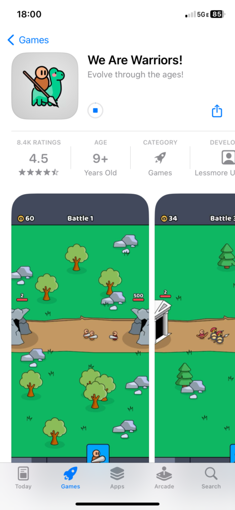
I chose to download a free mobile game called “We Are Warriors” for this assignment. The name is funny to me because my high school mascot was the “Warriors” and we had a chant that went, “We Are…Warriors.”

This is a free mobile game. I downloaded it for iPhone, and I suspect it is available on android as well. Is there any other mobile operating systems? It is probably available on those also if so.

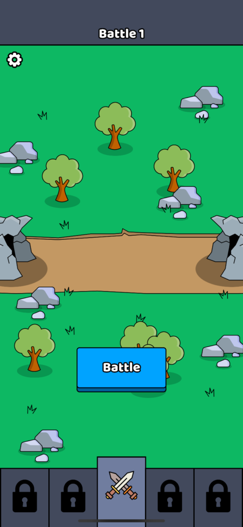
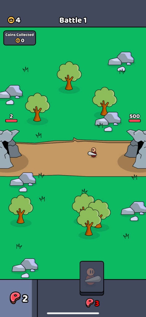
The game is very simple. You command an army that is facing an enemy army head on. You can summon a small variety of soldiers to fight the enemy. Different types of soldiers cost a certain amount of energy (as represented with meat) and have varied health and damage stats. The key strategy of the game lies in the ability to manage your energy and time when to send out which soldiers.

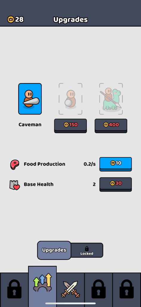
At the beginning of the game you generate energy very slowly, and therefore you lose the first battle quite quickly. This trend continues for a few battles, but you slowly collect some coins from killing a small amount of enemies. After a battle you are taken to a menu that gives you options to spend your coins to upgrade your army and statistics (base health and energy generation speed.) At first the progression of the game is pretty quick and satisfying, but as you get further it becomes more challenging to progress in an efficient way.

That takes us to the other main feature of the game, ads. The game has built in a mechanic where you can watch ads in order to either generate energy within a battle or double your coins after a battle. The later you get into the game, watching ads becomes the only way to progress in any timely manner. Well watching ads, or spending real money.

I found the game to be pretty fun at first, it had a cute art style, simple tap mechanics which fit the mobile format well, and enough strategy to keep it engaging, but I found the enjoyment to fall off quite severely as you got to later in the game. It was really annoying to watch ads or have to play the same battle over and over again to farm coins. Neither were an exciting option. Also the lack of variety of soldier options made the game feel really simple and repetitive after you learned the options thoroughly.

I imagine the target audience for this game is elementary to middle-school aged kids. I think the level of strategy is appropriate for that age, and they would find this style of game to be interesting. Additionally I think that the game has some predatory advertising strategies that would with that age range.

I don’t play mobile games often but mobile games with ads built into them, or rather built around advertising seem to be quite prolific. It’s a shame because I think that mobile gaming is a really interesting opportunity for creating unique and cool games. And I think gaming could be a healthier alternative to scrolling through social media. Not that I think it would be a great improvement, but at least a little more engaging to the mind.

All that said. I’ll probably just stick to my book on my bus ride home.

Categories
Uncategorized

Blog Assignment #9 (Winter #2)

Being a designer is being a Swiss Army Knife. These are my tools.

Tools I have:

  1. Adaptability. I’m pretty flexible, and willing to adjust to fit others needs. At the same time I am often able to recognize group dynamics quite well and help lead projects.
  2. Mechanical Skills. I’m a bike mechanic, I’m a hobbyist, I try to fix things when they break. I know how to a bunch of random things and know how to find the information needed to do new jobs. I have a willingness to tackle new challenges when they show up.
  3. Persistence. I care deeply about doing things to the best of my ability- at least when I’m having fun or inspired. If I’ve committed to something I will often find a way to see it through even if it means losing significant amounts of sleep or some other random consequence.

Tools that need development:

  1. Time management / efficiency. I’m not the most efficient person which can sometimes cause some issues because I like to put so much on my plate. I try and solve this with planners, but ultimately there isn’t enough hours in a day. I need to learn to care less about certain results, or prioritize more. Or the world needs to adjust to more reasonable expectations of one person.
  2. Photography. I’m a design student, but I’d love to improve my photography skills. I imagine there will be many times throughout my career where I need to take images, or could benefit from bespoke photography. I have done photography as a hobby for many years, but I would love to be more efficient with my camera.
  3. Adobe stuff. I’m starting to get pretty OK with all the adobe software, but I need to keep practicing to be comfortable in the places I want to go. That’s cool. There’s no rush and I’m getting better all the time. And it’s pretty fun.

Tools I need.

  1. Motion design. While I spent 5 weeks playing in After Effects with Eric, there is still so much I’d love to learn about motion design. It seems like it is a major part of design these days, is tons of fun, and looks incredible when done well.
  2. 3D modeling. Like motion design, this is a skill I want to build. 3D design is so incredible. It unlocks incredible opportunities in extended reality, gaming, branding, and so on.
  3. Job tracking. I’m not so great with keeping track of a million details, so I could really benefit to find a way to organize systems with lots of moving parts. I imagine this skill could become invaluable if I ever do freelance work and need to keep track of a bunch of client stuff.

Anyway, that’s my Swiss Army Knife. At least some of the tools.

Categories
Uncategorized

Blog Assignment #8

AI Images.

The topic that I am choosing to explore with an AI image generating tool for this blog assignment fly-fishing for rainbow trout in Montana. I recently took a trip to Montana, and my grandpa used to be a fly fisherman. This is a nostalgic and romanticized image in my mind.

I have used AI image generator tools in the past and know that they work very well if you have a particular style in mind. One of my favorite styles to experiment with AI in is pixel art. I love pixel art because it reminds me of old video games that I love and especially loved when I was younger. The AI image generator that I am going to use for this assignment will be Dalle3 through microsoft bing image creator.

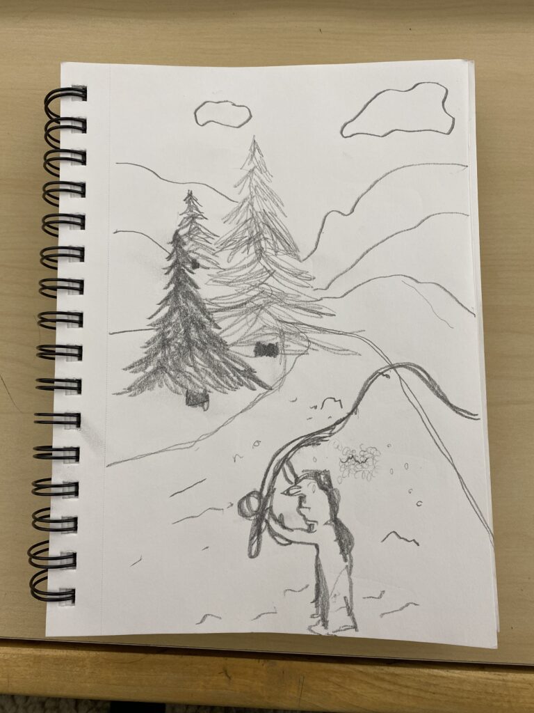
I want this image to look like a pixel art rendition of a stereotypical picturesque scene of fly fishing on a river in the forested mountains of Montana. Someone would be fly fishing in the foreground wearing waiters and be equipped with a pole, net, hat, and pack. They will be standing in a river that meanders around a bend into the horizon. The banks of the river will have evergreen trees. And tall mountains shaped by the river valley will be in the background. It will be a partially sunny day with fluffy white clouds in the sky. The fly fisherman will be excited to have just landed a rainbow trout on the line.

This is my sketch of my idea:

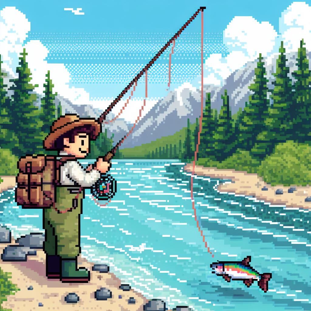
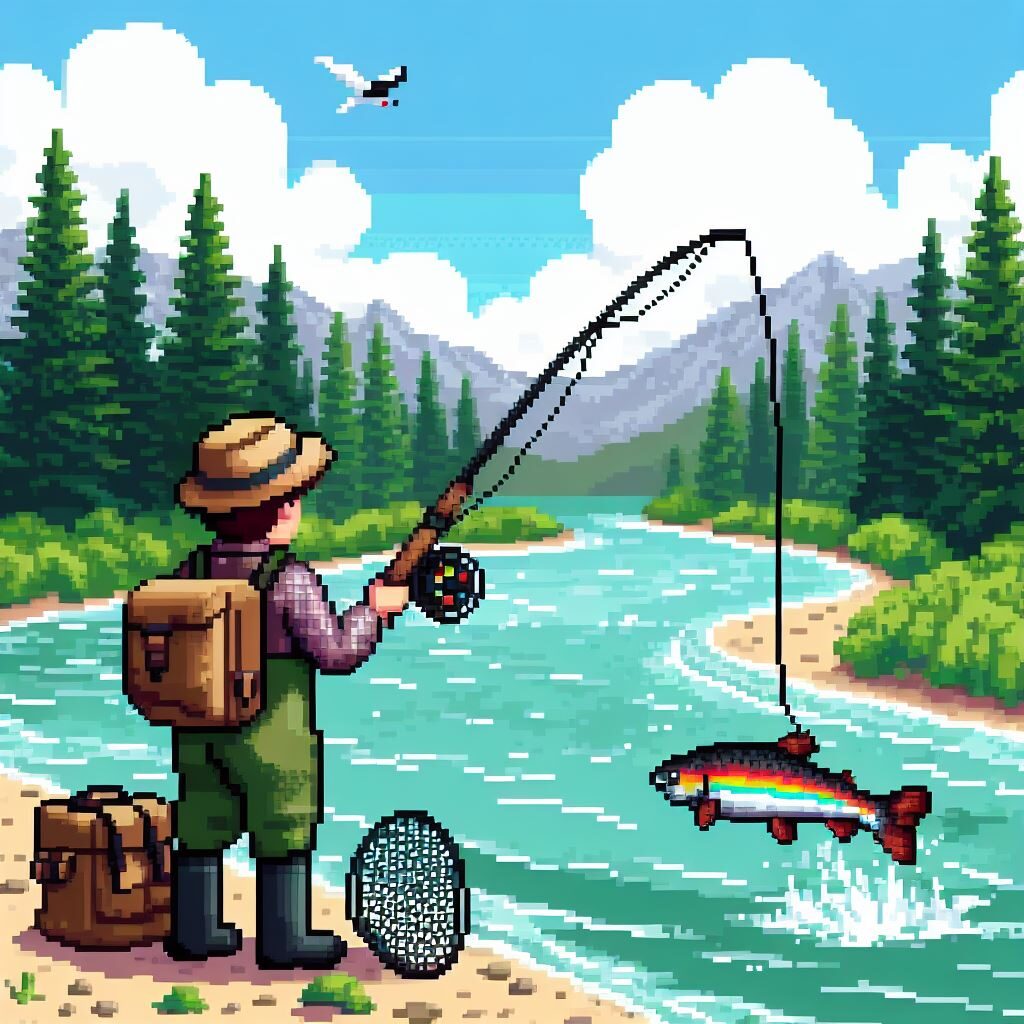
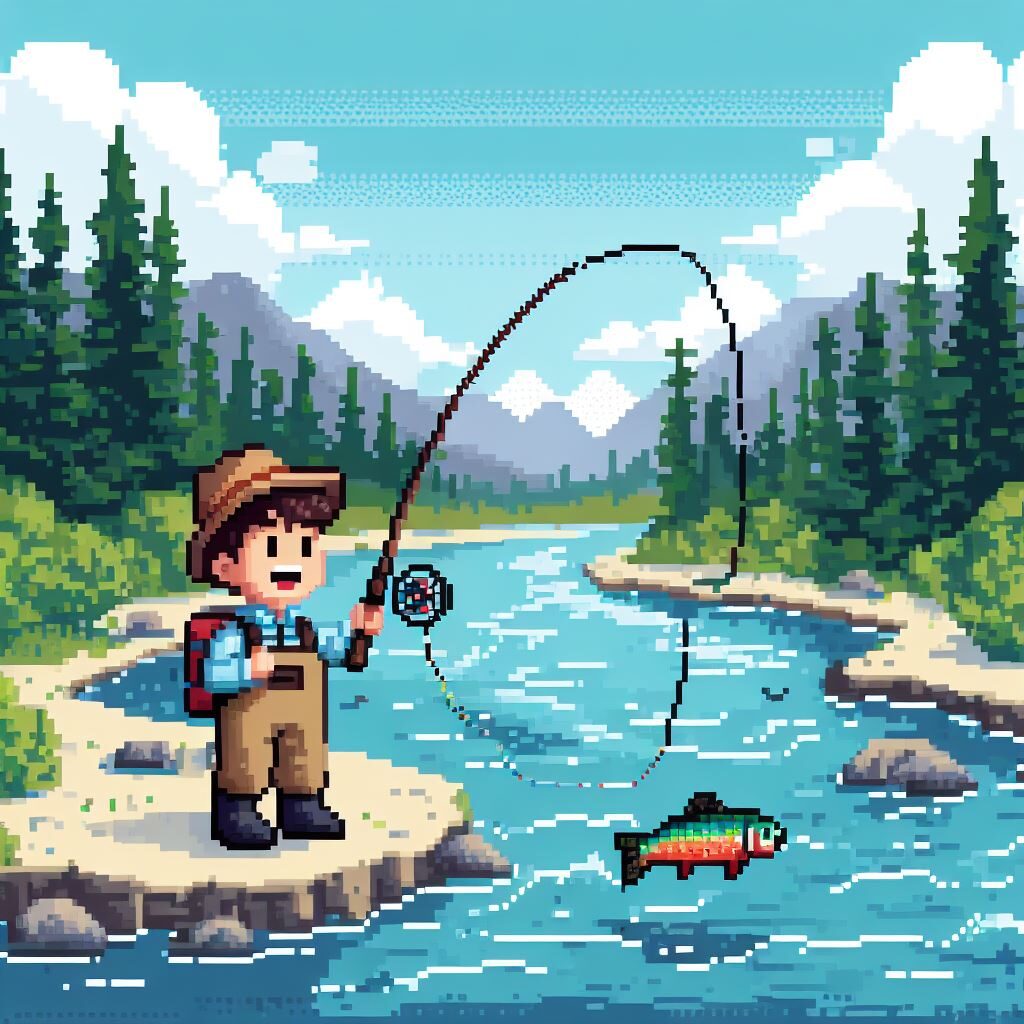
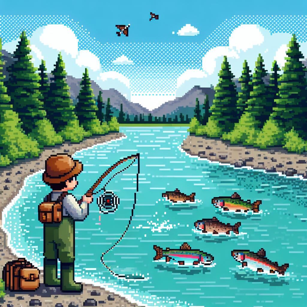
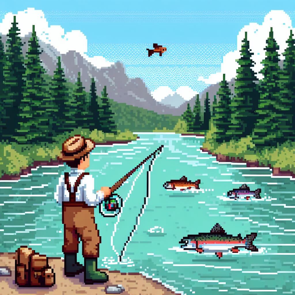
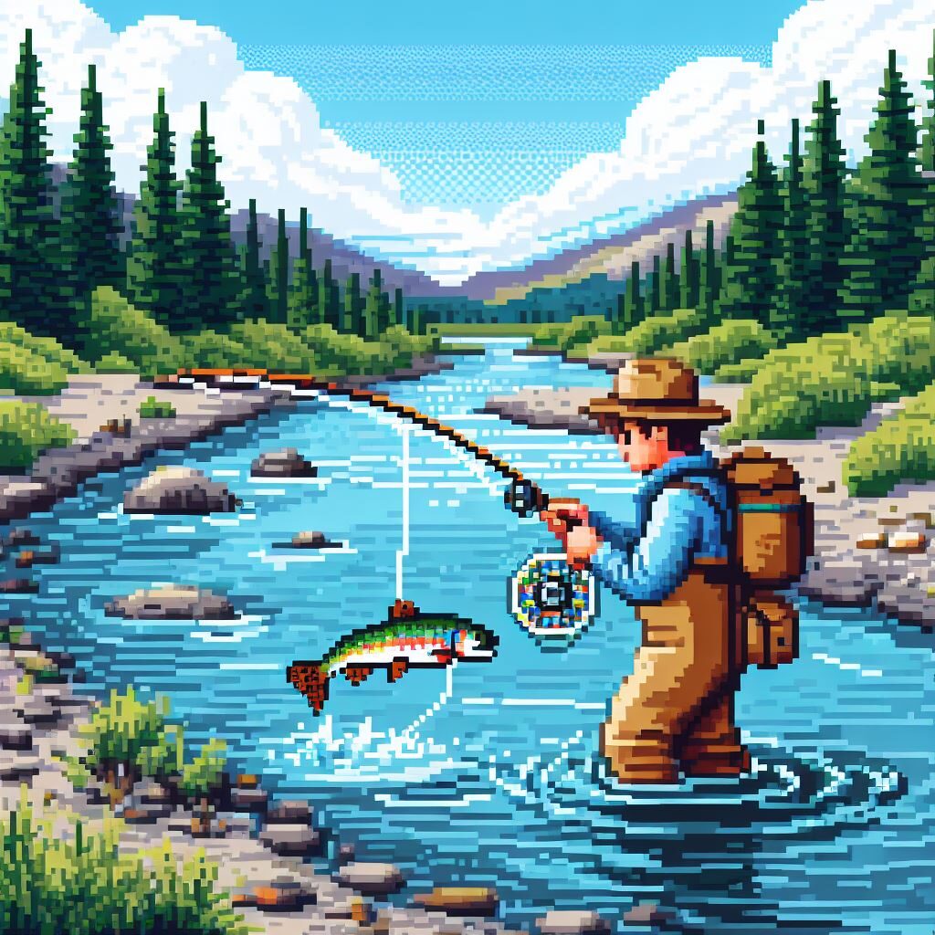
My prompt for my first set of generated images was this, “Pixel art of a boy fly fishing for rainbow trout in Montana. The boy is wearing waders and a hat and is equipped with a fly fishing rod, net, and pack. The boy is standing in the river. The river follows a bend into the horizon. There are evergreen trees on the banks of the river. There are mountains in the background. It is a partially sunny day with fluffy clouds in the sky. The boy is excited because there is a rainbow trout on the line.” Here are the results:

Results from the first round were pretty on point with what I was hoping to receive. The image generator basically nailed the setting and the outfit of the main character. The primary issues involved the fish not looking like it was being caught, and the boy is standing on the bank of the river, rather than in the water. I adjusted the prompt to try and address these issues.

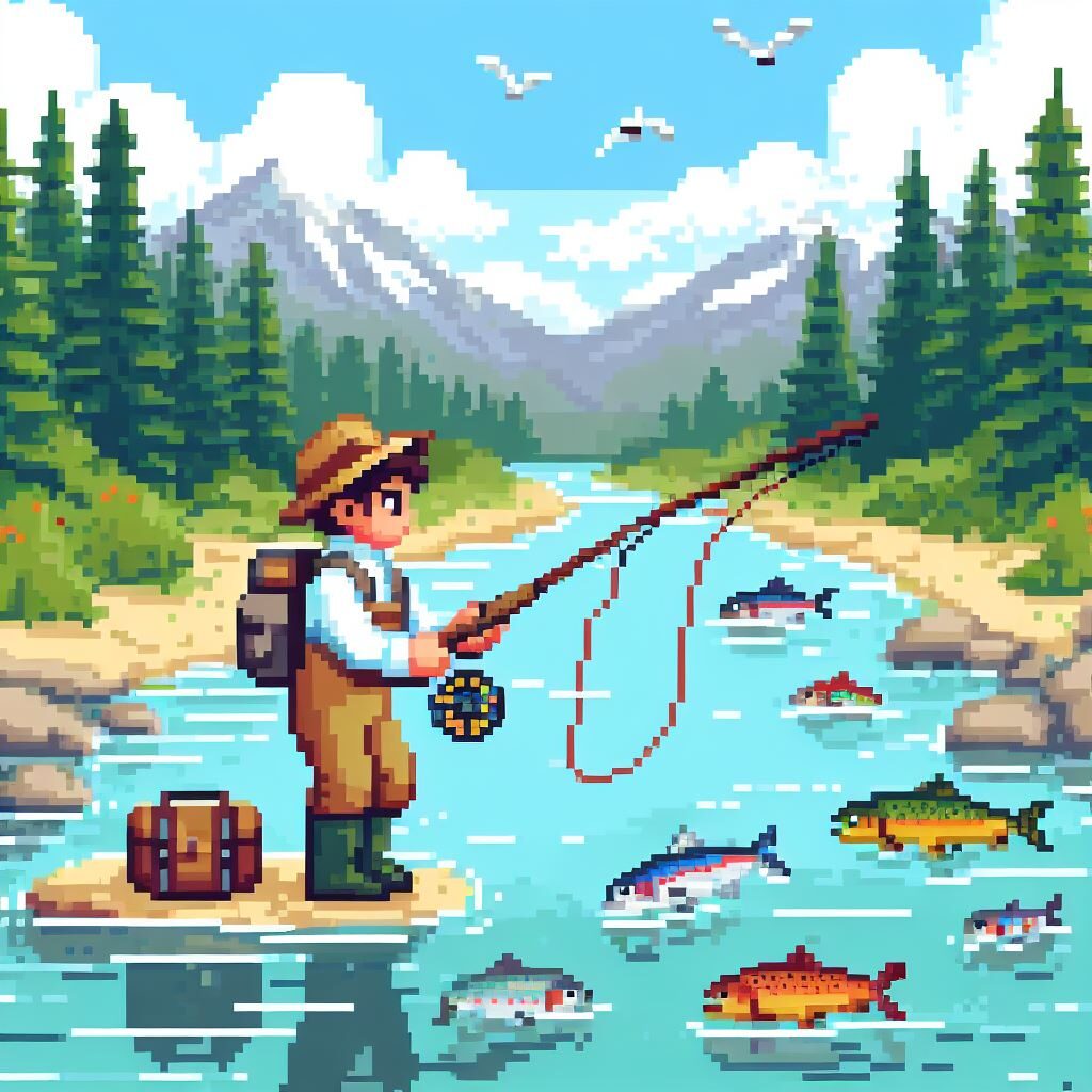
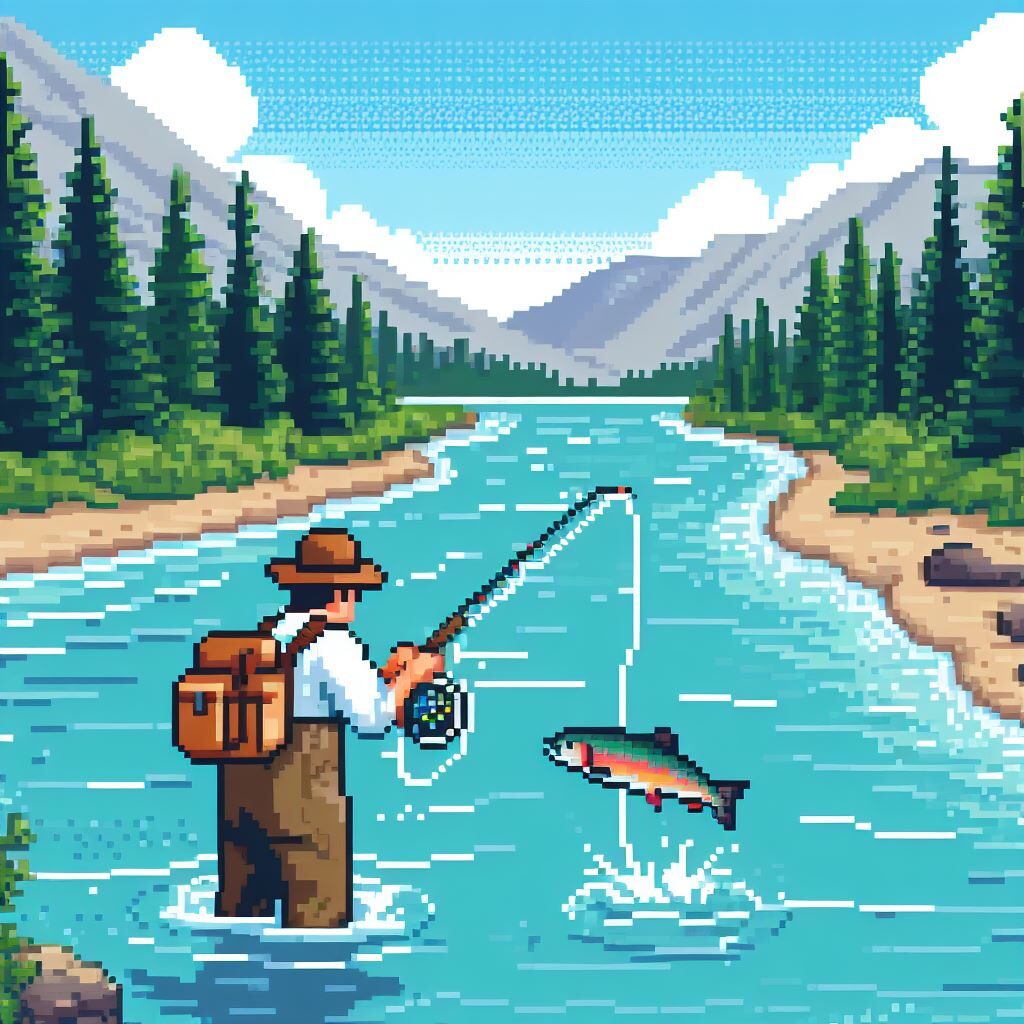
This is my prompt for the second round of images, “Pixel art of a boy fly fishing for rainbow trout in Montana. The boy is wearing waders and a hat and is equipped with a fly fishing rod, net, and pack. The boy is standing knee deep in the water. The river follows a bend into the horizon. There are evergreen trees on the banks of the river. There are mountains in the background. It is a partially sunny day with fluffy clouds in the sky. The boy is casting the fly fishing rod while rainbow trout swim by.” Here are the results:

The second round produced much of the same results as the first image, with the same issues. I altered the prompt more dramatically for the third round.

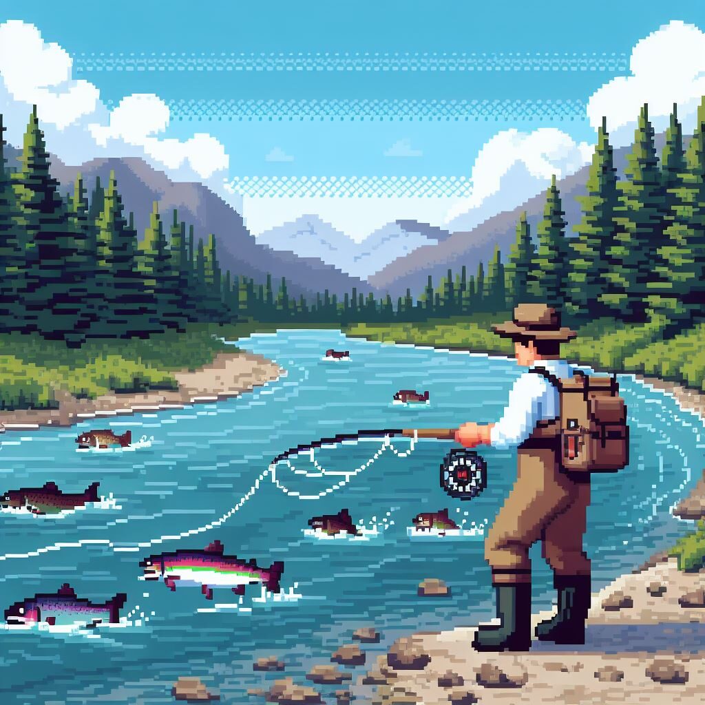
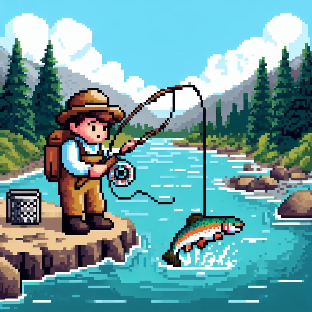
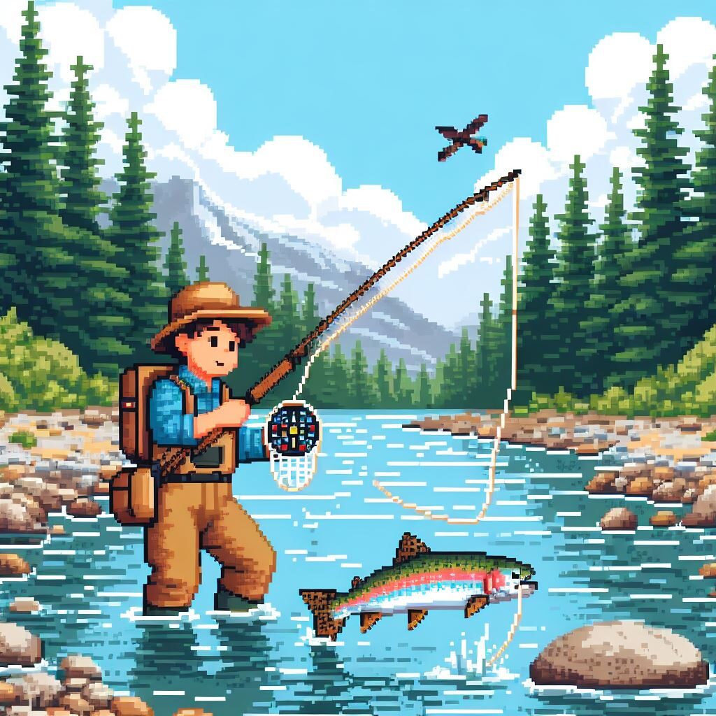
This is my prompt for the final round of images, “Pixel art of a boy reeling in a rainbow trout on his fly fishing rod in Montana. He is standing in the water. The river is up to his knees. The boy is wearing waders and a hat and is equipped with a fly fishing rod, net, and pack. The river follows a bend into the horizon. There are evergreen trees on the banks of the river. There are mountains in the background. It is a partially sunny day with fluffy clouds in the sky.” Here are the results:

This time around the boy was finally standing in the water, and the image is almost exactly what I am looking for, however the fish still doesn’t quite look right. It does not look like it is being reeled in, in the way it would in real life.

Overall I am very happy with the results. There are still quirks that would likely take a little while of prompt refinement, but it is so much faster than trying to create that myself, and so much cheaper and faster than commissioning an artist to create it for me.

The Image Generator through Microsoft Bing with Dalle3 is a very impressive tool. The design is really clean and straightforward, which is why I prefer it over the competition which often looks messy or over the top. Every prompt is responded to with one to four options, and is seemingly quite successful at creating what you have in mind. Some limitations include that it is hard to iterate. It would be nice if you could generate an image using text as images as the input, as opposed to just text- or at least select one of the resulting images and refine. Also there are only 15 free images available to generate a day. In some ways this is a pro and a con. More access is desirable, but a truly free option is very appreciated even if it’s limited it still includes all the important features.

Categories
Uncategorized

Blog Assignment #7

For this week’s blog assignment we are talking tech. Honestly, I love tech; ever since my first Gameboy and iPod I’ve been pretty fascinated with all sorts of different devices that has led me through projects and hobbies including building computers, modifying games consoles, repairing electronics, and digital and film photography.

Lately I’ve been trying to distance myself from the idea the the best products come from using the latest tool, and experimenting with older methods. I think this is pretty big trend in general, I’m not the only one feeling this way. However, a modern product that I think is pretty cool is action cameras. From my research action cameras really started to appear in the early 2000s, though cameras have long been used in action packed scenarios. GoPro has long been an industry pioneer, but other manufacturers who’ve produced action cameras include Sony, DJI, and Insta360 to name just a few.

For this review I am going to talk about the GoPro HERO12 Black. I would love to own a GoPro action camera. They look really fun to use on the go. I am someone that greatly enjoys outdoors hobbies such as biking, swimming, surfing, and skiing, and would love to have a small simple camera capable of rugged handling. GoPro’s are designed exactly for this purpose and the latest iteration seems to be packed with features including high resolution video capabilities, slow motion capabilities, bluetooth to connect to audio interfaces directly. It seems like a super smooth way to capture footage while out and about. I’ve tried to capture footage of my adventures in the past, but I often feel limited by the hardware that I have, often getting out a camera and setting up a shot takes more time than I would like and therefore I’m either unhappy with the results or I just don’t end up taking the photos or videos that I had hoped to. A dedicated action camera like the GoPro is designed to solve exactly this issue and I’m super interested in trying out this kind of camera at some point in the future.

I would love to eventually involve my non-design hobbies with the skills I am learning in this design program and I thinki that an action camera could be one avenue to capture memories and create projects using content from my personal interests.

Categories
Uncategorized

Blog Assignment #6

For this week’s blog post we are to discuss how our identities and past experiences shape our work, learning, and future projects. Put another way, we are to talk about our unique perspectives in relation to design.

There are so many experiences that I’ve had and identities that I hold that influence my work and learning, but for the scale of this blog post I will narrow the scope and talk about my experience with bikes. Bikes have been one of the great hobbies of my life, and have facilitated my growth as a person well beyond the act of riding.

Everyday I ride my bike to school. Before I enrolled as a student at Seattle Central College, everyday I would ride my bike to work. The bike is the primary way that I get to and from the places I visit most in my life. This mode of transportation inherently connects you to your surroundings on a much deeper level than driving, taking the bus or train, or even, in my opinion, walking. Moving through the world at the pace of a bike, you are able to actually process all the sensations you are experiencing, and you are subject to all the elements. In my ride from home to class I take in so much information that I don’t think I would ever encounter if I drove. I see interesting designs of posters, stickers, graffiti, murals; I see textures of broken glass, metal or wooden fences, asphalt, steel beams; I wave to other cyclists that I pass at the same place going the opposite direction at the same time everyday. I witness the progress of the development of the new buildings along my route. This is all information that I believe sneaks into my designs. And when I recognize these sources of inspiration appearing in things that I create, I feel even more connected to the place I live.

Before SCCA, I worked at a nonprofit whose mission is to assist people with disabilities in getting access to outdoor recreational experience. My job was as a program coordinator for the adaptive cycling program, and that included helping people get fit for an adaptive cycle that would fit their needs. I also repaired all of our rental cycles. These were free rentals available to anyone who could benefit from their use. This job has made me especially conscious of the need for accessible design and that is one of the biggest skills I hope to grow throughout this program. I ultimately would probably like to work for some sort of government agency as a designer focused on accessibility.

My experiences with bikes and advocacy for accessibility have not only enriched my personal growth but have also prepared me for a journey in graphic design with a distinct perspective.​​

Categories
Uncategorized

Blog Assignment #5

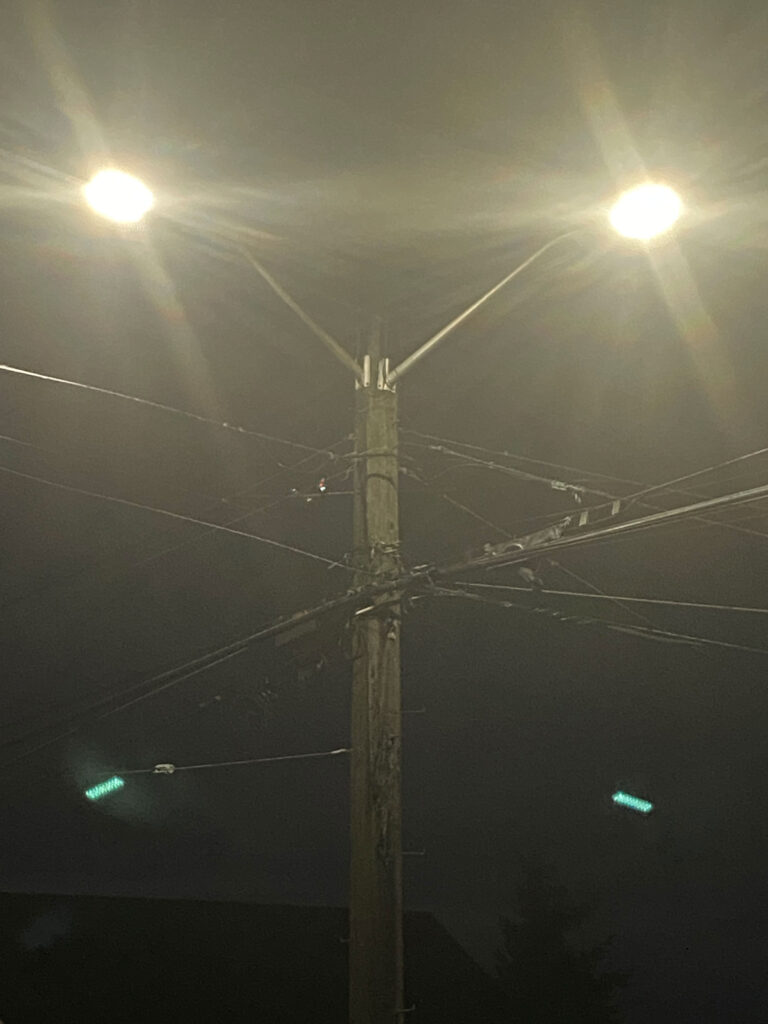
This week we’ve been tasked with finding letters in the wild. My letter is Y. Y is a pretty easy letter to come across. You see it often in human constructions because we use triangle so often and a Y is essentially a triangle with a tail. You also see it in nature often. I noticed the most common Y I saw was on trees where the trunk would have a distinct fork and split into to paths.

The Y that I chose to take a picture of and share felt like one of the more interesting scenarios I came across. It was a street light on a corner with two branches of lamps.

Categories
Uncategorized

Blog Assignment #4

For our scenario of thinking about working internationally, the international city I’d be interested in living and working in is Victoria, BC, Canada. Not far from Seattle, Victoria has a familiar feeling that I find comforting, but also has a lot of interesting differences. The things I like about Victoria include: 1. it’s on an island; 2. it’s proximity to forests and other beautiful natural landscapes and wildlife; 3. it’s proximity to the ocean; 4. the Canadian and British influence i.e. poutine, tea, and gardens; 5. it has great cycling infrastructure and 6. it’s relatively close to home in Seattle. That list can continue, but I think I’ve made my point- I like it there. The downside of Victoria (likely result of the upsides) is it’s housing is expensive, and the wages aren’t that great relative to that. This seems to pretty much be the case in most cities (definitely including Seattle) so it’s not really that big of a turn off to me, might as well live a life without savings somewhere really interesting to me. A job listing I found for this hypothetical scenario is, “Graphic Designer: Web and New Media” at Pacific Design Academy. This job intrigued me because it paid higher than many other similar postings and utilized the skills we are learning at SCCA seemingly to a “T”. The annual salary worked out to be ~$50-60k. I don’t know if that’s in line with what to expect for this field, but the seemed to be on the higher end for people early in their design careers in Victoria. Who knows maybe I’ll actually try it out there someday.