
I researched Rebecca Black on Instagram, the web, and checked out the actual poster that was made for her for the event prior to designing the poster so I could get a sense of her music, personality, and aesthetic since I was wasn’t familiar with her or her music. I listened to her newest album, Let Her Burn. Her music is poppy (with variations) and her style is somewhat extreme as you can see in the photo above on the poster. That was taken from her music video for “Crumbs”. It’s an extreme outfit/costume and when you look at how she dresses on her Instagram page its wild, dramatic, fun, bright, colorful, young, lots of make-up, sometimes dark like above. In my research I came across a statement she made about how she liked dressing up as characters. The look of my poster was going to be bright in terms of the pink in the background, also a bit dark to align with the picture displayed which is spooky and futuristic. I thought the dots were a nice simple addition to the composition. I chose the name Friday for the venue because that was the name of her first hit single.
Here is a link to the music video “Crumbs”: https://www.youtube.com/watch?v=Ecm-ylA29X0
Rose Boucher
Polycam Project – Dinosaur Pusheen spotted at SCCA!
BREAKING NEWS – Dinosaur Pusheen was seen live on the scene at SCCA today. Liz was so excited to see a huge version of this cuddly cat and ran towards him with open arms only to realize he was AR and disappointment ensued.
Our project this week was to use the app Polycam to make AR from an object we took at least 80 photos of to create the 3D rendering. I used my Pusheen stuffed animal as the object. It was fun to come up with a little story and try out the app and other options it has on it.
What I did in a week: 10/20/23-10/26/23

Saturday:
11am- get out of bed
11am- 11:30am – make breakfast (take Athletic Greens first) and refresh my cat Igloo’s water and food, clean his eating area. Listen to NPR. Unload and load dishes in the dishwasher.
11:30am-11:45am – clean up Igloo’s barf in the bathroom, tell him its ok and we are going to talk to the vet about it since it’s been happening somewhat regularly. Shower.
11:45am- 11:55am – clean Igloo’s face with baby shampoo and water plants.
11:55am- 12:05pm – meditate
12:05pm- 2:20pm – try to open group project sent to me in Premier Pro and have difficulty (first time using app) so chat with an agent and give them control over my screen with a remote session to figure it out. Thank god for experts to help in those types of situations.
2:20pm-2:40pm – delete stuff on my computer to make space for new projects/programs
2:40pm – 3:20pm – do yoga workout from YouTube and then quick shower
3:20pm – 3:50pm – make food and eat it (its a Green Day: pesto pasta, asparagus, and olives). Listen to the WTF with Marc Maron podcast. Then listen to Doug Stanhope (comedian) album.
3:50pm- 6pm – work on slides for group project in History of Graphic Design class (Art Nouveau research)
6pm – 6:55pm – read The Lens of Colonialism for History of Graphic Design
6:55pm – 7:45pm – try to not suck as much at CSS and HTML by playing frog game Erik sent us and watching a video on the basics of CSS
7:45pm – 8pm – Read Rick Rubin’s The Creative Act since it came up in my New Media class and it’s been sitting lonely on the book shelf
8pm – 12am – me time: watching shows and drawing subconsciously, social media, texting friends, candle burning, special colorful light going, cozy couch and waffle blanket, herbal tea
Sunday:
10:30am – get out of bed
10:30am – 11:40am – breakfast (Athletic Greens first) and listen to NPR. Refresh Igloo’s food and water. Social media- post my drawings with Beyonce music clips.
11:40am – 11:55am – clean up Igloo’s barf in the bathroom again and get increasingly concerned, must tell vet at our appointment on Tuesday, shower.
11:55am – 12:20 – clean apt and do laundry, listen to Doug Stanhope album
12:20pm – 12:30pm – meditate
12:30pm- 1:40pm – do pilates workout from YouTube then quick shower, turn on Roomba
1:40pm – 2:20pm – make food and eat it. Listen to podcast Chubby Behemoth.
2:20pm – 2:35 pm – work on graphic translation sketches for Project 1 in Jason’s class and email them to him, listen to podcast Smartless
2:35pm – 4pm – work on giraffe sketches for Project 2 in Jason’s class and email them to him, listen to podcast Smartless
4pm-4:30pm – play around on internet
4:30pm – 4:35pm – pick the 2 books I want to redesign for History class and put those images on slides Gabriel made
4:35pm – 7:30pm – work on Yale website for Erik’s class, get stuck on logo issues but import large logo and it looks good, make paragraphs on my sections. Play frog game to help me learn coding, get stuck on a couple things.
7:30pm-7:40pm – read The Creative Act
7:40pm – 7:50pm – get groceries at store next door
7:50pm – 8:30pm – have a beer with friend who lives in the building on the roof, and he gave me Indian snacks
8:30pm 11:30am – ME TIME! watching shows and drawing subconsciously, social media, texting friends, candle burning, special colorful light going, cozy couch and waffle blanket, herbal tea
Monday:
7:20am – get out of bed
7:20am – 730am: shower
7:30am- 8:30am – watch Democracy Now! and make coffee and take Athletic Greens. Pack snacks. Get dressed and order Lyft.
8:30am – 8:45am – Uber ride to school, meditate for 5 minutes on app, listened to Chubby Behemoth
8:45am – 9am – get help from Erik on website to clean it up
9am – 11:30am – Interactive class. Each group picks the best website to show to the class and we go over them. Border-radius: 20px, image generator. transition belongs to initial state. transition:flex-direction: column; for small screens, 800-1600 px for larger screens. how to make something a circle – img.circle {border-radius:50%;} class ended early.
11:30am- 1pm – stayed working on frog game and alien/ocean/restaurant group project.
1pm – 1:30pm – take street car dropped off a 10 minute walk from home, on walk home get take out from a Vietnamese restaurant
1:30pm – 2:15pm – eat Vietnamese food and clean apt
2:15pm 2:55pm – zoom with Erik and other students to work on website
2:55pm – 3:40pm – meeting with Sal from financial aid regarding my situation to see if I could get some money back on tuition since I’m planning to not work for 2 years and focus on school
3:40pm – 4pm watch feedback videos from Jason on sketches.
4pm – 4:30pm – zoom with Erik to fix my website, one issue was having html in my css
4:30pm – 4:50pm – do sketches for Jason and email them to him
4:50pm – 6:20am – in Illustrator make menu for group project in New Media combining aliens/underwater/restaurant
6:20pm – 7:50pm – listen to Smartless podcast, laundry, quick workout, eat, social media – post my drawings to music
7:50pm – 11:30pm- ME TIME! watching shows and drawing subconsciously, social media, texting friends, candle burning, special colorful light going, cozy couch and waffle blanket, herbal tea
7:00am – get out of bed
7:00am-7:15am – shower
7:15am-8:10am – watch Democracy Now! and make and eat breakfast (take Athletic Greens first) get dressed and get Igloo ready for the vet to get a lion cut
8:10am – 8:15am- take Lyft to vet
8:15am – 8:30am – get Igloo set at the vet and sign forms
8:30am – 8:45am – Lyft to school
8:45am – 9am – ask Gabriel’s permission to auto record part of class since Yuliia isn’t here today and requested I do that for her and settle in.
9am – 2pm – History of Graphic Design class. Went over types of type, small group project where we picked something that represented the current culture (we picked Patagonia) and characteristics of it. Really interesting conversation on ours and what other groups chose.
2pm – 5:30pm – work on Illustrator project on Graphic Translation
5:30pm – 5:45pm – Uber to vet
5:45pm – 6pm – pick up Igloo in his new fresh look and take Uber home.
6pm – 6:20pm – short yoga work out and quick shower
6:20pm – 8pm – watch Illustrator videos and also make sure my work is sent to Jason digitally for our project.
8pm – 11pm – ME TIME! watching shows and drawing subconsciously, social media, texting friends, candle burning, special colorful light going, cozy couch and waffle blanket, herbal tea
Wednesday:
7:20am: get out of bed
7:20am -7:30am – shower
7:30am – 8:30am – make and eat breakfast (take Athletic Greens first) watch Democracy Now! and cry for the Palestinians and all those in pain in this horrendous political situation that seems to keep spiraling out of control. Get dressed and ready.
8:30am -8:45am – Uber to school
8:45am – 9am – get settled in class and get ready for critique
9am – 2pm – Illustrator class with Jason. Critique on projects then lessons on blender and width tool.
2pm – 2:30am – take bus and then walk home.
2:30pm – 2:50pm – workout and quick shower
2:50pm – 6pm – work on project for Jill’s class. Pick one of the businesses and make a logo, starting with 30 sketches of possibilities.
6pm – 7:30pm – work on menu for Phathom’s Grotto in Illustrator, the made up restaurant for New Media class and send to team and Ben.
7:30pm: ME TIME! watching shows and drawing subconsciously, social media, candle burning, special colorful light going, cozy couch and waffle blanket, herbal tea
Thursday:
7:20am – get out of bed
7:20am-7:30am – quick workout
7:30am – 7:40am – shower
7:40am – 8:30am – Take Athletic Greens, make and eat breakfast, watch Democracy Now! and ugly cry about the current situation in the Middle East. Get dressed.
8:30am – 8:45am – Uber to school
8:45am – 9am – settle into class
9am – 2pm – Intro to design with Jill. Work on creating logos. I picked a book store to work on. Worked in small groups to give each other feedback and my group was great.
An international job
Our assignment was to choose a job we would be interested in that is outside the USA. The link above leads to a Graphic Designer position at Developed posted on LinkedIn. They are property specialists and part of an assembled group that includes other companies that “recognize and award employees” so taking this job could open up opportunities in other industries as well. I chose Melbourne, Australia because Australia seems to have a solid standard of living and I want to be close to Indonesia/Maylasia/Philippines for scuba diving on my off time. Branding is very interesting and exciting to me and that was one of the items mentioned in the role. Also ‘attend brainstorming meetings and creative sessions’ sounds stimulating. Work life balance and perks are important to me and they write there is a competitive salary, and invest in their employees by giving them $1,000 to further their education/professional development, $250 towards your own personal choice of fitness, 4 weeks of leave, $150 towards home office set up, etc. I want to work somewhere that rewards you for being a good employee, and in my mind, with more perks like those theres more incentive to do the best you can. I think it also speaks to the company caring about the mental/emotional/physical health of their employees which you can’t find everywhere.
What do you C?
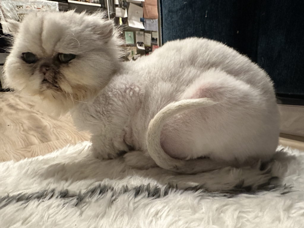
My assigned letter to find in the wild was C. Look at Igloo’s tail! C stands for CUTE.
App review: BBC’s Civilisations AR
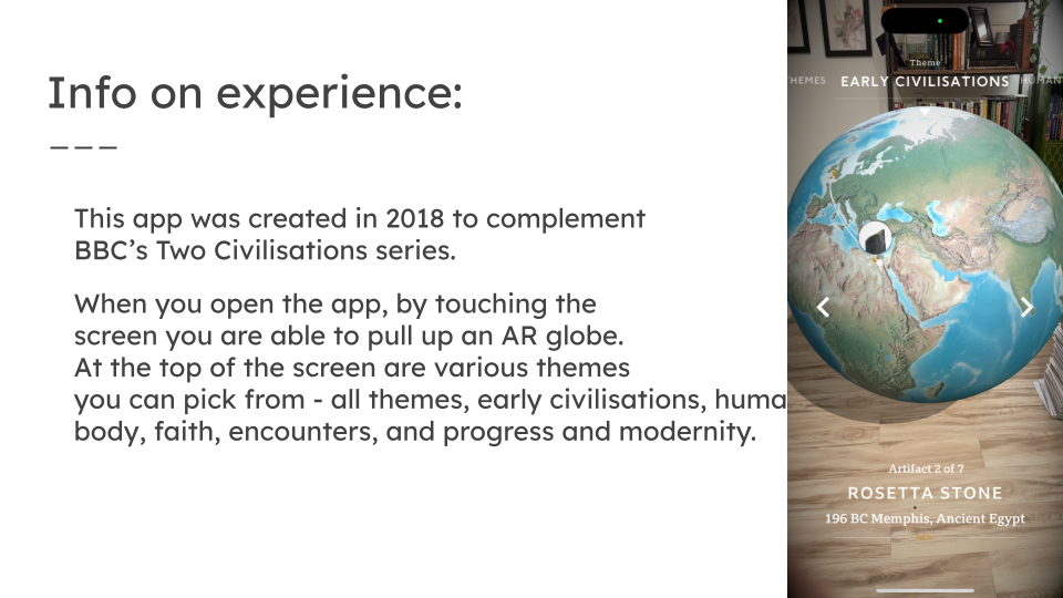
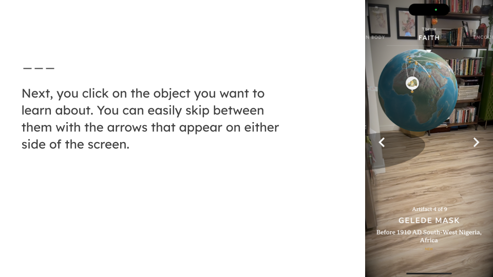
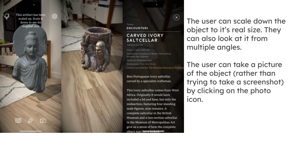
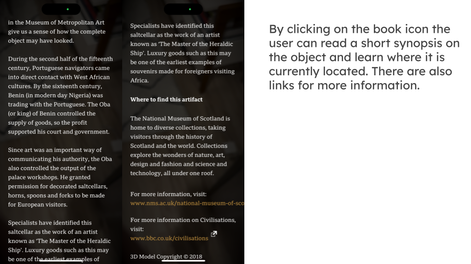
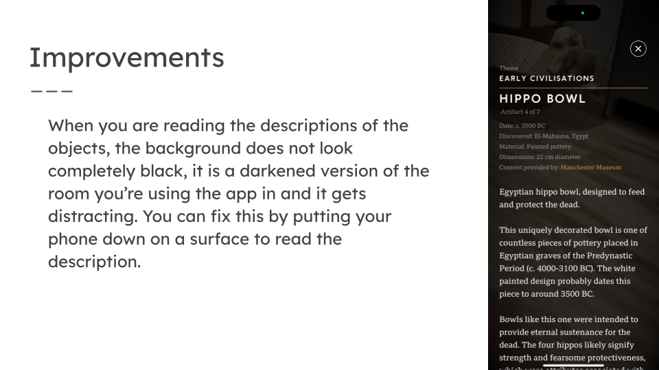
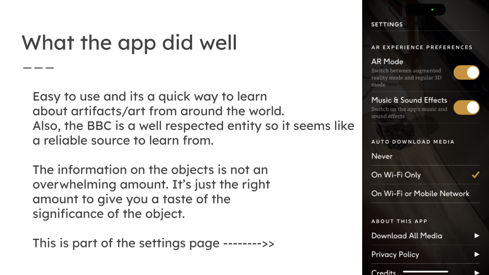
I chose to review this app because it seemed like an interesting way to learn about history. I thought about this after picking the app (and this may be neither here nor there because I don’t know how they decided which items to showcase and would have to do a lot more research to figure this out), but in our History of Graphic Design class we talked about how through colonialism many items are stolen from it’s creators and showcased in the oppressor’s museums. There is a movement going on to give ownership of the items back to the people who created it. In some situations the creators might be fine with the item being in another land at the museum, but the point is WHO has the power to make that decision and it seems fair to give it back to the people who originally crafted the item.
EyeJack App
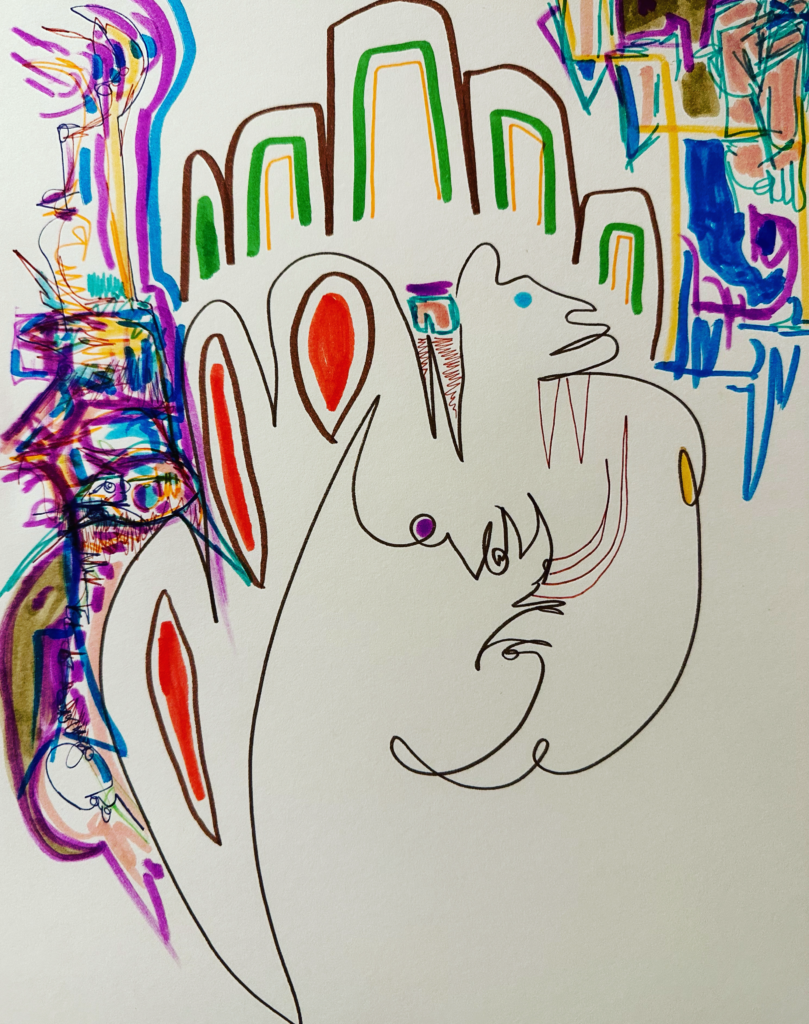
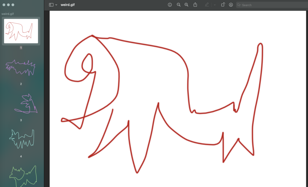
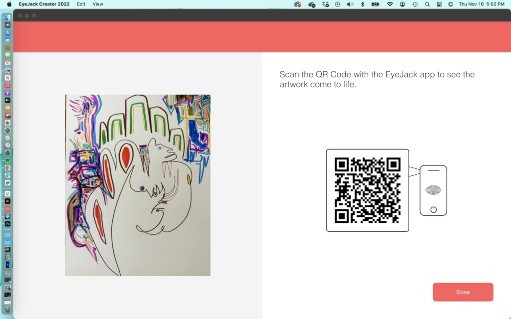
I wanted to use some artwork I had made and tried using a scuba diving video to go along with it, but this didn’t work, maybe due to sizes not lining up. I followed along with the one minute tutorial on how to make a quick animation in PhotoShop. The first image I put in EyeJack was the drawing, then I added my animation, then I added the sound from breathing underwater in my dive video. It was a little challenging for me at first but like anything the more you use a program the more you understand it and get more comfortable with it.
Why I’m unique as a design student
I enjoyed how our guest speaker Gabriel Lopez talked about essentially learning the rules so you know how to break them. This is something that resonates because you can clearly see that in art school/classes. You learn how to draw. You practice and practice and eventually get good at it – so what’s next? You can take risks and see what works and what doesn’t. You grow through lots of trial and error. My artistic style of seeing what shows up when I draw automatically allows me to feel free and trust myself so that is one thing I think will help me in my design career.
Traveling internationally (especially solo) has given me confidence in myself which is helpful to push forward with my artistic vision and career. When you travel solo as a woman you have to be on your toes, trust your instincts, and not only worry about protecting your phone/money/property but also your body when surrounded by cultural attitudes that may be very different from your own. I’ve developed strength protecting myself alone all over the world and I think it’s made me more assertive and confident which will help me as a designer. I know I can usually rely on myself to get out of tough situations.
I also love learning about new cultures and meeting new people so being exposed to that is something I’m grateful for with all the traveling I’ve done. I think this will help me when working with clients because I am a good listener and will really want to understand them, where they are coming from, and where they want to go. Another thing that makes me unique is that I held down my previous job for almost 15 years so I’m a steady and reliable employee. My previous job was very relationship/trust building based at its core so I have a lot of experience building long lasting (or brief) professional relationships whether it was with other staff or nurses as a union organizer.
I draw strength from scuba diving, a hobby that changed my life and is a core part of my identity. As a new diver I was in a situation with strong currents that was so scary I thought “this may be how I’m going to die”. I still did the next dive that day (even though I was emotional) and realized how profound the sport was, as I was initially drawn to it through my love of the ocean and its myriad of creatures. I fully realized how much I was relying on myself to stay safe underwater when a million things can go wrong. My father used to say he was proud that when I was a kid and learning to ice skate I would fall then get right back up. I think resilience could help in any field and the field we are going to be entering into as graduates of SCCA has been described as cut throat and filled with rejection, so being able to get back up after taking spill seems to be important to keep improving and flourishing.
EyeJack app
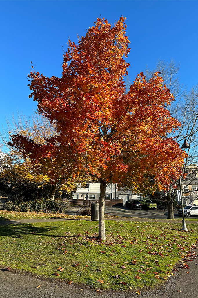
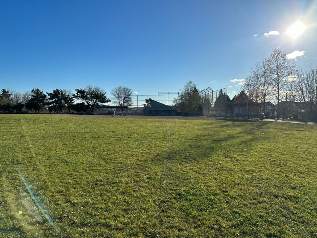
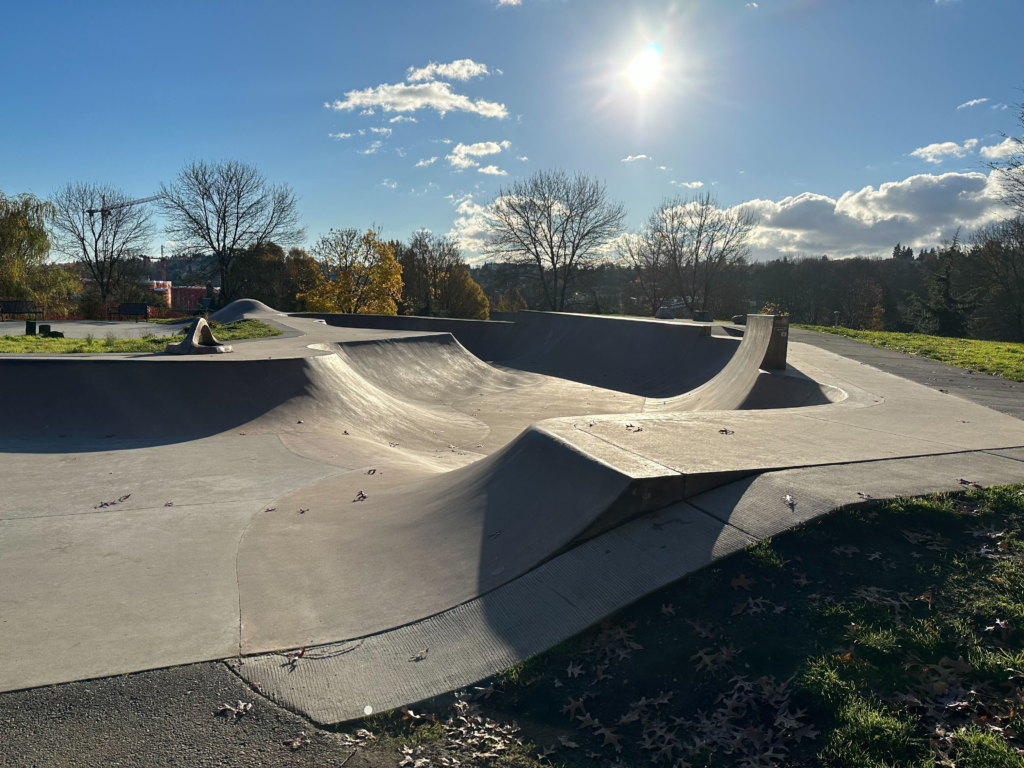
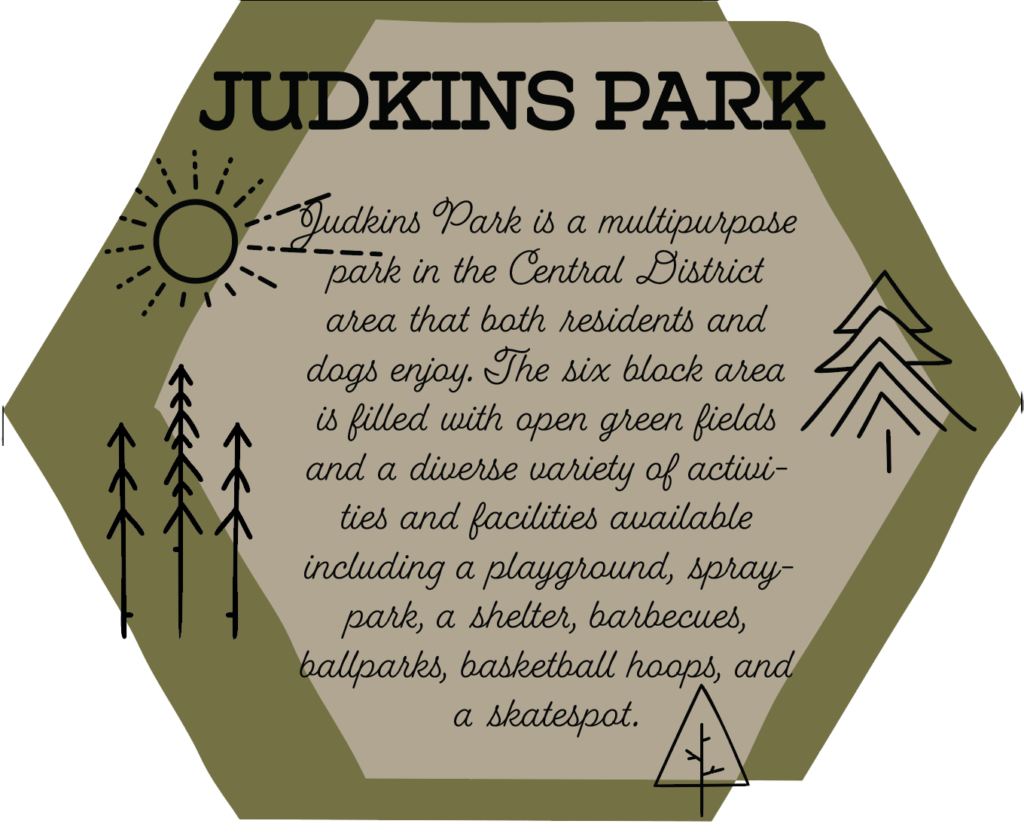
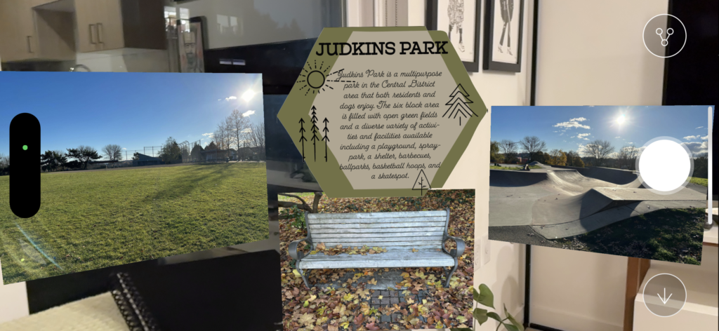
My team chose parks in Seattle as our Point of Interest. The team is Craig, Kas, and Oliver. I chose Judkins Park which is close to me in the Central District. It was a beautiful sunny day on my walkthrough to get photos/videos. One of the photos is a wide open green space with a baseball field in the distance and I chose that as one of the photos because one thing I love about that park is the wide open spaces (which you don’t always get if you live in a city) and I will walk in them rather than the concrete path off to the side. The park has a wide variety of activities/facilities available such as: a playground, a sprayground, basketball court, skate area, barbecues, shelters, baseball fields… there is a lot to do there. People play soccer or volleyball or practice any number of activities in the open green spaces.
I used Illustrator to edit the tile Craig made for us to all use to keep it cohesive and make a short description about the individual park we each chose. The slide with the description on it was challenging because I tried many file extensions and the text was blurry when I opened it in EyeJack but finally I tried taking a screenshot in Illustrator and opening it in PhotoShop, and removed the white background around the polygon. I haven’t worked in PhotoShop yet so now that I know about removing the excess background I’ll be doing that when needed. The description photo above is a little strange on the sides, but it looks like it should in the actual project. The assets I used were mostly if not all png.
Aero Project: Grace’s Birthday
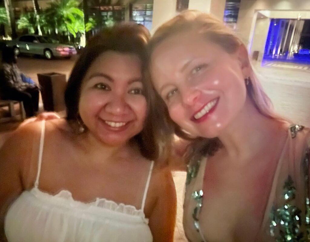
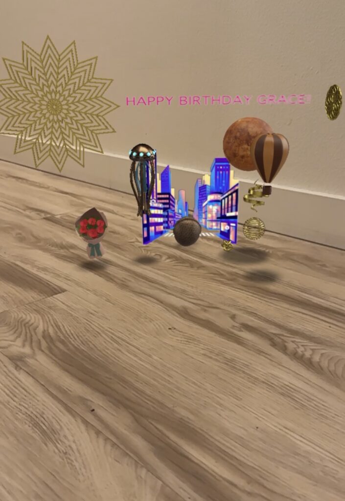
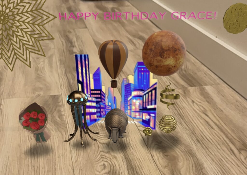
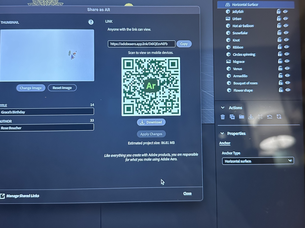
Jumping jellyfish, it’s Grace’s Birthday! Grace is one of my best friends and her birthday was a few days ago. We tend to spoil each other on birthdays but currently as an unemployed student I’m not sure what I’ll be sending her, but I think she’ll appreciate the sentimentality of this project. For New Media class we had to pick a subject for a card we made in Aero so Grace came to my mind quickly when I started the project. I tried to spoil her in an AR way through all the assets I used. I started with the cityscape like we were going out for her birthday. She gets a bouquet of roses, spinning and jumping gold objects, an animated jellyfish, a rolling armadillo, and a hot air balloon revolving around Venus (what every girl wants). I used the hot air balloon asset because years ago we took a ride in a hot air balloon with some other friends and it was quite memorable. I had fun putting everything together and building a little moving world. I didn’t really have any issues but getting a good screen recording took awhile.
AI generated picture of a pet friendly interstellar vacation
1/10/23
For the first assignment of the quarter we have to use an AI image generator to make a picture based on an idea/ sketch. My idea in terms of an image of an interstellar pet friendly vacation was a woman on a beach (in some distant planet) with her beloved cat, lizard, and ferret with her. The animals are pissed and confused why they are wearing space helmets because if they were to breathe the air on this planet they would immediately burst into flames. But Emma can’t live without her fur (and scale) babies so when this opportunity came along to take her squad into space she went for it. In the sketch she is taking a picture “for the gram” with her angry pets in the background. On this planet animals can talk to each other so they each have their own speech bubble of bewilderment. There are planets in the background, an umbrella on the beach, a container of SPF 100, and a cocktail. I’m hoping AI can make something enjoyably weird.
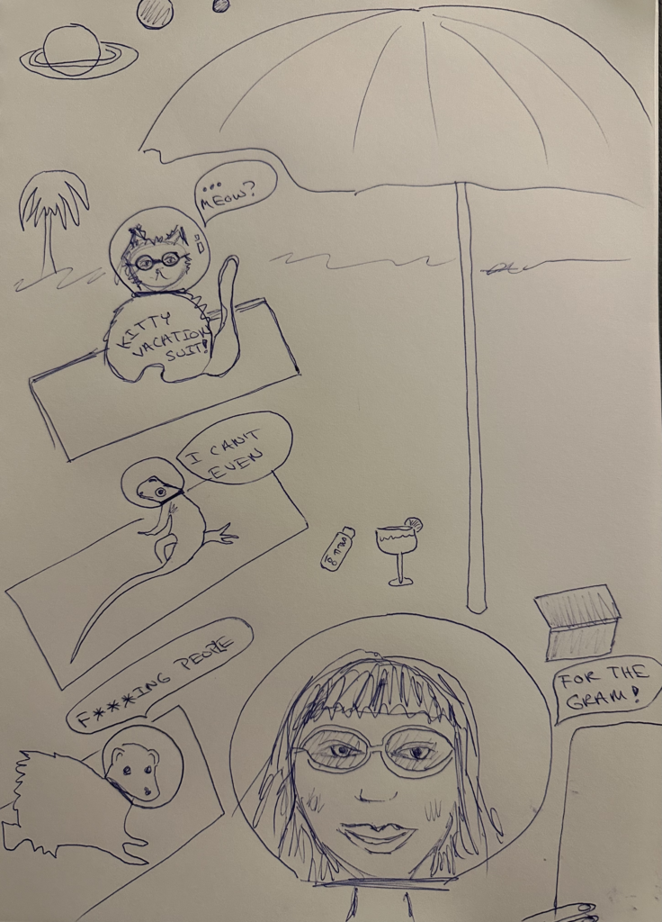
This was my first description given to imagine.art, and below is the image:
The setting is a distant planet, a woman on a weird beach vacation with her pets, a cat, lizard, and ferret on towels. The animals are pissed and confused why they are wearing space helmets. They each have their own speech bubble expressing discontentment. The woman is happy in her space helmet and taking a selfie for social media. They are under an umbrella and in the sand is SPF 100, a cocktail, and a book.
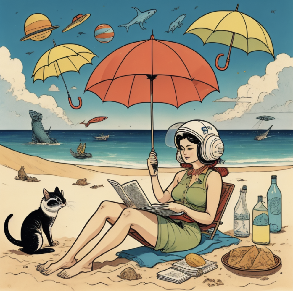
It missed the mark in certain ways but I do enjoy the floating sea creatures and umbrellas. Second go around this was this prompt and below is the image:
The setting is a distant planet, A woman on a weird beach vacation with her pets, a cat, lizard, and ferret on towels. The animals are wearing space helmets. They each have their own speech bubble expressing discontentment. The woman is happy in her space helmet and taking a selfie for social media. They are under an umbrella and in the sand is SPF 100, a cocktail, and a book. Make it weirder. The woman is very happy and her pets are sad.

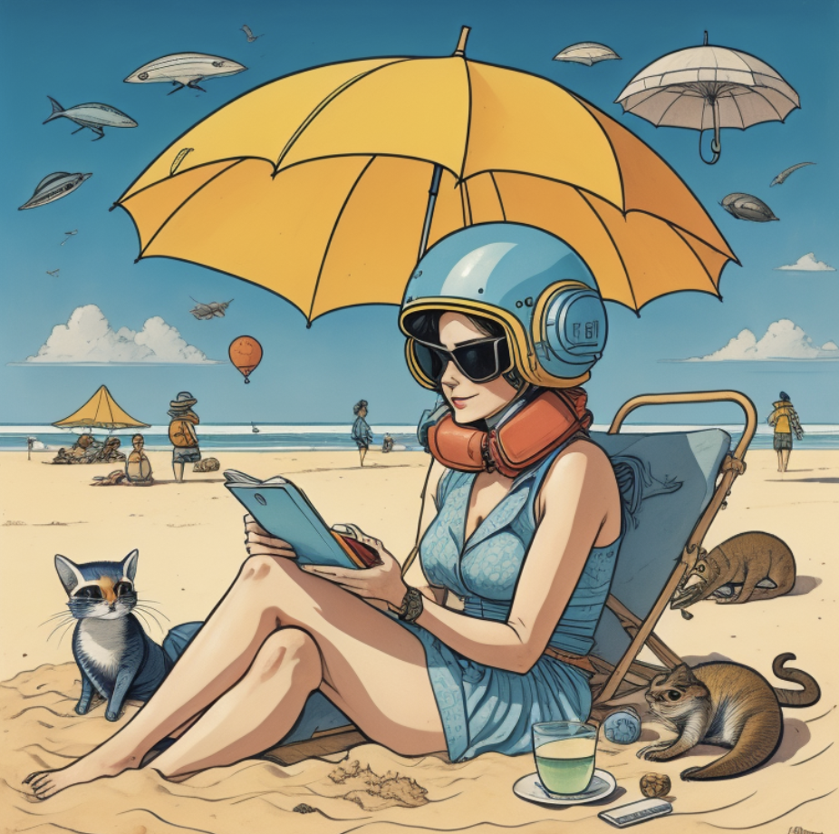
The animals still aren’t wearing space helmets. Third time is a charm. This was my prompt and below is the image created:
The setting is a colorful, distant planet, a woman on a weird beach vacation with her pets. A cat, lizard, and ferret on beach towels. The animals are wearing space helmets and so is the woman. They each have their own speech bubble expressing discontentment. The woman is happy in her space helmet and taking a selfie for social media. They are under an umbrella and in the sand is SPF 100, a cocktail, and a book. make it weirder. The woman is very happy and her pets are sad and confused.
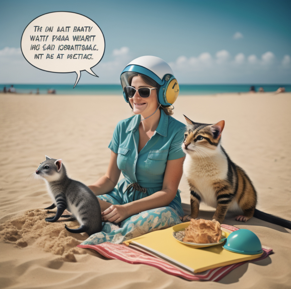
The text is unreadable and maybe an alien language or the way the animals are communicating with each other. Still no space helmets on the animals and where is the lizard? I was hoping to make something more bizarre on my final image but this was a fun exercise. I’ve used Imagine AI Art Generator for a class project before and really enjoyed seeing what kinds of images you can get with it, even if in this case it didn’t produce exactly what I wanted. I guess that’s part of what we need to learn – how to write good prompts for AI to get the results we want.
Swiss Army Knife
1/16/23
Our next assignment to list out what tools we currently have for our careers, tools we have that need development, and tools we do not have that we need to learn. We need to list at least 8 tools total.
Tools I currently have:
Know how to work with people and build good relationships, interest in networking, being respectful, preference to be well prepared to lower anxiety about work/assignments, some Illustrator skills, some coding experience, professional wardrobe, writing skills, interest in editing/copywriting, brain that makes associations easily, computer with Adobe Suite, daily meditation and workout routine for self care, a BA in Studio Art, excitement about design, eagerness to learn, willingness to take risks and fail, and good listening skills.
Tools you have that need development:
Illustrator, Indesign, Aero, After Effects, coding (though relevance in field is fading), Figma (have very basic understanding but needs a lot of work), learning about the industry and what kinds of positions would be a good fit for me.
Tools you do not have that you need to learn:
Webflow, Dimensions, other Adobe Suite programs, a deep understanding of the field and where I would fit, a strong network of design professionals and those on the outskirts of graphic design or those who would interact with them like photographers and videographers etc. Maintained solid rapport with classmates so we can help each other find career opportunities, experience of an internship so I understand (at least one example) what life will look like in the professional world. A strong portfolio.
Play a game – Space Team
1/25/24
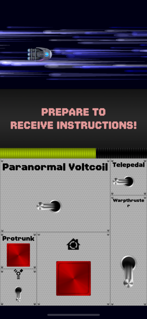
For our assignment we had to pick a game and play it, explain how it’s played, review it, talk about what we liked or didn’t, and identify the target audience. I chose Space Team, a game that is an app you download on your phone that I played with other students for the first time. You have to all be on the same wifi and then you can find the other players to connect with. We used my hotspot since the school internet with being funky on some of our phones. It’s a multiplayer game and the idea is that you’re driving a spacecraft and have your controls and gears in front of you on the bottom of the screen (with ridiculous names) and you have to tell the other person or people you’re playing with what commands you see pop up every few seconds. The top part of the screen is your spaceship and in one round we were very close to a flaming sun/something insanely dangerous. The commands that appear could apply to your controls or theirs. As we played green ooze started coming out of the controls and there was smoke and we shouted instructions at each other while the time was whittling away for each command to be completed. It makes sense that their game description is “cooperative shouting game”. The names of the devices are weird like paranormal voltcoil which adds to the stress because it’s easy to stumble over the words and you have to scan your controls of nonsense words to see if it’s yours or your partner’s. I played with one person (a group of us passed around two phones, switching after a round completed) but you can play with up to 8 people which I can imagine being very chaotic, as it felt chaotic just playing with one person. It felt fun and I enjoyed the silliness of the game. If you are someone who gets easily stressed it might not be an enjoyable experience to be under a tight deadline in a life or death situation and have someone shouting at you. The graphics are rudimentary (this was enjoyable), though I’m not someone who typically plays video games and has an eye for that. I’m not quite sure but maybe it’s aimed at millennials? It harkens back to video games when people my age were playing video games in the 80s/90s. Below are some screenshots from while we played.

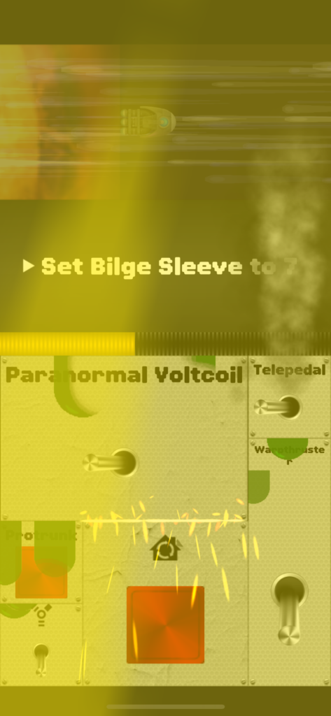
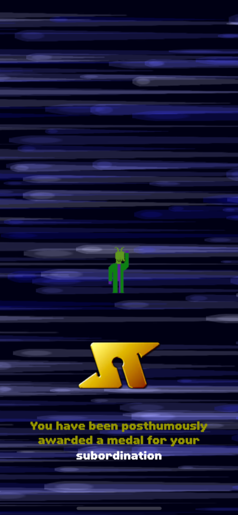
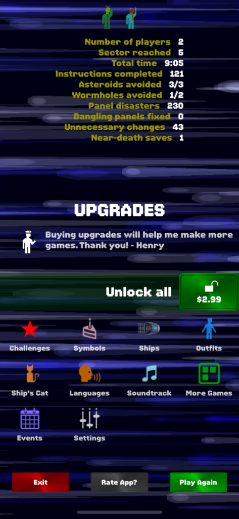
The BAR Method and my giraffe
2/1/24
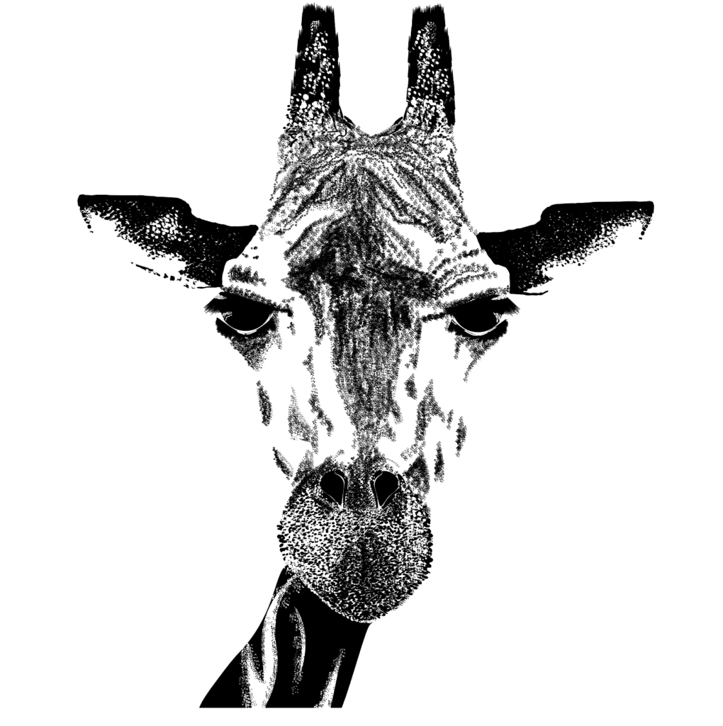
For our assignment this week we have to think about the BAR method, as it was something brought up by our guest speaker, Joe, from Microsoft. We have to pick a piece we made that we think was successful.
Background:
We were instructed to create a stylized design for our Illustrator course first quarter with Jason. We had to choose an object and represent it without actually drawing it and using only black and white in Illustrator. As someone who draws regularly, it was a challenge to make my style in Illustrator less like illustrations, when the project calls for that. However, this project I think was a success. The object I chose was a picture of a giraffe. I wanted an animal, something organic I could put a lot of layers on to build up texture.
Action:
First we traced various levels of opacity of the object to get a sense of the shapes playing out in the image which could be helpful to us when we actually got into Illustrator. I had many many iterations and helpful feedback from Jason on how to move forward during the process. I ended up using a lot of brushes for fine detail – point sizes of .25 sometimes. It was time consuming of course and took a lot of trial and error to figure out the best way for me to make my giraffe. I enjoyed working in only black and white to increase my focus on shading and light.
Results:
Though I had a tumultuous relationship with my giraffe during the process, I think it came together in the end. As someone new to Illustrator it was eye-opening to see what you could create (even as a newbie) without actually drawing something. I think I was successful in creating the kind of texture I wanted to display. Another result was being very aware how helpful it is to ask for feedback from professors to make sure we are on the right path, or to give us ideas on how we can do better moving forward. I think it’s good practice for when we will have clients. Consistent and clear communication back and forth, and being on the same page, seems essential for the success of the project in the real world. Easier said than done on some projects probably but seems like a generally helpful way to work.
Personal Project Ideas
2/8/24
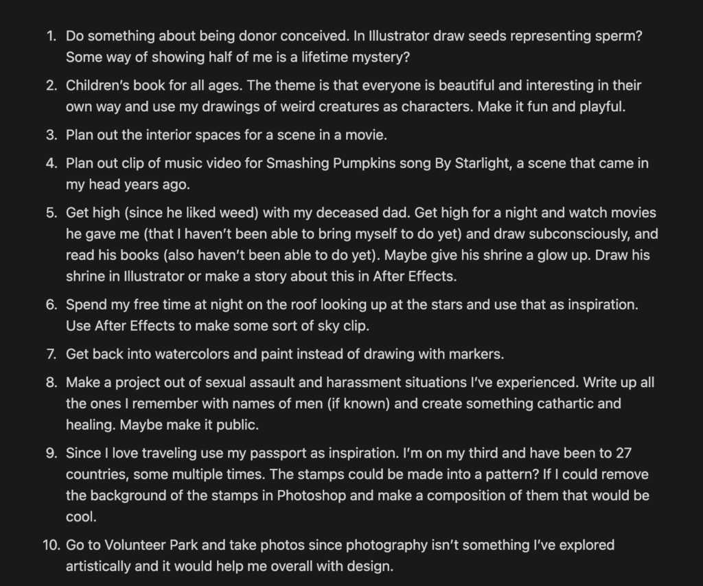
This week we have to come up with a list of personal project ideas and select one.
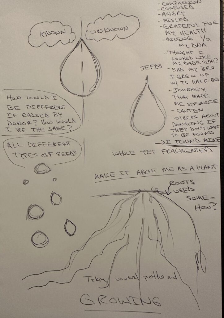
I like a few of the ideas on this list but the most compelling to me overall is the first, exploring being donor conceived. I think it’s a great experience to draw from because it’s not something people talk about openly a lot, or know about, and its deeply personal to me. I like personal projects that explore a part of myself and enjoy putting my vulnerability out for others to see. I found out 10 years ago at age 30 my dad is not my biological dad and instead it was an anonymous sperm donor. Lots of therapy and DNA testing connecting me to half sisters from the same donor who knew exactly how I felt was healing, but it was insane at first finding out you don’t know where half of you came from. One sister found the donor so we know who he is which was also reaffirming. There are a lot of pieces to this story so I could dig into different aspects in a visual medium like Illustrator making seeds representing sperm (this is an idea I had years ago but never did it) or make a clip in After Effects trying to explain how my identity was completely confused and I felt lied to and robbed of who I thought I was etc. Because it’s complex there would be multiple parts to shift though. Not only would it be a potentially cathartic experience for me, but I know people finding out they are donor conceived can use understanding and validation of their feelings which I see all the time in social media groups I’m in for DC people. Someone joins the group freaking out bc they just found out and there are many of us who comfort and guide them. I’m in a healthy space about it now but I could dedicate it to myself at 30 when it hit. Career wise I want to increase my skill level in Adobe programs so using Illustrator/After Effects/others to explore this would be fruitful and could turn into a larger project, and could share with DC groups.
Super Bowl 2024 Commercials
2/15/24
For this week’s blog post we had to watch at least five Super Bowl commercials and critique two. I watched:
- Draft Kings with Vince Vaughn and Tom Brady
- Coors Light with LL Cool J
- Big 3 – Sir Anthony Hopkins, Wrexham, and Stok
- Frito-Lay’s “Taste the victory” with 3 NFL Legends
- Chris Pratt in Pringles Uncanning
- Eric Andre’s SB Drumsticks’ debut
- David and Victoria Beckham in Uber Eats
Two I will critique:
- Eric Andre’s SB Drumstick debut
As someone who has been a fan of Eric Andre’s irreverent and chaotic comedy for years, I’m biased already about loving him and wanting to write about him. Also happy he’s doing something as big as a SB commercial because he is not a mainstream comedian. In this commercials he is going through security for a flight with Drumstick ice cream hidden in his luggage and gets caught, and the security “confiscates” aka eats some of his ice cream.
Pros:
1.”The name’s Umstick, Dr. Umstick” a little puppet with hair blonde like the nuts on top of the drumstick with a little clever line in there.
2. As this is their first SB commercial, it was a bit brave and out of the box for Drumstick to use such an odd comedian, but in my opinion its a risk that pays off. He can deliver the short performance.
Cons:
- Though I like the line mentioned above, I wish there was a little more context about who that tiny character was. However, I know these are very short, expensive commercials and every second counts.
- I can’t think of much to critique, it could be nice to see more of the Drumstick action on the plane, at the end we see the plane flying away (also a fine way to end it in my opinion and sometimes less is more).
2. David and Victoria Beckham in Uber Eats
Pros:
- These are two posh (hehe) and beautiful celebrities so to see them having a lack of understanding about football was entertaining. It made them seem more down to earth and relatable while they are massive stars. “Super big baseball game” “Hockey ball” were descriptors of the SB game.
- Victoria is sitting on a couch and David is hiding behind a wall coaching her which was also humorous. His last bit of coaching is to remind her to say that “Jessica” Aniston will be in the commercial too. I enjoyed the camera work with close ups of David.
Cons:
- It’s hard for me to critique something made by probably designers/others at the top of their game to be in the position to make these super expensive and special commercials. Maybe add another fak-ish sport?
- The Uber Eats bag at the end has lovely flowers in it which looks elegant but because it’s for the SB you would think it would be game day food related. However, it could also be a nod to them having no idea what they are talking about and this is actually a pro.
Creating a little world
2/22/24
For our assignment this week we are making a tiny world for an object, a little composition, and photograph it. I love Ellis Brooklyn, a perfume company that was highlighted as one of the products in our most recent speaker’s, Manny Insixiengmay’s, work. I have been wearing this brand for years, my favorite scent being Rrose, and probably have enough Ellis Brooklyn perfume to last many years. Rrose is the star of my composition, but I wanted to highlight other scents by the brand that I enjoy as well. My understanding of the perfume industry is that it is not well regulated and labeling an ingredient ‘fragrance’ can mask dangerous chemicals. Ellis Brooklyn was started by Bee Shapiro, who was/is a writer for The New York Times Style Section. When she got pregnant and was looking for products to use without dangerous chemicals, she ran up against the issue stated above. This inspired her to create Ellis Brooklyn, which is careful to use chemicals that aren’t known to be dangerous, and the scents are sophisticated and beautiful.
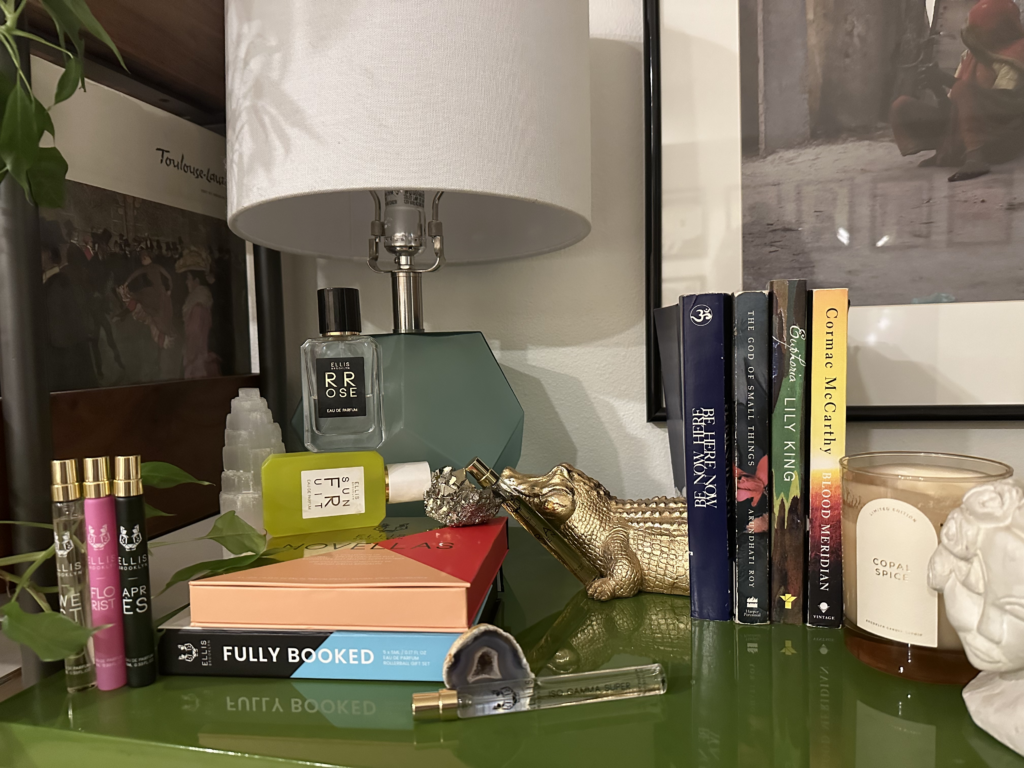
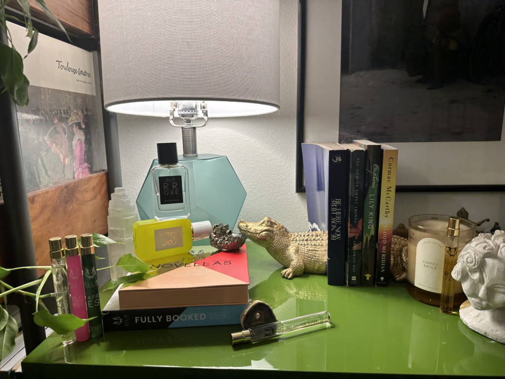
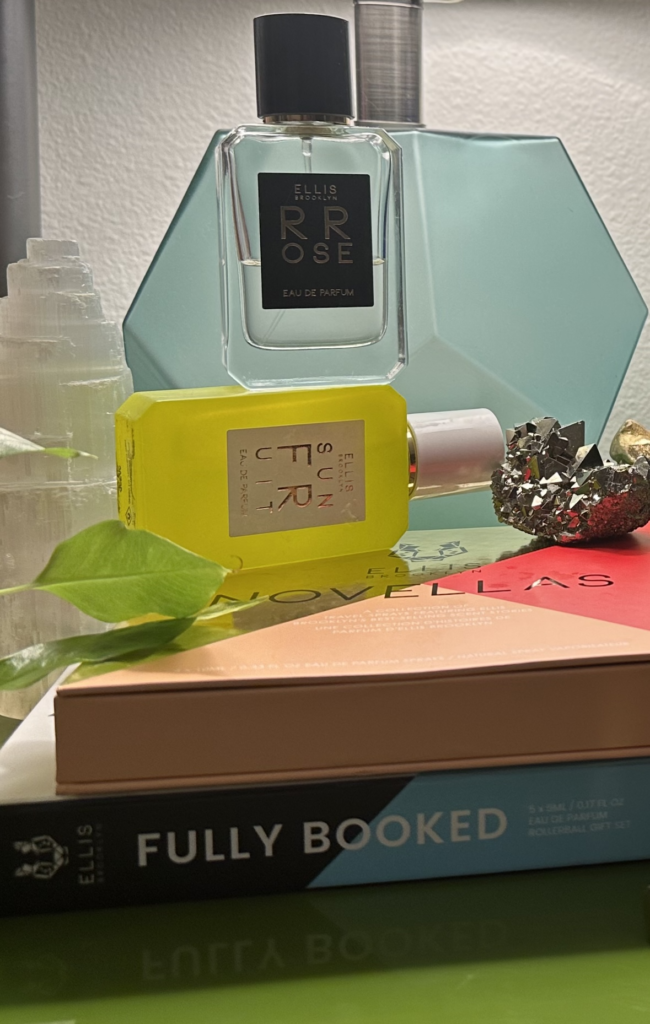
There is a variety of perfume from the brand with a cozy surrounding. The plant leaves and candle are supposed to add to the warm atmosphere. The books, crystals, and sculpture are meant to add intrigue. I like the reflection of Fully Booked in the last picture.
Ruby Red Kickers
3/3/24
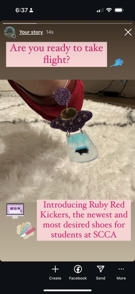
This week we were assigned to make a new shoe that would help out SCCA students. Some students have long commutes, some hit traffic on their way in, etc. It could be a number of reasons but arriving on time is important whether its school, work, or social events. SCCA students have a lot on their plate. What if you could arrive to the 5th floor in .3 seconds? Would that make your life easier?
Introducing…
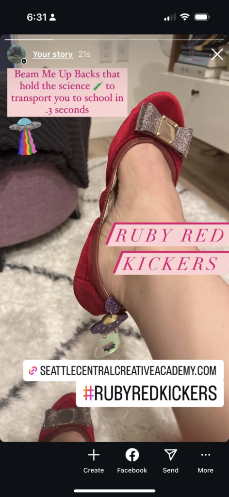
Ruby Red Kickers
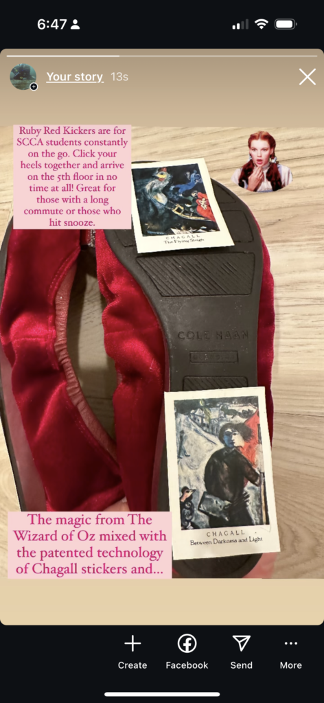
Simply click (or Kick) your heels together and arrive at school. Not only are they efficient but for the earth conscious, no fuel is needed. You also save money you would normally spend on your commute. The shoe works with a combination of very old Chagall (the first artist I really loved) stickers fused to the bottom, and Beam Me Up UFO earrings. Chagall’s The Flying Sleigh sticker in particular packs the punch we needed to make this work. Our revolutionary technology will improve your life as a SCCA student while also making you look cute. Nice.
Show an assignment and talk about process this week through video
3/7/24
This week we had to take an assignment we were working on this week and show and explain the process through a video between 1 minute and 1 minute 30 seconds. I picked an assignment for Courtney’s UX class. We had to make a more complicated flow in Figma based on screenshot from a previous assignment, which is explained in the video.
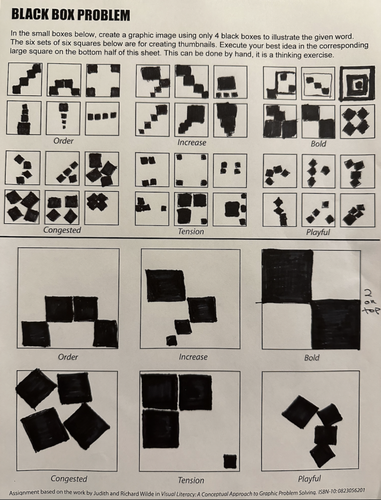
Black Box Problem
3/14/24
Design Systems
4/6/24
This week we have to review 3 out of 13 strong design systems in an article, and list 3 things we learned about each one.
1. Audi
A brand I’ve long since admired because they have always had a sense of elegance and communicate a high quality vehicle.
- Treatment of the rings

A new feature they are rolling out is for the option of three different thicknesses for the Audi rings. There is a clear system of do’s and don’ts for the rings. They have to be over a “calm” image, can’t be over other rings such as the front and back of the car, only black or white, etc. The stay cool part I thought was kind of funny. The rings can be trimmed but not from the top.

2. Tone of voice

It was fascinating to read about the tone of voice of the company. For the 4 descriptors listed above, they break down each one in more detail and even have a sample of text showing the right and wrong way of communicating. They also mention using gender neutral wording when possible to show respect for customers. They refer to the planet rather than mankind to be more inclusive. I also learned about how while they are elegant, sophisticated, and understated, they are careful not to be seen as arrogant. That seems smart because it can seem easy to be seem as arrogant when you are presenting a high quality product since it is for people who have money. I liked reading their analysis of wording to make it appropriate for the brand.

3. Animation

This was so interesting to see their animation curve. It represents a fast acceleration of a car as well as a fast deescalation of the car. To see the CSS info and incoming/outgoing velocity in After Effects – before starting this program I wouldn’t understand what those settings meant, but I can understand the context now. I love that every little thing has a meaning behind it.
4. This seemingly flawless company is human

We only need to list 3 things but wanted to point out that Audi is capable of making mistakes. Progressive premium in the screenshot above has funky quotation marks. I wish I could make money off of catching typos because it is something I enjoy and took seriously at my last job, carefully scanning our fliers to make sure we weren’t putting out mistakes or if found, taken care of right away.
2. The Guardian
- Introduction

To be honest this branding is less interesting to me than Audi. For these three sections I feel like I have less to say. Maybe partly because a news organization has to ideally be somewhat neutral which is clearly not what happens in reality but when thinking about personality of a brand, Audi has a personality there is more I can say about. As you can see in the screenshot above the card types are shown and each has it’s own personality that is used based on the article and tone.

The screenshot above references thrashers, a term I wasn’t familiar with. It seems to reference the Damian Hirst podcast in the middle, like it’s thrashing in through the design.

2. Brand use
I didn’t know what a roundel was before this assignment. The logo and roundel can only be used at the top right or bottom right of the screen.
3. Colo(u)r Palette


I liked reading about their consistent use of color across the platform. Sections are color coded to make it easier for readers to navigate the site.

You can see the HEX and RGB colors used for each section. It would be interesting to be in the room while the discussion went on about why culture should be brown or sport is blue etc. I would guess culture is brown because it references skin tone and a neutral color, news is red because its a bold color and commands attention, opinion is orange because it is close to red but less intense, lifestyle feels more loose so a fun purple pink fits. Sports might be blue because it’s a complementary color to orange? Who knows.
3. Google Material Design

- Styles
This screenshot above shows items such as progress indicators and I learned what the term snackbar means.


This screenshots above are in reference to the motion section, and helps with transitions. I like that specific programs for use are shown in terms of resources.
2. Foundations

This section above goes into the use of color for a brand. Primary, secondary, etc colors are shown as examples.

Design tokens are explained and described to have a single source of truth. Style updates on them will ripple through to all elements of your system, like if you change color for example.

However, tokens may or may not be right for you. If seems like in general they would help with having a more dynamic system and a pivot on styles if needed.

I like the do and don’t section like found on Audi. Here, the above screenshot is showing a do and a don’t of alt text. Screen readers is not a term I was familiar with so another thing I learned in this assignment. Also, seen below – alt text is subjective and must not ignore the caption.

3. Overall
Overall, from looking through Google Material Design, they seemed to have thought about everything. I’m a student and haven’t used it so I’m not qualified to say that but it seems comprehensive. There are links to all the programs you will need. It is not surprising a company like Google would be thorough and I wouldn’t fully know until using the system but that is the impression I get. Also the simplicity. There is a lot of open space and the directions are clear. Like shown below, paint-by-number is being referenced and explained in the way it would apply to your product.

The Stanley 32oz Dog Bowl
4/18/24
For this week we had to create a mood board for a new product. Stanley is exploring the world of dog bowls and this is the look and feel we are going for. You love your dog and you want to give them the best. They are always there for you whether it is to go for a walk or cuddle on the couch. The happiness and comfort of their dogs is very important to our customers. We believe our new line of flannel patterned dog bowls will please both our human and canine base, with flannel representing coziness, warmth, security, as well as being visually pleasing to look at. The quality you can expect from Stanley now supports food and hydration for our beloved four legged friends.

ReWA – Refugee Women’s Alliance – 497 words
I am so excited to donate my $25,000 to a non profit I care about. There are many worthy causes (and issues I care about) and there wasn’t an obvious answer right away of which one I should choose. I did research on some of the many Seattle-based non profits that exist and settled on ReWA – Refugee Women’s Alliance.
I’ve long been someone who was interested in learning about other cultures. I would attach myself to foreign exchange students in high school to learn about their culture and help them feel comfortable in the US, as well as be there for them. I generally like helping people, even if it’s just listening to them get something off their chest, and it can be hard to be in a completely new culture. Around the time of college I was wondering if there was any way to turn supporting immigrants and refugees into a career (without becoming a lawyer), and remember having a conversation with an Anthropology professor about this. Our country’s ideals, which are unfortunately fought by some Americans, include welcoming immigrants and refugees. We are often called a melting pot of many different cultures and that is something that I think is beautiful about the US. Even if you were born here, there is a good chance your relatives came here at some point from another country, maybe for a better life. A new chance. People risk their lives to come to the US – just think of the perilous journey many Central Americans make north to reach the US, often facing violence and danger of all kinds along the way. To take that kind of risk, there is likely a strong reason behind it.
ReWA has been active for 35 years and has services available in 50 languages and dialects. They support immigrant and refugee women in a holistic sense and promote integration and self-sufficiency. Clients work directly with professionals who speak their first language and understand their native culture. Some of the services available are ESL classes, housing assistance, legal services, employment and job training, and childcare support. I watched a touching video about Medina from Ethiopia, whose case worker talked about how much he wanted her to thrive. She had been an accountant in Ethiopia but since there are obstacles to getting the same type of job in a new country, he is helping her navigate that and she is building the life she desires in the US. Medina spoke highly of how ReWA helped her transition to living in the US in a multifaceted way.
The United States is better off supporting those who come here, often in plight. We can learn from each other and build an endlessly richer tapestry of voices and experiences when we open up to the rest of the world. I hope my donation will support many women like Medina, who want the best for themselves and their families in an unfamiliar country that can be full of promise.
The Blender Project – 498 words
3/3/24
For the Blender Project I was matched with Nathan Watson and Craig McKee on the video titled BLEACH. Off the bat I was happy it was a mix of Graphic Design and Visual Media students so our different areas of experience could commingle. I had met Craig through being in the same New Media module but hadn’t interacted with Nathan before. Nathan and I got lunch that first day to get to know each other a little bit, then the three of us sat down to brainstorm.
The ideas flowed in all types of directions as we made associations with our three picked objects. Not getting too attached to a direction if others want to move another way seems to serve those types of situations well, as it is not an individual project. We were having fun and coming up with some wild ideas. We continued to chat on Slack and had another small meeting to further build our ideas together. It was a smart move to “reserve” the Reference Room on a New Media day so we had that whole day to shoot (and we didn’t leave until almost 7pm). I helped out by buying some props and Craig brought a bunch of props from his home, including a fog machine. I made our SpongeBob sponge that drops from the ceiling and a bleach label for a container in the right shape that Craig had brought, but wasn’t bleach. We had music playing while we put together our disgusting set with a lot of laughs, fake cockroaches, and collaboration. Since Nathan has video experience he led the directing and encouraged me to do a little shooting as well, which was nice to try out. We created a very appreciative atmosphere for Dan when he came in to be our actor and were impressed by his commitment to the part, improvising things we hadn’t thought of that helped flesh out the character. Shooting was a fun experience.
A few days later the three of us met to look at the footage and pick the clips we liked best, and I organized each scene (since we did multiple takes on a scene) in its own folder with the best one marked, as well as making a folder with all the choice scenes. That same day Nathan and I shot a separate short close up scene together of gross cheese and excited cockroaches to incorporate into the video.
We erred on the side of having more footage rather than less, the only downside is that can make it harder to whittle down what you don’t want. Nathan started editing in Premier Pro and Craig worked with him on that process. Craig made our storyboard. I wrote our treatment, set up our files for deliverables, and made our slideshow presentation. It felt like a group effort, all of us ticking off boxes of what we needed to complete to make the best, most interesting project we could in the time allowed.
Food Truck for Bar Del Corso – 315 words

For this week’s blog assignment we had to take a local Seattle restaurant and design a food truck for it. I chose Bar Del Corso, which is a restaurant located in Beacon Hill. They specialize in wood-fired pizza, small plates, salumi, and seasonal produce. Looking through their website they have great reviews from The New York Times, Seattle Times, and Conde Nast. Conde Nast was quoted as listing them as one of the 21 best restaurants in Seattle in 2019, which is high praise.
The owners were inspired to start this restaurant in 2004 after months spent traveling Italy. They previously were running a restaurant in Washington DC. Reading through their About section makes the restaurant seem community based as they talk about how part of what secured their funding was backyard fundraising parties. They opened their doors on July 15, 2011.
For this food truck I wanted to pick one or two foods to focus on. Pizza seemed like the first answer, and this food truck will be special because it will have a wood-fire pizza oven. I also put one of the dishes on my truck I found on their Yelp page – sausages and vegetables. Their brand is very focused on fresh ingredients, unless it is a specialty item directly from Italy, so freshness and restocking of their ingredients will be of high importance in the food truck. Bar Del Corso’s new wheels will allow them to travel all around the city (and beyond) sharing key items from their delicious menu. As someone who was not familiar with Bar Del Corso, I have to say looking at pictures of their food and learning about their restaurant has made me hungry!
A message from Bar Del Corso: “We will post a schedule of our food truck whereabouts on social media and our website! Come enjoy some authentic Italian food at our new food truck!”
Mother’s Day Project

My mother has always had a green thumb (a trait I unfortunately have not inherited). As a kid, I would eat strawberries fresh from the garden that tasted like sunlight. We would dig our hands into the ground to harvest carrots or potatoes. Many gardens filled with flowers of all colors. I love that about my mom, how she knows how to work with the earth and still does to this day. In her honor, I created a chandelier made of items from the gardens I remember adding so much vibrance to our home.
Green Night jerseys for the Seattle Kraken

Freedom
5/26/24

Freedom to Express
I feel very lucky to have the freedom to express myself. Living in a world where some horror or another could inhibit one’s ability to express themselves – I have no (known to me) serious limits. All my basic needs are met and I have the luxury of not only exploring my thoughts and emotions through art, but I am in school to learn how to fine tune my work and overall learn as much as I can. Some people are too inhibited, overworked, unwell, beaten down, etc etc or even filled with excuses. Not only do I want to express myself, but I am required to express myself through school, and I desire to express myself on my personal time as well. Focusing on the artistic part of me which is very deep and authentic has helped me feel self-actualized. I also feel like I’m in the right place at the right time, like I should have met my classmates.
Freedom to Explore
Exploring how I want to express myself artistically is also something I’m grateful for. Taking risks and finding new mediums to work in has helped me grow as a person, not just as an artist. If you told me ten years ago that I would be learning the Adobe Suite in school I don’t know what I would think – but I was in a very different place then. I think I would be proud of myself for going back to my artistic roots and exploring this avenue for a career. It makes me feel brave and also secure being surrounded by brilliant professors and talented, supportive classmates that I love.
Freedom from Expectation
Freedom from expectation is something I’ve had since before school started, as my main mode of expressing myself was drawing subconsciously and seeing what appeared. If a story emerged cool, if not, that was also cool. Playing with a composition and letting my instincts take over was what mattered to me. It was natural and made me trust myself deeper. When school started we quickly learned that an idea is not your own, and not to worry about having bad ideas. Ideating a lot can bring you to a better solution. I’m willing to fail at something (not a class but an attempt to make a project interesting in my own way) if ultimately I learn from the experience. Our failures help us grow and mature into the creative person we desire to become, or maybe the person we didn’t even know we desired to become. Falling down and getting back up increases your resilience, which in turn can make you a more interesting artist if you are not afraid to take risks because you know you can recover if it doesn’t work out. If you always play it safe then how do you know if you’re growing?
One reply on “Rebecca Black Poster”
Hi, this is a comment.
To get started with moderating, editing, and deleting comments, please visit the Comments screen in the dashboard.
Commenter avatars come from Gravatar.