Categories
Uncategorized

Blog Assignment 3 Q3

Something I’ve always been passionate about are animals, and for a long time, I was so sure that I would go into a career field involving them. 

In Spring/Summer of 2021, I interned for the PAWS Wildlife Rehabilitation Center full time. This was when I was planning on going into Veterinary Medicine, specifically for wildlife rehabilitation; I was scheduled 40 hours a week, but definitely worked “overtime”- I was an  unpaid intern. 

I loved that job, but oh my god- it’s insane I wasn’t getting paid everything for the amount of work I was doing. I believe this was before Washington passed a law that requires interns to be paid, so it was legal, but it still blows my mind that my payment was a $60 Visa Gift Card and a water bottle. And occasional snacks and otter pops. 

I’ve no clue what it’s like there now- I’m sure (I hope) interns now are getting paid. I also hope that the facility is still well equipped now that they have to put costs into paying interns… 

Overall, the facility was extremely understaffed and over reliant on volunteers. The summer months were extremely busy, since the public came into contact more with wildlife. This was also during a heat wave, where birds were falling and dying left and right from lack of water and heat exhaustion. The place rode on the backs of unpaid and underpaid workers; I recall my mentor, a rehabilitator, telling me he gets paid $25/ hour. This man was saving lives of native wildlife EVERY DAY and he was only getting paid $25/ hour….?!?! I was appalled. I am still appalled. 

So, if I were to have $25,000 of spare cash on hand, I would give it to the organization to pay their 3 rehabilitators on site just a little bit more. A bonus, if you will. This is probably the wrong way to be donating this money, but these rehabilitators deserve much better pay. They’re helping preserve, protect our native biodiversity, and are extremely underappreciated. 
Categories
Uncategorized

Blog Assignment #2, Q3

This Stanley will be for the Dark Romance girlies (or hims or theys or whoever is into dark romance). This is suitable for for the goth girlies (Or hims or theys or whoever) who wants to make sure that everything in their home has a cohesive aesthetic. The drama needs to exist everywhere. Including the dog bowl.

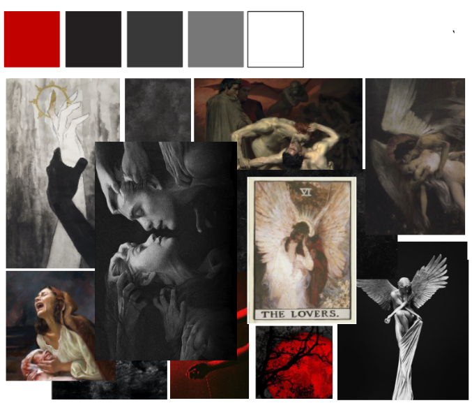
The dog bowl’s color palette is red and shades of black. The pattern on it will be a gritty, smudgy texture, mutch like the paintings portray. They will have “The Dog Bowl” written on it in a blackletter font, as shown below… they might even have wings on them. They might have some of these images printed on. Let’s just say the consumer can custom make these.

Categories
Uncategorized

Blog Assignment #1 (Q3)

Carbon Design System

  • Carbon Design System is not a company; it is a design system developed by IBM, a global technology company. They specialize in computer and technology solutions.
  • The design system is meant to be modular, meaning that components can be mixed and matched to suit design needs. The components are designed so that despite mixing and matching, consistency can be achieved.
  • It is open source! The code is available for the public to freely adjust and use. There is a community behind it, which I find cool.
  • Design tokens are used to define the visual properties of components, such as color and typography. This creates ease in updating and maintaining the design system.

The Guardian Digital Design System

  • “Thrashers are custom-designed containers usually promoting a single article or series.” This is new vocabulary for me! I guess it’s kind of like a highlight on a page.
  • “The desktop grid is based on columns of 60px with 20px gutters.” Is this a standard? I’m curious why there are no horizontal grid lines.
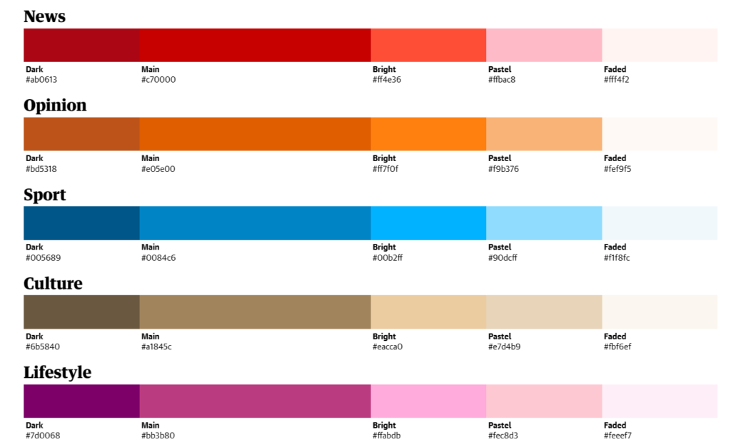
  • Color: “dark, main, bright, pastel and faded colour variant”. These colors totally make sense for each category… why? How were they decided on?

Atlassian Design System

  • It is customizable: designers can customize the design system to match their brand or specific application requirements while still maintaining consistency with Salesforce’s design principles.
  • The site offers recommendations for fonts, including sizes, and spacing, to ensure that text is legible and easy to read across different devices and screen sizes. They also offer guidelines for appropriate line lengths.
  • There is an entire system specifically for icons, with guidelines for sizes and color. There is an emphasis on accessibility and “Internationalization”.