Categories
Uncategorized

Blog Assignment #8

Freedom To Express

I am a pianist (or I was… I trained classically for 11 years from age 5-16. My god. It’s already been 6 years since I quit..??).

Freedom to express. I would play a piece how I see fit. I would play a piece how I envision the emotion it is conveying. Being rigorously trained classically, there was rarely room to add my own flare- a complete restrain of the freedom to TRULY express. Express, yes… but tasteful amounts only… there was always a fine line between “just right” and “too much”.

I would add unnecessary, necessary flairs. I would over or underexaggerate crescendo’s, decrescendos, slam the tips of my fingers into the keys to draw out the sharpest, most jarring, staccatos

That’s how I would depict “Freedom to Express”.

Freedom to Explore

Why, I’d improvise.

Today, in class, we were creating scenarios. User stories, if you will. Someone at my table said, “and then she walks into Timmy doing some WILD art”…

So, I would do some WILD art!

Maybe it means trying to create something alike to those pieces in museums that people see and go, “my 6 year old could do that”. Maybe it means picking up trash and glueing it to a canvas to create a sculpture. Maybe it means spitting on a drawing. Maybe it means tearing one up.

To explore is to go beyond. I would try to think of things that I had never even considered doing before.

Freedom from Expectation

Easy- I would do absolutely nothing.

I think this one especially is very subjective; expectations of someone are relative to those they surround themselves by. The people that surround me expect things of me. So, to be free from it, is to do nothing, and to be ok with it.

If this were to be a piece of art, it would be like drawing a blue line down the middle of a white canvas. “My 6 year old could do that”. Maybe it would be playing Twinkle Twinkle Little Star or Hot Cross Buns.

Did I do this assignment right? Do you even read these?
Categories
Uncategorized

Blog Assignment #6

My mother

loves the color yellow.

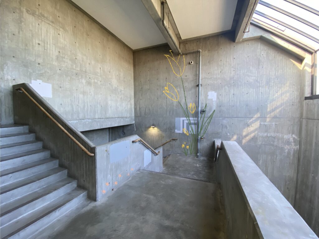
Her condo that she bought 2 Junes ago, is mostly white, save for splashes of yellow of the place mats on her glass table, the kitchen towels patterned with lemons, and the yellow tulips I got her for Mother’s Day.

She’s remodeling the kitchen and bathroom. When she moved in, she replaced the floors to be an ash gray wood- I don’t know what it is- but I asked her why she wanted everything to be hospital white and gray. She said she prefers to be able to build color on top of it.

My mom loves yellow tulips. I’ve never gotten any other type of flower for her.

My mom loves the color yellow.

The second part of the mural won’t upload… but it’s just more tulips

And, she has a cat. 🙂 which is why there are paw prints on the wall

Categories
Uncategorized

Blog Assignment #5

For my food truck, I decided to design one for Hiroshi’s Poke. I didn’t realize they had multiple locations before this assignment, nor did I know they had a logo!

I decided on this place because I was trying so hard to think of a favorite restaurant of mine, and I genuinely couldn’t think of anything (I don’t really go out to eat, it’s so expensive!). This is somewhere I used to go to with my family a lot (it was either here or 45th Stop, also very good).

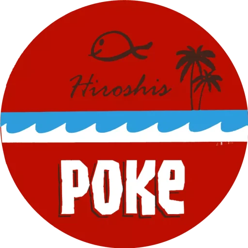
This is the logo:

Based on this, here are some rules that I decided on for the truck:

  1. the color of the truck shouldn’t overpower the logo.
  2. the logo should be on the back, and sides
  3. the waves should be a design on the sides of the truck!

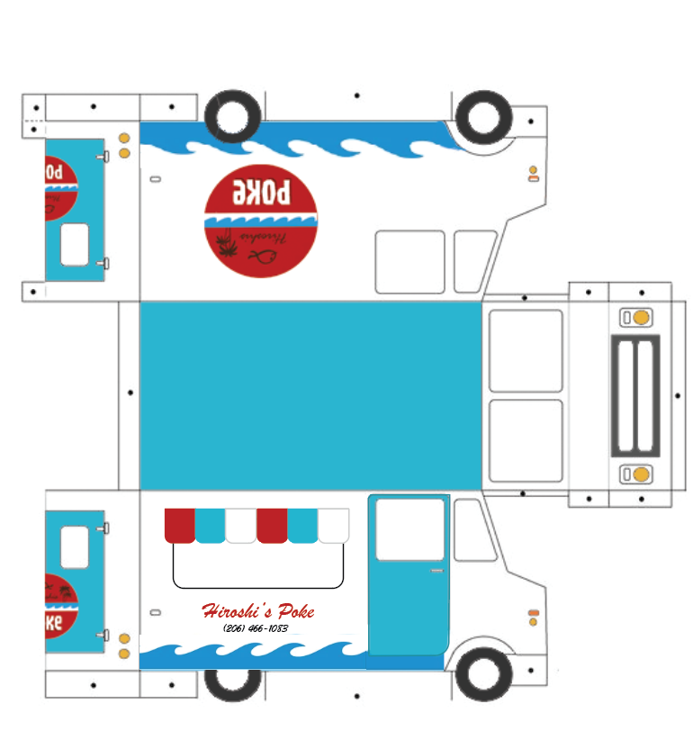
Based on #1, I decided it was best if the truck was left white. The accent colors should be blue, so that the only red on the truck is the logo, so that it stands out.

The logo on the back would be on the doors- so each half of the door would have half of the logo. Since there will be a “food window” on one of the sides of the truck, maybe the logo should just be blown up and put in the background as though it’s a texture. Or, we could toss all possibilities of a logo aside on that part of the truck, and just have the name “Hiroshi’s” written on that font somewhere. Maybe underneath the food window? Above? I’m assuming there’s going to be an overhead thing of sorts.

Now that I’ve thought about all this, I started to think about how to make the actual design.

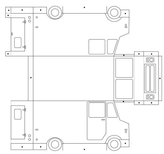
First, I decided to recreate the “dieline” in illustrator:

And then I realized… I built it poorly, and the main parts (like the body of the truck, the door), are not individual, connected lines. So this was basically useless.

I had a sudden flashback to something I learned in Jason’s photoshop class: the paint bucket tool. With “all layers” selected! I sat there wondering why I didn’t think of this before. I had wasted a lot of time rebuilding a die line.

So anyway, that’s what I did. Then I brought that into illustrator and build the rest of the designs and patterns.