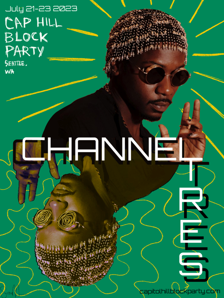
Channel Tres is a techno/house artist who incorporates rap and elements of funk into some of his tracks.
I decided to use a “futuristic” font based on his techno background; this one is called “Orbitron”. The green background is for a similar reason, but also because the color contrasts nicely with the image I used of him. This image choice is based on the fact that it is a recognizable photo of him, which I believe is important for a promotional poster.
I saw an opportunity in combining the two parts of his name; the “L” at the end of “Channel” and the “T” at the beginning of “Tres”. This however created a large space in the bottom left corner; after some trial and error, I decided on a mirror image of himself, stylized differently.
This choice of stylization is based off his target audience, who gravitate towards “trippy”, or more “psychedelic” music. It’s no secret that festival goers engage in psychedelic drugs, so I wanted to replicate that in the design.
In order to keep it fairly balanced, I also added the yellow “doodles” in the “normal” image of him. I opted for straight lines for both contrast from a visual standpoint and to also represent the more “straight laced” side of his music.
The “Cap hill block party” in the left corner is hand written. I felt it helps make the poster look less 2 dimensional.
His music is honestly not for me, but I do enjoy this song:
https://spotify.link/CANexRMHRDb
“Tunnel” by Channel Tres.