Psychedelic Poster Assignment: Design History
In Gabriel’s Design History class, we worked on 2 projects. The first was creating a 10 minute video based on an Art Movement our groups were assigned; my group was given Psychedelic Posters. The second project was based on the first, where you were to create a poster based on the movement you were given the first project, with a modern twist to it.
I chose to redesign Beach House’s “Depression Cherry”. We were instructed to create something completely new; to not use the same typefaces nor colors on the original cover. It was also a requirement to include all text on the original piece in your redesign.
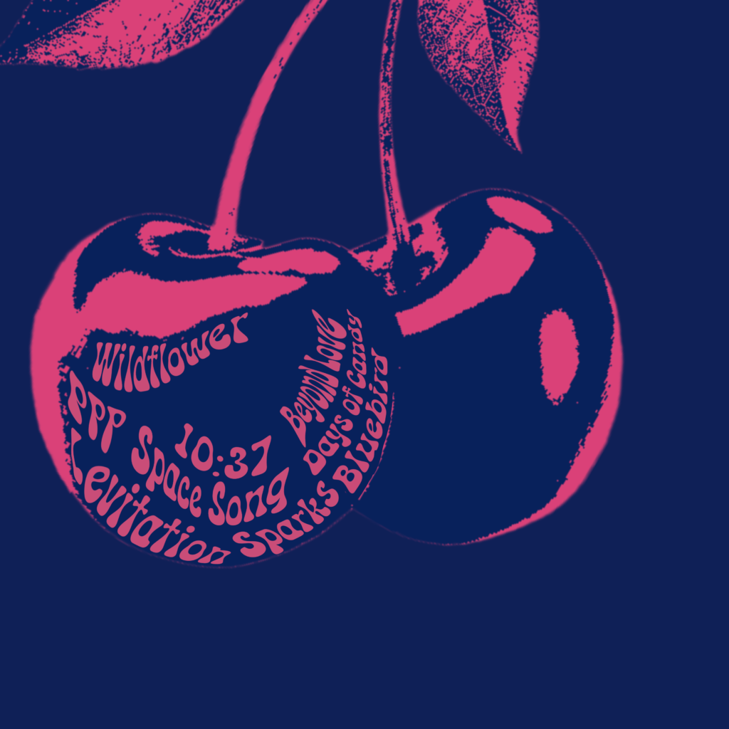
Studying Psychedelic Posters, I found many of them utilize flowing, curving lines, photography, and women. Based on these, I drew up several sketches with women with flowing hair as the centerpiece. My idea was to incorporate lettering within the flowing hair. For the back cover, I had the idea of taking a photo of a cherry and warping the names of the songs so that they all fit within a pair of cherries. As for the colors, I studied Modern Psychedelia and took inspiration from their vibrancy, particularly neon. For the typeface, I scoured through psychedelic adobe fonts until I landed on something I felt looked right.
This project went through A LOT of phases… and honestly, what I ended up working through for most of it was nothing like any of the sketches I made.
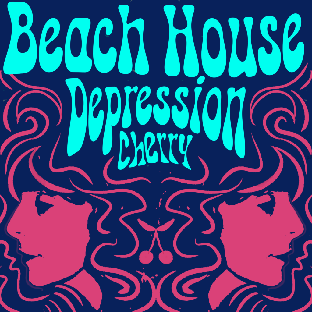
My first SOLID digital iteration, of the front and back of the album cover:


These just did not click for me. It looks flat, a little boring… maybe it was the lack of detail/smoothness in the women’s faces, but the front cover looked almost too Art Nouveau.
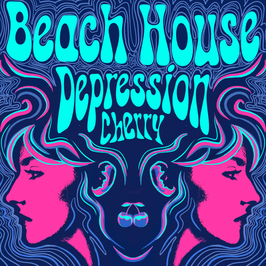
So, I decided to scrap the idea of using Victoria Legrand’s face+, opting for a better photo (even though it was a random lady’s face off the internet), then decided to ramp up the saturation and brightness of the pink. I decided to keep the cherry in the middle, but to directly take the cherry from the back cover and photoshop it so that it was symmetrical.
When I did this, I realized that there was potential for found imagery. The reflecting ears of the women’s faces, the cherry in the middle, the way the flowing hair was oriented… it kind of looked like an animal. This was an awesome discovery because psychedelic designs frequently utilize creatures in the artwork. I took this opportunity and ran with it.
After I had my shapes and placements solidified, I kept layering more lines. I ended up adding cyan into the lines instead of it just being in the album title, so that the illustration and title were better tied together. I filled the space more with curving lines that framed the illustration and title.
There could have been a better process for this, but I’m not sure how to do that for something like these where better ideas emerge as I work. A lot of these changed happened through pure feeling.
At the end, I received a 97 on this assignment; the points taken off were for being underprepared to present, which was largely a printer issue (I arrived to class an hour early to print and still wasn’t ready until around 9:15). The project itself was done successfully. I love how it looks, especially the back. : )