My process of how I made my anti-war poster for Brit’s color theory class.
Blog Assignment 10
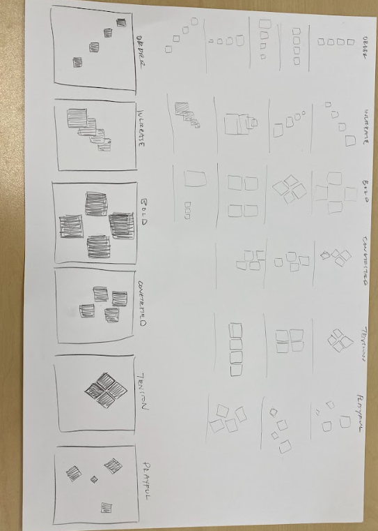
not much to say about this. I am so tired from finals you guys why are you assigning us more stuff : ( please give us a break!! much love
Project 3
I chose to review the AR Stack- I used to play the original Stack game a lot and so I took interest in this one. 🙂
Overall, I think this is a decent AR app. The biggest perk is that you can play the original game within the AR app- you can freely toggle back and forth between its AR and non AR form. It took me a few tries to figure out how exactly to do this (which is a flaw), but the fact that it exists is great.
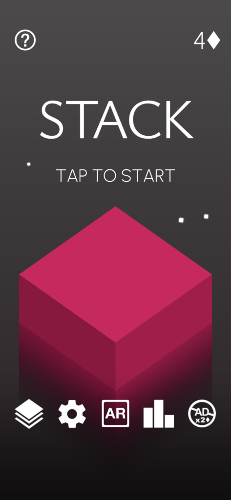
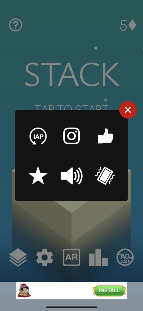
There are a couple of flaws:
- It takes one too many screens (in my opinion) to get back to the button that allows you to turn on/off AR after completing a round.
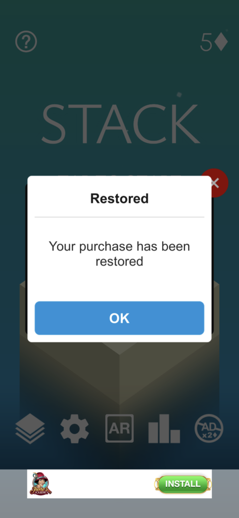
- there’s an unclear icon that displays a message about restoring a purchase… I never made a purchase. What does this mean??
Project 2: Adobe Aero
I decided to create a hot air balloon scene and use it as an invite to a hot air balloon tour. I got this idea as I was browsing through the assets in the software; I was originally wanting to do a camping invite scene but there wasn’t a camper van asset. So, I went with the balloon instead.
I created an asset in Figma:
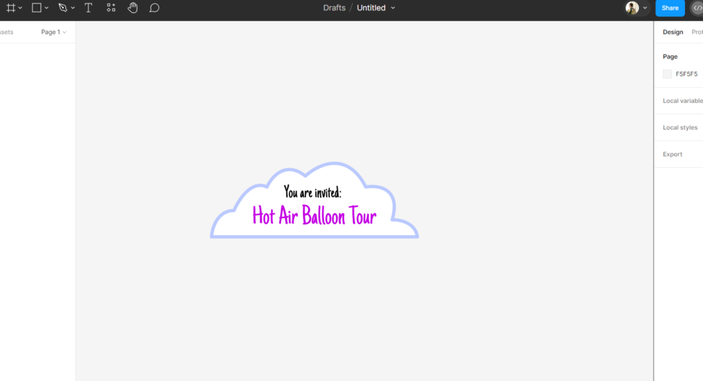
And imported into Adobe Aero.
My scene was intended to go like this:
- the clouds and trees appear.
- upon tap, the invitation note card appears.
- with proximity, the balloon appears.
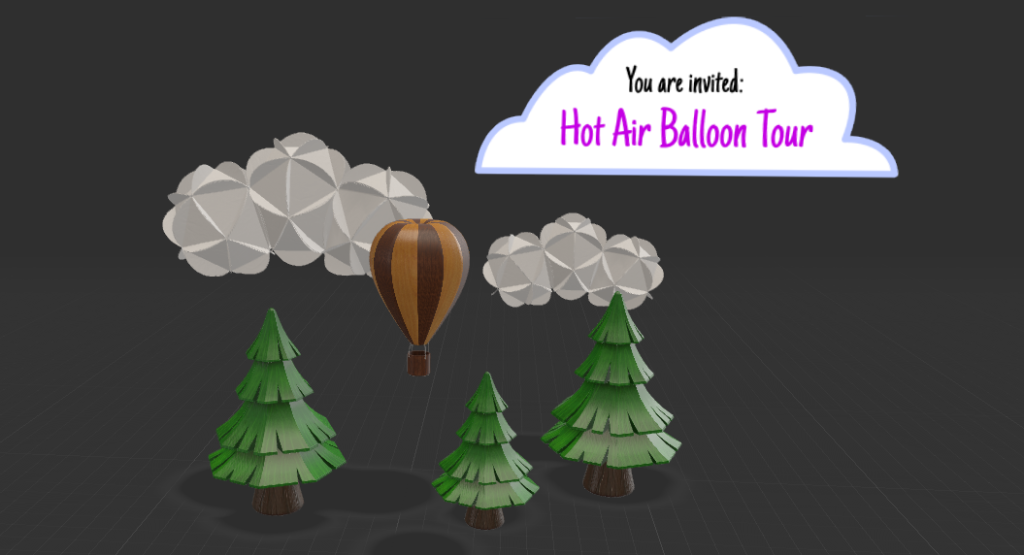
I could not figure out step 3 for the life of me. I adjusted distance and tweaked everything I could think of in past commands, but the balloon simply would not appear… I’m truly at loss. I’m sure it has to do with my lack of experience in the program, but it’s frustrating nonetheless.
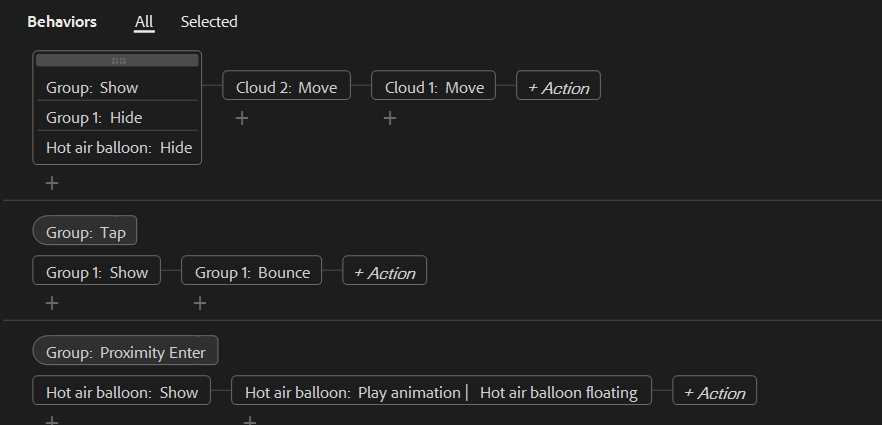
This project was hard for me to enjoy solely because the AR aspect was refusing to cooperate with me on my phone. I cannot count how many times I had to reset where the assets are set up in the camera.
AR is very cool, though. 🙂
Blog Post #7
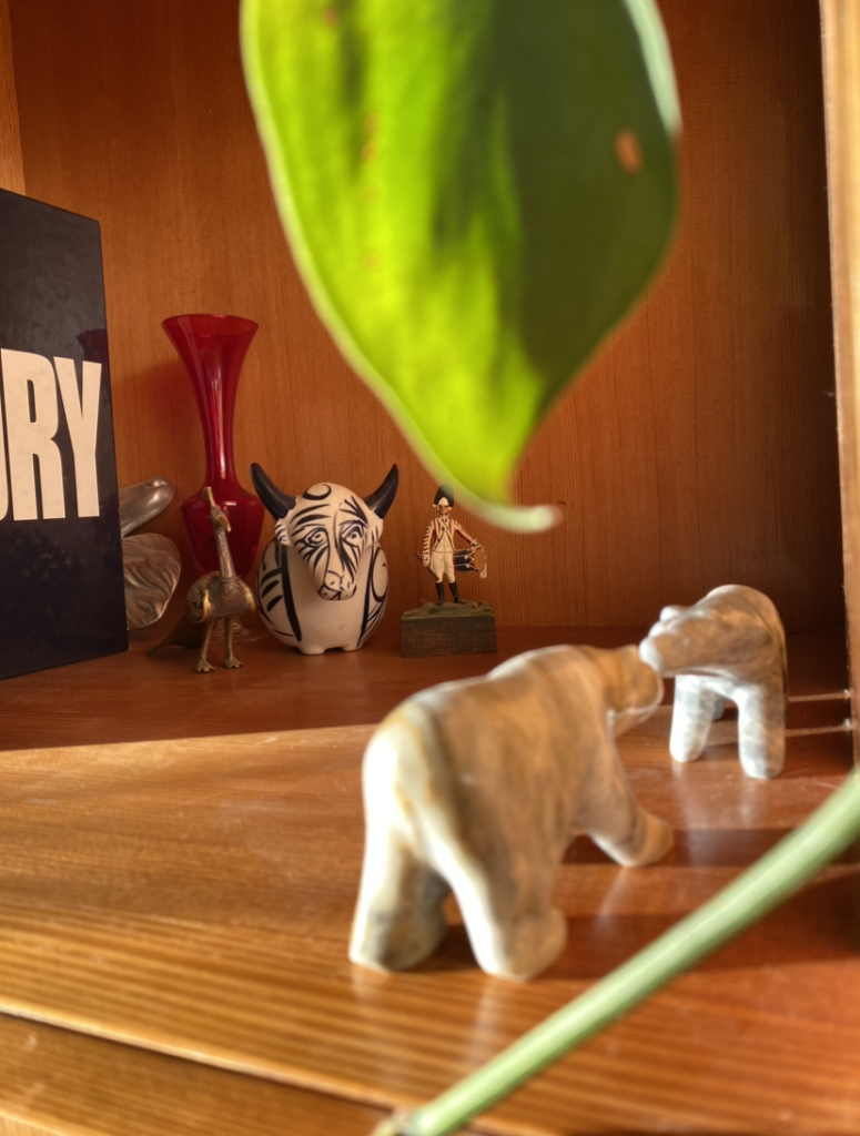
My friend’s house has a lot of little figurines and collectibles that I adore. They have a big shelf that are like little cubes; I see that itself as a little world.
I was looking at this shelf when I saw one where the lighting was hitting it just about 50% even in the inside. So, I got the idea to create a composition where some figurines are in the light, some are in the dark, and to create a story with it.
Here we have 3 individual figurines, who have no likeness to each other. There is a peacock, a bull, and a man; they stare longingly at the pair of bears sharing a kiss in the setting sun.
It’s a little humorous. It’s also relatable and a little sad; I think most people have been in the position of the peacock, bull, or man.
It took me a while to figure out the camera angle (I am not a photographer). The big leaf in the middle looks a little strange but the photo looks even stranger without it. I wonder how a true photographer would have shot this scene.
Project 1: AR Poster
This was so fun! I’ve never tried the animation feature on procreate so this was an awesome opportunity to try it out.
I did not create an “animation”, per say; more so movement in the lines (that’s different, right?). I adjusted the lengths of each “scene” and put them all together in the Capcut app. I looped it so that it reached the required 25 seconds. 🙂
The animation feature in procreate is incredibly simple and straightforward. Each layer acts as a frame, as shown here:
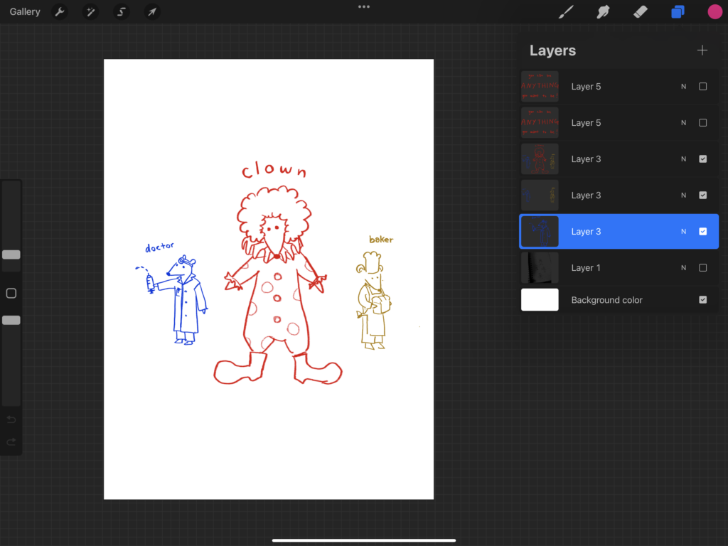
My poster shows the mice being shown one by one. I drew each individual mouse, then duplicated and combined layers so that they showed up and stayed in the page at appropriate times.
An issue I ran into was that the fpi cannot be adjusted for different layers in the same file, so I had to create different files for each “page”. It was such an easy fix, though, that I was not bothered by it at all.
The second thing is that the poster was initially 8.5 x 11 but it somehow shifted up during the making of it. I’m not sure what happened. All of my pages are the same slightly scaled up size, and since I was duplicating pages to move onto the next phase of animation, I’m guessing something happened on the first page.
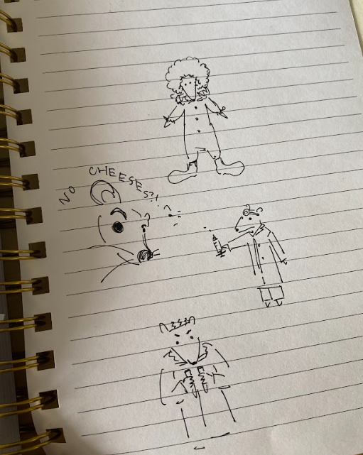
This poster is inspired by the mice I drew in my notebook the other day. I love drawing little creatures. 🙂
Blog Assignment 6
- Old School Delivery Budweiser Super Bowl 2024
- Cheetos Super Bowl Commercial 2021
- Amazon Alexa Super Bowl 2022
- Dunkin’ “the Dunkings” Super Bowl 2024
- Michael CeraVe SuperBowl 2024
FIRST AND FOREMOST:
ISRAELI SUPERBOWL AD
I’m disgusted. A victim does not have $7 million dollars to drop on an ad.
This ad presents the idea that being anti-Israel is anti-semitic. It pushes the idea that Israel and its people are the victim. It pushes a false narrative.
It’s extremely harmful to Palestinian Liberation.
ANTI-SEMITISM CAN BE DISCUSSED WHILE ACKNOWLEDGING ISRAEL’S WRONGDOING TOWARDS PALESTINE. BEING ANTI-ISRAEL AND ANTI-IDF DOES NOT MAKE YOU ANTI-SEMITIC.
FREE PALESTINE!!
Cheetos Super Bowl Commercial 2021
This commercial features Mila Kunis, Ashton Kutcher, and Shaggy. It begins with Kutcher catching Kunis eating his cheetos. The commercial then turns into a compilation of Kutcher catching Kunis eating Cheetos, with her repeatedly denying the fact. Shaggy is also featured in this ad, along with his hit song “It Wasn’t Me”; Kutcher and Kunis sing this song with altered lyrics to fit the narrative, with the “It Wasn’t Me” portion remains the same. Shaggy also makes an appearance himself, singing the song with altered lyrics. The commercial ends with the first scene continuing, with Kutcher accepting Kunis’ “It wasn’t me” statement.
The target audience includes those who enjoy Cheetos and snacks like Cheetos, fans of the song (and Shaggy), the actors present. In a nutshell, it’s those who follow Pop Culture.
Pros:
- Celebrity Endorsement: The use of popular celebrities like Mila Kunis and Ashton Kutcher, along with Shaggy, brought attention and star power to the commercial.
- Humor: The commercial’s comedic approach, using the classic song “It Wasn’t Me” to depict the scenario, contributed to its entertainment value. This also makes the commercial catchy and memorable.
Cons:
- Humor is Subjective: Humor is subjective! Not everyone will find this commercial amusing. On the topic of subjectiveness, not everyone likes the song. Some may even find it annoying, which would turn them off from the commercial as a whole.
- Dependency on Humor: The commercial is carried by the humor aspect and does not highlight WHY the snack is delicious and appealing. This is dependent on the fact that the watcher is familiar with the taste of Cheetos… although, this is probably nothing to worry about, since Cheetos are a core chip treat (in America at least).
Michael CeraVe SuperBowl 2024
Michael Cera is promoting a Cerave Cream. It is quite Meta as it is shown at the end that the entire first part of the commercial is actually a commercial he is pitching in a CeraVe company meeting. There really isn’t much else to it!
Audience: Michael Cera lovers, skincare lovers. Those who are thinking about getting into skincare.
Pros:
- Humor: Oh my goodness this commercial is hilarious. There are just so many layers; the satirical drama in the first scene with the flowing curtains, the line “let my cream hydrate you”, the cut to the company meeting.
- Product Information: It’s hydrating! If you didn’t know what the CeraVe cream does you do now. If you didn’t use cream before, you can start here. (and it’s endorsed by Michael Cera).
Cons:
- Crude Humor: the line “let my cream hydrate you” might come off as crude and unsavory to some. But cool people would find it hilarious.
- Lack of Product Description: Yes, it’s hydrating, but why? Those who are into skincare would want to know what makes this cream special. Where can it be used? The commercial shows it can be used on the body, but what about the face? What skin types is it good for?
Blog Post 5
My 10 Personal Projects
- Writing and illustrating a children’s book
- Taking photos and integrating illustrations into the photos and then making an album out of them
- a childrens book out of concepts from #2
- making crafts out of random scraps I’ve acquired over the years
- tailoring the clothes I’ve gotten from the bins that are too big for me/don’t fit me quite right
- Designing/illustrating cards
- Interior Design
- making a botany illustration collection
- learn how to use Blender
- Cosplay
#2: Designing/Illustrating Cards
The wonderful thing about cards is that there can be a card for anything. What I love is the thought goes into the choosing of the card. I think it’s one of those human things that I really adore.
I’ve of course made cards in my life; for family, for friends, coworkers and teachers. Every card I’ve made is personal; it is the person’s interests and aura in mind. I never considered it designing but I guess it was.
I don’t have photos, because I’ve given them away. I haven’t really thought to take photos of them. They are for the recipient’s enjoyment.
For reference, most of my cards are sketched out in pencil, drawn over with thin sharpie (or any pen that doesn’t bleed), then lightly colored in with watercolor. So, it’s done on watercolor paper.
Because I’ve only made personalized cards, I think it would be great practice to make ones that could be received by a broader audience, much like how we need to think about accessibility in graphic design. Since it would be a personal project and something I believe I should thoroughly enjoy, I won’t stress too much about this aspect, but it would be on the back of my mind as I design them. 🙂
This would be a good addition to my portfolio because it would not only show my creativity; it would show my understanding of typography, layouts of imagery, grasp of aesthetic, and the ability to cater towards different audiences. I’d hopefully hone in on a specific concept to show that I can specialize, but for now, I’d be exploring.
Maybe this will be my summer project! Who knows. Depends on how much time I have since I plan on working to pay my bills.
Blog Assignment 4
Psychedelic Poster Assignment: Design History
In Gabriel’s Design History class, we worked on 2 projects. The first was creating a 10 minute video based on an Art Movement our groups were assigned; my group was given Psychedelic Posters. The second project was based on the first, where you were to create a poster based on the movement you were given the first project, with a modern twist to it.
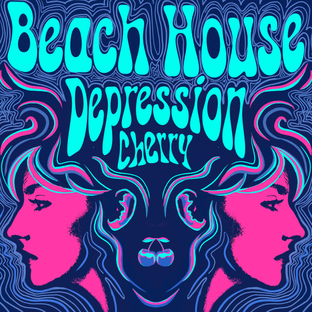
I chose to redesign Beach House’s “Depression Cherry”. We were instructed to create something completely new; to not use the same typefaces nor colors on the original cover. It was also a requirement to include all text on the original piece in your redesign.
Studying Psychedelic Posters, I found many of them utilize flowing, curving lines, photography, and women. Based on these, I drew up several sketches with women with flowing hair as the centerpiece. My idea was to incorporate lettering within the flowing hair. For the back cover, I had the idea of taking a photo of a cherry and warping the names of the songs so that they all fit within a pair of cherries. As for the colors, I studied Modern Psychedelia and took inspiration from their vibrancy, particularly neon. For the typeface, I scoured through psychedelic adobe fonts until I landed on something I felt looked right.
This project went through A LOT of phases… and honestly, what I ended up working through for most of it was nothing like any of the sketches I made.
My first SOLID digital iteration, of the front and back of the album cover:
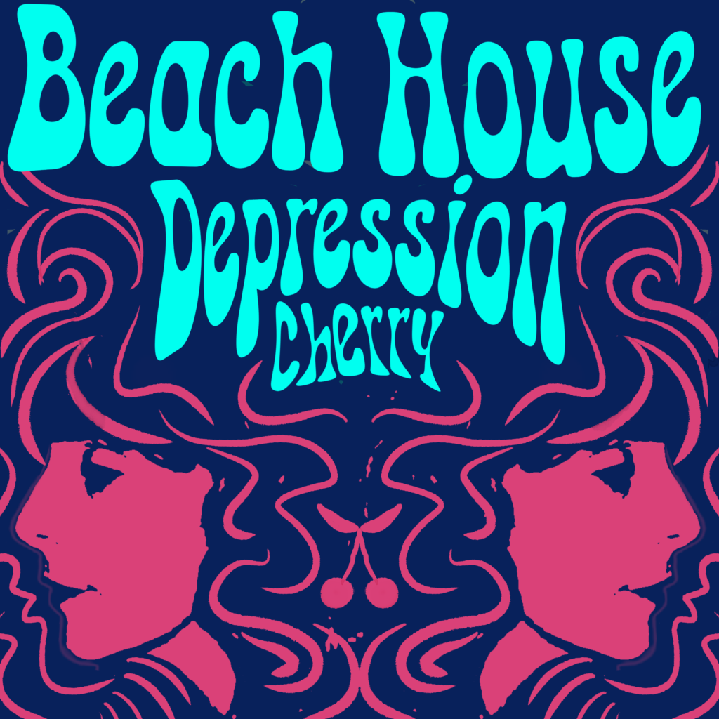
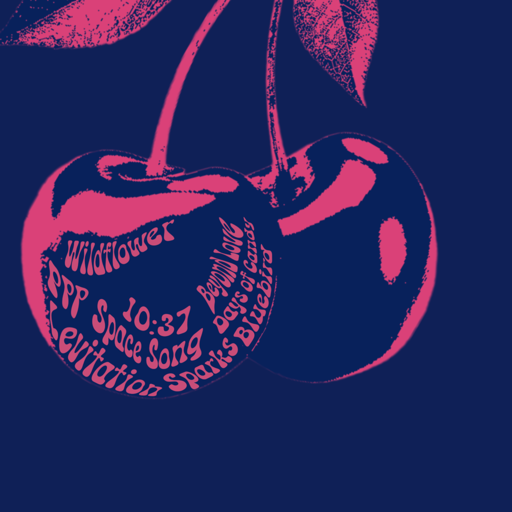
These just did not click for me. It looks flat, a little boring… maybe it was the lack of detail/smoothness in the women’s faces, but the front cover looked almost too Art Nouveau.
So, I decided to scrap the idea of using Victoria Legrand’s face+, opting for a better photo (even though it was a random lady’s face off the internet), then decided to ramp up the saturation and brightness of the pink. I decided to keep the cherry in the middle, but to directly take the cherry from the back cover and photoshop it so that it was symmetrical.
When I did this, I realized that there was potential for found imagery. The reflecting ears of the women’s faces, the cherry in the middle, the way the flowing hair was oriented… it kind of looked like an animal. This was an awesome discovery because psychedelic designs frequently utilize creatures in the artwork. I took this opportunity and ran with it.
After I had my shapes and placements solidified, I kept layering more lines. I ended up adding cyan into the lines instead of it just being in the album title, so that the illustration and title were better tied together. I filled the space more with curving lines that framed the illustration and title.
There could have been a better process for this, but I’m not sure how to do that for something like these where better ideas emerge as I work. A lot of these changed happened through pure feeling.
At the end, I received a 97 on this assignment; the points taken off were for being underprepared to present, which was largely a printer issue (I arrived to class an hour early to print and still wasn’t ready until around 9:15). The project itself was done successfully. I love how it looks, especially the back. : )
Here is a link to the timelapse of this project:
Blog Assignment 3
Genshin Impact: A Review
Hello everyone! I have been playing this game for about 3 years, which is absolutely insane. When I started, I didn’t think I’d be playing this game for this long, and the fact is still unreal.
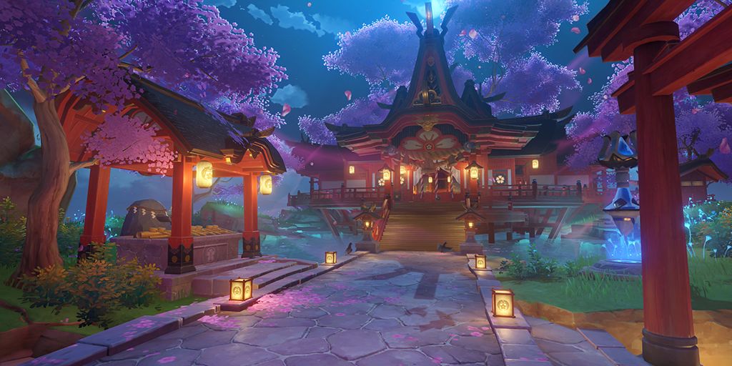
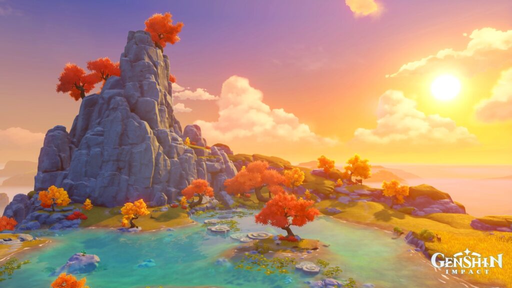
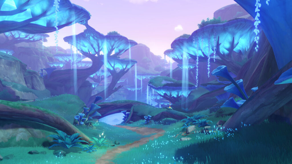
Genshin Impact is an open world, online, RPG exploration game. Its vibrant sceneries, creative, inventive character designs, gorgeous musical scores, and ever developing storyline, are reasons why I adore this game so much.
There are several factors that cause people to get hooked onto this game, and most fall under the Wishing aspect of the game, which is essentially gambling.
Wish System: Where the addiction starts
This game has a system where new characters and weapons are released on a regular basis. The characters and weapons are displayed on banners, and those displayed cycle out about every 2 weeks.
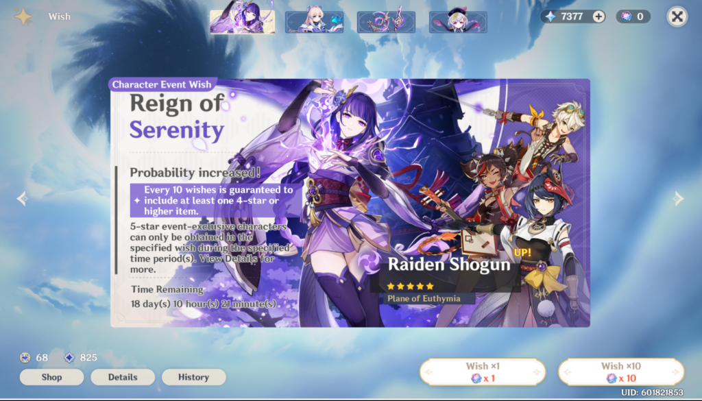
Players are given the choice to “pull” for these characters using an in-game currency, called primos. 1 wish is 160 primos; a 4 star character is guaranteed every 10 wishes, or 1600 primos. A 5 star character is guaranteed at 90 wishes. On top of that, if you’ve previously gotten a 5 star banner character, the next time you hit 90 wishes, you are not guaranteed the banner character… you have a 50/50 chance of getting a different 5 star character. Which means….
People will either 1. Do everything they can in the game to rack up enough primos to get the 5 star character they want, 2. Pay for primos.
I once paid for primos. Never again. Which is why I am one to play this regularly, to gain primos from Daily Quests, exploration, and events.
You are given 4 commissions a day, each earning you 10 primos. Completing all of them earns you an additional 20 primos.
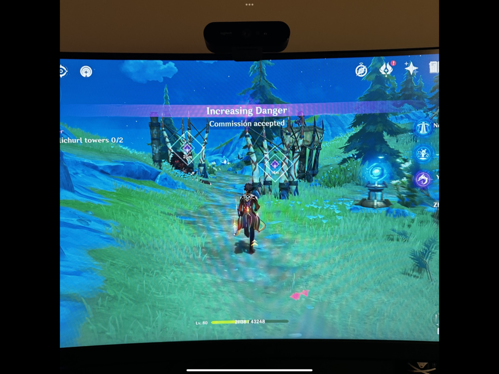
Opening chests and completing puzzles in the open world gains you primos, as well as other currencies that allow you to gain primos. It’s very convoluted… but basically, there are a lot of mechanisms in this game that rewards you with primos. Exploration is a great way to achieve this.
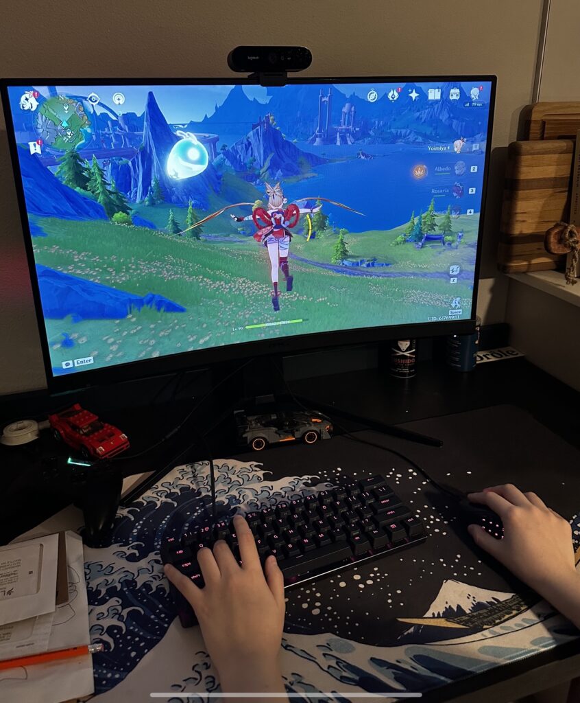
What characters and weapons will be released on what banner is generally announced or leaked far enough in advance for people to be able to prepare. “Preparing” means saving up enough primos to be able to pull the character, and “preparing” can also mean farming for the character; which is, arguably, a bulk of the labor in the game.
Character/Team Building
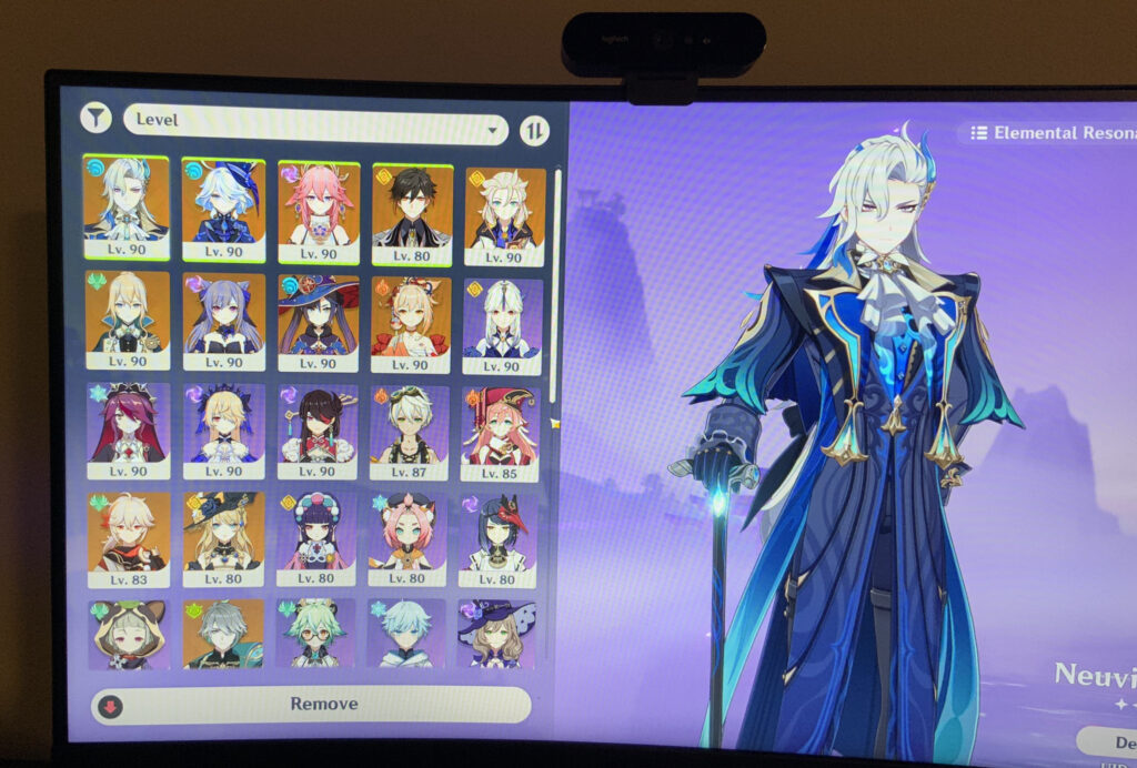
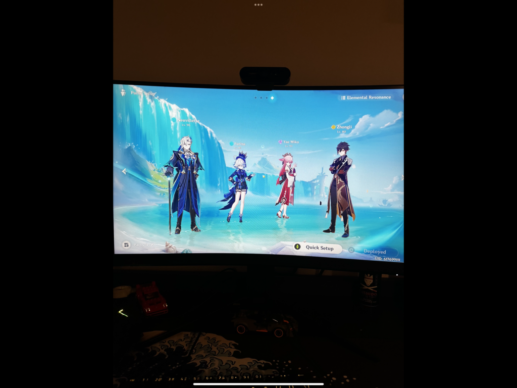
Each character usually has a specific role for them to be assigned on a team.
- Main DPS (main damage dealer)
- Support
- shield
- healer
- Sub DPS (passive damage dealer)
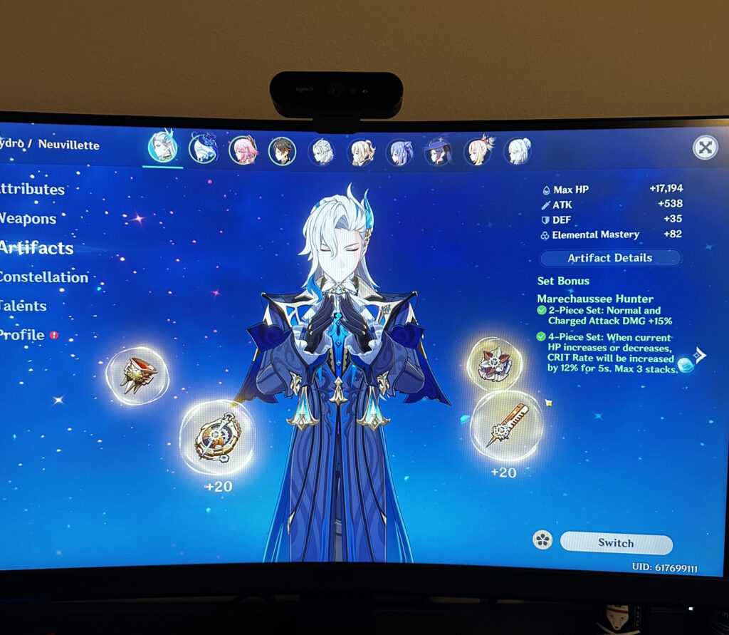
You are able to “farm” for equipment for each character that best suits their kit. What equipment you farm for, how you choose to build your character, varies greatly depending on the team you decide to put them on, the weapon they have, what aspect of their kit you will choose to utilize.
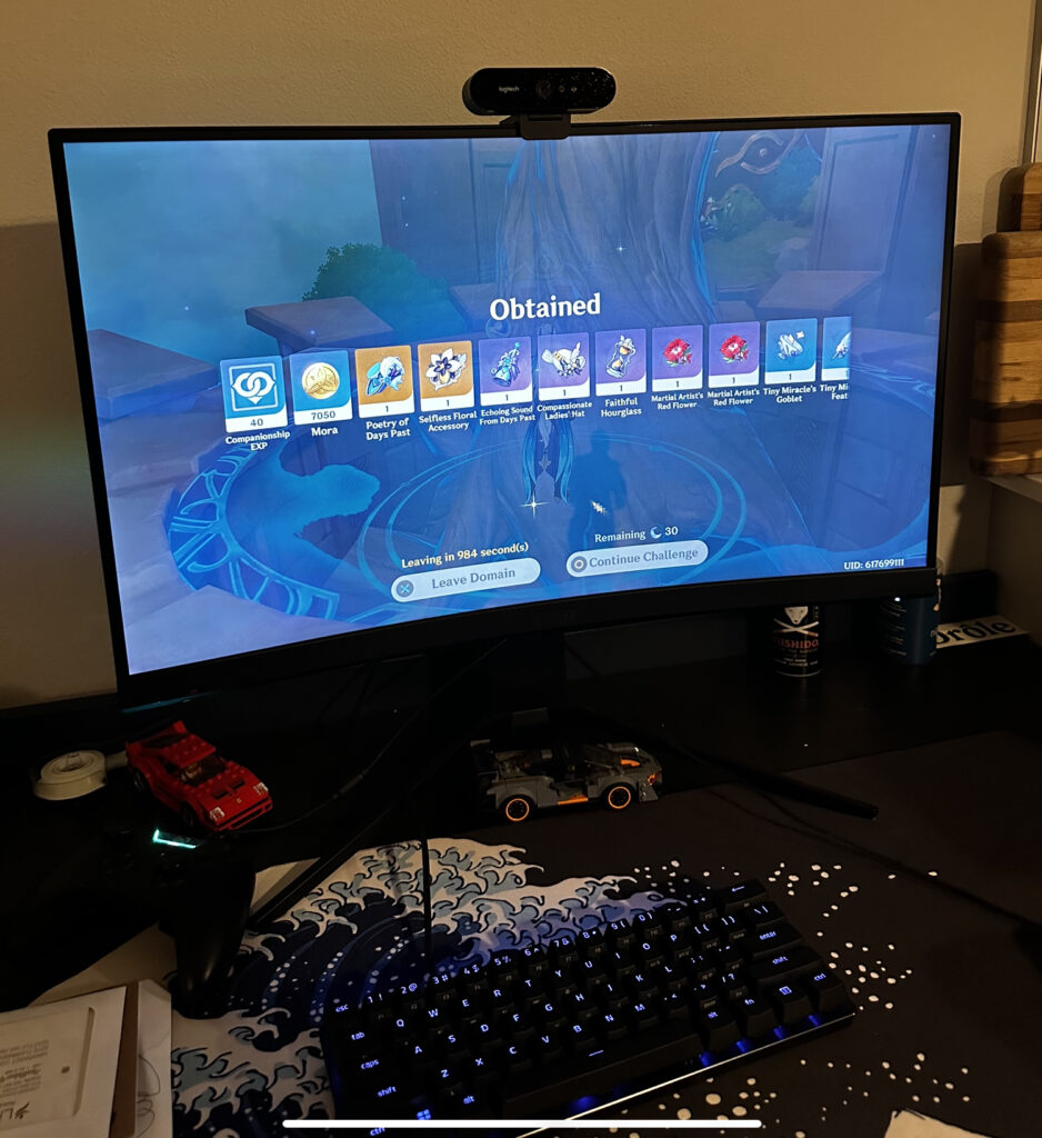
I love, LOVE this part of the game. It is extremely fun and exciting to come up with new team compositions, different equipment you can put on characters to utilize them best on your team. It’s satisfying and cathartic to see your damage go up, and the efficiency at which you are able to take down enemies.
Open World- Exploration- Scenery
Here are just a few of the countless beautiful areas in this game. 🙂
The ACTUAL Review
I adore this game. I love its versatility; I love how many different ways you can build your characters and teams. I love how much there is to explore, and I love how beautiful it is.
Something I did not talk about is how fleshed out so many of these characters are; everybody has their own unique place in the story and playstyles that suit them. My attachment to this game is largely through my attachment to these characters.
THAT BEING SAID…
Mihoyo (the company that makes this game) is SO stingy!! It is insane how hard we have to work to obtain these primos. I wouldn’t complain if it weren’t for how generous they are to the players in the other games they produce… it’s very odd.
On top of that, as much as I love building characters, the farming aspect is an absolute nightmare. I recently obtained a character, and I’ve been farming for her artifacts for about a month straight now. Almost every day, and I do not have a full set to give her because everything I get has awful statistics that would do her no good.
It’s just a lot of labor; I wish the chances of getting what I need was higher, both for statistics on artifacts and characters and weapons on banners.
Despite these annoyances, I will not stop playing. 🙂 I love this game. Even though the general internet consensus is that those who play it are cringe.