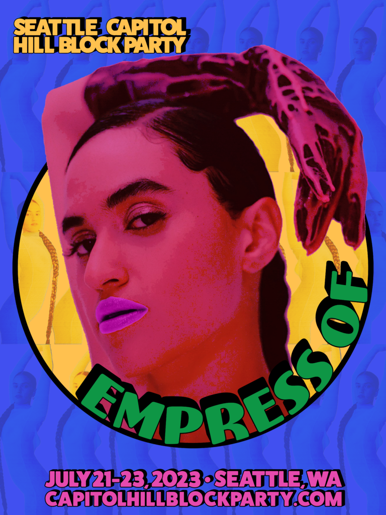
Last week, I was given a challenging assignment for my New Media class at Seattle Central Creative Academy. The task was to design a poster that would promote “The Empress of’s” performance at the “Capitol Hill Block Party” festival, and the twist was that I had never designed a music poster before.
Who is Empress of?
First, I would like to share some information about the artist Lorely Rodriguez, “Empress Of.” She is a singer, songwriter, musician, and record producer based in Los Angeles. Her outstanding abilities and distinctive approach have significantly impacted the music industry. She has released three albums so far: “Me” in 2015, “Us” in 2018, and “I’m Your Empress Of” in 2020.
Empress Of’s debut album, “Me,” includes the song “Standard“. In 2018, she released “Us,” and continued to collaborate with other artists, contributing to DJDS’ “Why Don’t You Come On” and a cover of Lana Del Rey’s “Love“. In 2020, Empress Of released “I’m Your Empress Of,” featuring the single “Give Me Another Chance“. Notably, she founded her record label, Major Arcana, allowing her to release music independently.
The Design Process
This assignment was a completely new experience, and I felt excited and nervous about it. I aimed to create something that would stand out and accurately reflect the essence of the festival. To help me achieve this, I drew inspiration from this year’s festival poster. I aimed to maintain the same graphic style, including the color scheme and typography, to maintain the festival vibe.
My goal was to highlight the “Empress of” herself. To achieve this, I selected a photo of Lorey and used Photoshop to add lovely shades of pink and magenta. This gave the poster a burst of color that immediately drew attention to the main attraction. For the background, I used another photo and a bit of repetition to create an aesthetically pleasing canvas.
To complete the project, I focused on the typography. I used Illustrator to accurately replicate the text style featured in this year’s festival lineup promotional poster. I aimed to create a poster that seamlessly integrated with the festival’s visual identity, making it feel more cohesive.
I stepped outside my comfort zone and enjoyed creating a visually appealing music poster.
