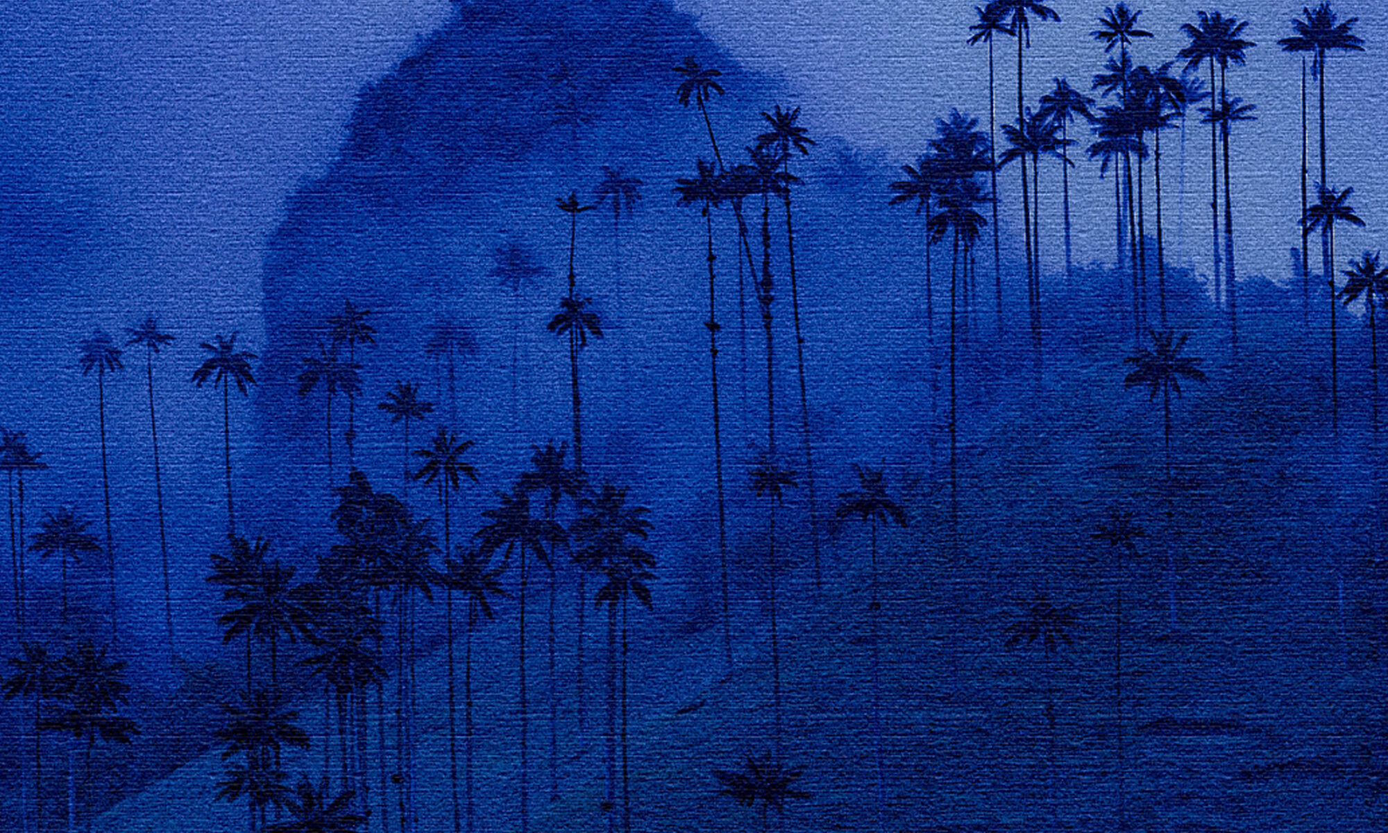
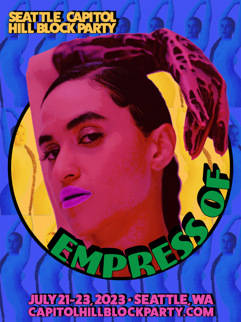
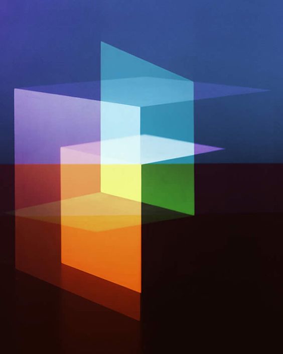
In this blog, I want to share my experience making an interactive poster using the EyeJack application. In my first Blog Assignment from my New Media class, I created a promotional poster for an artist who performed at the Capitol Hill Block Party 2023. My assigned artist was “Empress Of,” and I decided to use the same poster for the interactive version. Here’s a look at the poster I designed.
Promotional poster of Empress Of at the Capitol Hill Block Party.
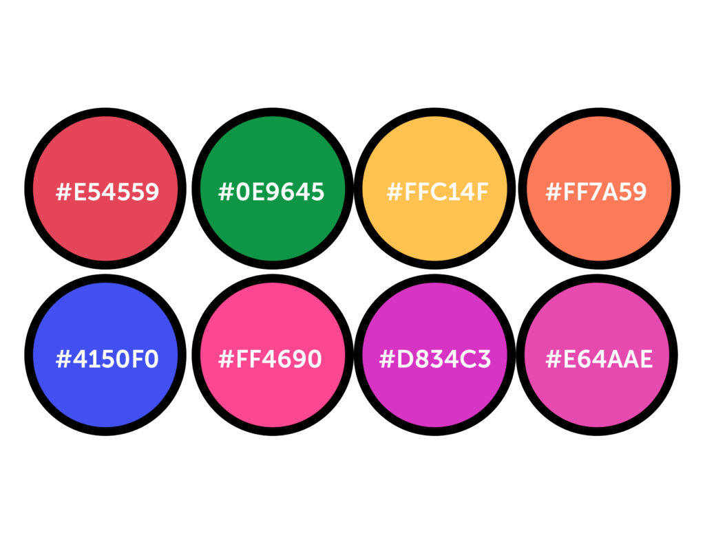
I had initially planned to make an animation in After Effects of the poster and accompany it with music by Empress Of. However, I later decided to use the original poster as a reference and create a simpler version, allowing me to showcase a video of the artist instead. Despite this change in plans, I maintained coherence between the two assignments by using the same colors.
Colors I used in the project.
I like how easily Adobe Suite allows me to import files created with different software. In this project, I imported an Illustrator file of the original poster into After Effects to animate each layer. With the “Color Overlay” option in the “Layer Style” section, I animated the background and circle fill to create a flickering effect with each color. Also, I used the circle to display the Empress Of video and then enlarged it to fill the whole canvas.
Screenshot from After Effects
You can check out After Effects’ end product by clicking thislink.
In order to view the AR poster, you will need to download the EyeJack app to your phone. Once you have downloaded the app, scan the QR code provided and then focus on the image to enjoy the video. If you prefer not to download the app, you can visit the following link to view the final result on YouTube.
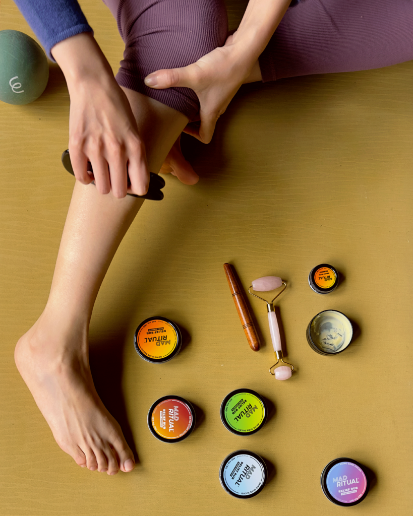
Mad Ritual is a natural balm that not only acts as a product but also as a partner that helps soothe discomfort and revitalizes your body. This versatile formula is specially designed to alleviate daily ailments such as soreness, tightness, headaches, joint pain, muscle cramps, irritated skin, sunburns, or pesky bug bites. It is made with natural ingredients such as arnica, peppermint, eucalyptus, and lavender, known for their natural healing properties.
This product is an extraordinary moment where I can dedicate time to give myself massages and release muscle tension after a workout session. The balm has a smooth, soft, and soothing texture on the skin. It has a pleasant scent that is not overpowering, making it perfect for use anytime, anywhere. That’s the story I wanted to tell.
I have created a vivid scene that epitomizes the efficacy of Mad Ritual’s wellness products. In my scene, a person is shown sitting comfortably on their yoga mat and massaging their leg after a strenuous workout session. The scene seamlessly showcases the various rubs that Mad Ritual offers, each designed to cater to different needs and preferences.
Moreover, I want to highlight the benefits of using Mad Ritual’s products alongside commonly used massage tools. The combination of Mad Ritual’s rubs with massagers, rollers, or other such tools can effectively amplify the benefits of the rub, creating a deeply relaxing and comfortable experience.
My scene aims to showcase the importance of self-care practices and the significance of taking time out to pamper oneself. It emphasizes the idea that by prioritizing self-care, we can boost our overall well-being and lead a more peaceful and fulfilling life.
The Super Bowl is a huge deal that hooks millions of people every year. The commercials are a central part of the spectacle and have become highly coveted by advertisers due to the limited ad space, massive audience, and high production value. These ads aim to capture viewers’ attention and make a lasting impression.
Below is a list of the five Super Bowl ads I watched:
Google Pixel 8 “Javier in Frame”
Dove “Hard Knocks”
Silk “Feel Planty Good”
Verizon with Beyonce
Dunkin Donuts with Jennifer Lopez & Ben Affleck
Google Pixel 8 “Javier in Frame”
The commercial for the Google Pixel features Javier, a blind man whose life is beautifully documented through photos taken with the device’s Guided Frame feature. This feature helps Javier capture important moments, from spending time with his dog to witnessing the birth of his child, by indicating when faces are in the camera’s frame. The ad is emotionally powerful as viewers witness Javier’s journey through milestones, showcasing the emotional impact and accessibility of Pixel’s technology. The target audience for this ad includes consumers who are interested in innovative technology, those who value inclusivity and accessibility, and individuals who appreciate emotionally resonant storytelling. This ad may also appeal to those specifically interested in smartphone photography and features that enhance user experience.
Pros:
Emotional Resonance: The advertisement effectively elicits emotional responses from viewers by showcasing Javier’s journey through life’s meaningful moments and emphasizing the importance of accessibility and inclusivity in technology.
Representation and Normalization: By featuring a blind actor as the lead and portraying him as living a whole and fulfilling life, the ad contributes to normalizing disability representation in advertising, helping to break stereotypes and promote inclusivity.
Cons:
Missed Opportunity for More Impact: The advertisement concluded with the sentence, “Captured your life, no matter how you experience it.” However, despite the emotional depth of Javier’s journey and the innovative technology showcased in the commercial, a more impactful and memorable message could have been used to leave a stronger impression on viewers. A more targeted and specific closing statement could have reinforced the ad’s themes of inclusivity, accessibility, and the power of technology to enhance people’s lives.
Stronger Call-to-Action: They should include a clear and compelling call-to-action at the end of the commercial to motivate viewers to take action.
Dove “Hard Knocks”
The Dove commercial “Hard Knocks” is a touching portrayal of the challenges faced by young female athletes, both physically and emotionally, while participating in sports. The advertisement features young girls competing in various sports, experiencing falls, hits, and tumbles. However, the message goes beyond physical challenges, highlighting that 45% of girls quit sports by age 14 due to low body confidence. Dove aims to draw attention to the emotional toll these experiences can have on girls during a crucial time when their bodies change. The ad encourages viewers to recognize the significance of supporting girls’ self-esteem and body confidence in sports through Dove’s Body Confident Sports program.
Pros:
Powerful Message: The commercial effectively raises awareness about the issue of low body confidence leading to girls dropping out of sports, shedding light on a significant societal problem.
Creative Execution: By pairing an emotional message with the upbeat tune of “It’s a Hard Knock Life,” the ad balances seriousness and entertainment, engaging viewers and delivering its message.
Cons:
Lack of Specificity: Although the commercial does well in highlighting the issue, it falls short of providing specific details about Dove’s Body Confident Sports program and how it plans to tackle the problem other than raising awareness.
Potential for Misinterpretation: There is a possibility of misinterpretation in the ad. Some viewers might perceive the use of falls and hits in the first part of the commercial as reinforcing stereotypes about female athletes being physically delicate. This perception could undermine the message about the actual problem: low body confidence.
For my blog assignment this week, I’ve been tasked with brainstorming ideas for a personal project that I can include in my portfolio.
Brainstorming List:
Create a unique logo to represent my personal brand as a designer.
Design and code a website that showcases my photography portfolio.
Take classes to make my own jewelry collection.
Create a catalog featuring photographs of my pottery creations.
Experiment with transferring images onto wood surfaces to create a unique art series.
Design branding materials for social media profiles.
Design and code an interactive website to showcase my portfolio.
Create customizable web design templates for sale.
Create 3D models to showcase some designs in realistic settings, such as product mockups or environmental scenes.
Create a series of art pieces using Color Aid papers.
What is the idea?
I have the idea to create a collection of art pieces using Color Aid papers. These papers are famous for their vibrant hues and are widely used by artists and designers to explore color theory and composition. I plan to experiment with various techniques such as collage, layering, and cutting to give life to my artistic visions.
My inspiration
Yulia Brodskaya, a renowned artist known for her innovative paper art, is an excellent inspiration for this project. Her vibrant and dynamic pieces involve meticulous manipulation of paper strips. By studying her techniques, I can gain insights into creating visually stunning compositions. Her success in gaining international recognition and collaborating with various brands showcases the potential for paper artwork to make a meaningful impact in art and design.
Why it would be an excellent addition to my portfolio?
I believe that exploring the world of Color Aid papers would be a fulfilling and valuable addition to my portfolio for several reasons:
It will showcase my artistic versatility and demonstrate my ability to work with various mediums beyond digital platforms.
It will allow me to deepen my understanding of color theory and composition, which are fundamental aspects of graphic design and visual communication.
It will set my portfolio apart by adding a unique and visually striking dimension that captures viewers’ attention and creates a lasting impression.
What skills do I hope to acquire?
I am hoping to improve my skills in the following areas through this project:
Using Color Aid papers will help me understand deeply color relationships, harmonies, and the effect of using different color combinations.
By experimenting with collage and layering techniques, I will improve my skills in composition, balance, and visual storytelling.
Working with physical materials will allow me to develop my craftsmanship skills, which include precision cutting, gluing, and handling delicate materials.
This project will motivate me to think outside the box, push boundaries, and explore new creative possibilities. This will encourage me to be more innovative and original in my work.
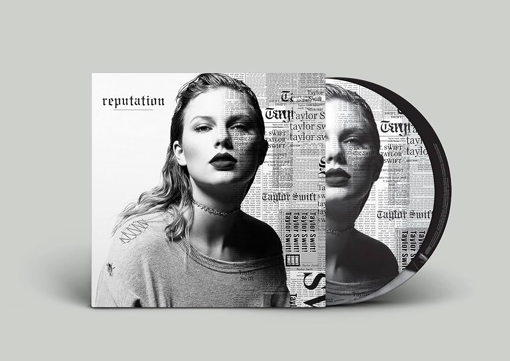
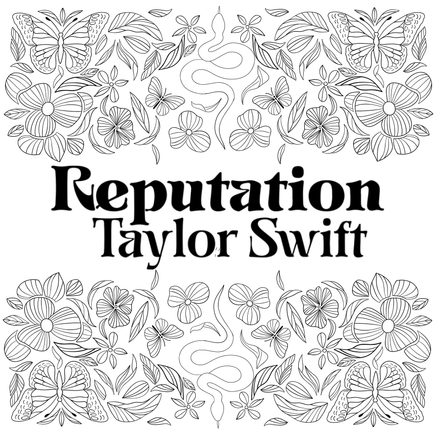
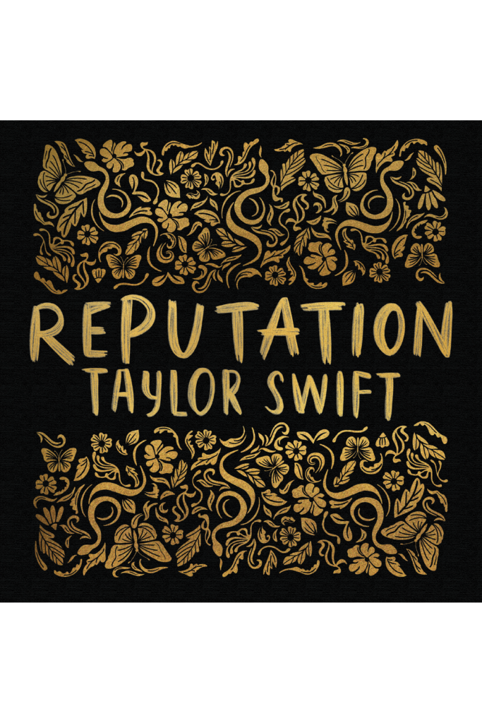
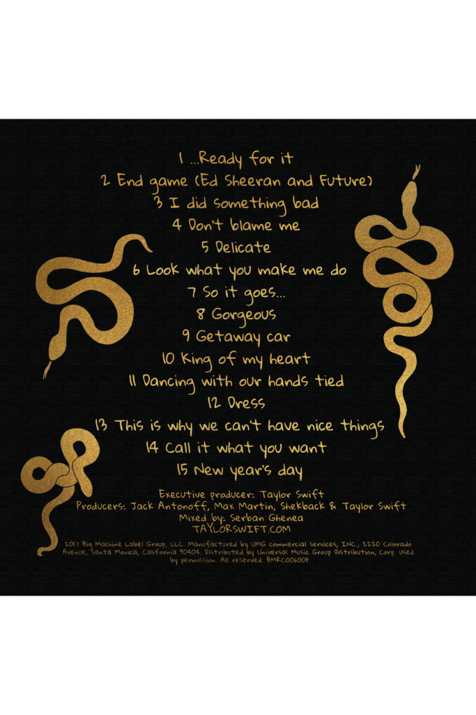
For this particular project, my task was to redesign Taylor Swift’s Reputation album cover while integrating Art Nouveau elements into the design. The task wasn’t to reproduce a replica of Taylor Swift’s Reputation cover but to reimagine, reinterpret, and redefine elements within the styles and approaches associated with her visual character. This encompassed typography, color, form, pattern, layout, and illustration. Incorporating Art Nouveau into the design added an extra layer of complexity. It required a thoughtful integration of this artistic movement into a contemporary design work. The objective was to strike a balance, ensuring a harmonious blend of Taylor Swift’s essence and Art Nouveau influence.
“Reputation” is Taylor Swift’s sixth album, released in November 2017. It departs from her previous pop-country style and explores themes of fame, relationships, and media scrutiny with a darker tone. The album consists of 15 tracks and was released after an extensive strategic campaign. Despite mixed reviews, Swift reclaimed the snake symbol, turning it into an empowering emblem during the campaign. The album reflects her response to controversies and embracing a more assertive persona.
Taylor Swift’s Reputation Vinyl Cover
As I approached the challenge of redesigning the album cover of “Reputation,” I noticed some interesting parallels between the album’s themes and the elements of Art Nouveau. The snake motif, which symbolizes shedding skin and embracing change, is aligned with the album’s theme of overcoming public perception, reminiscent of Taylor Swift’s promotional phase. I drew inspiration from Art Nouveau’s nature-inspired motifs and explored incorporating elaborate floral designs and organic elements that symbolize growth, transformation, and resilience. Examples include portraying flowers at various stages of blooming to represent personal growth, vines symbolizing adaptability, and butterflies depicting transformation. Balancing dark and light elements, a characteristic of Art Nouveau, can mirror the duality in Swift’s public image, acknowledging darker aspects while highlighting moments of hope, growth, and resilience.
Inspiration from some Art Nouveau Book’s covers
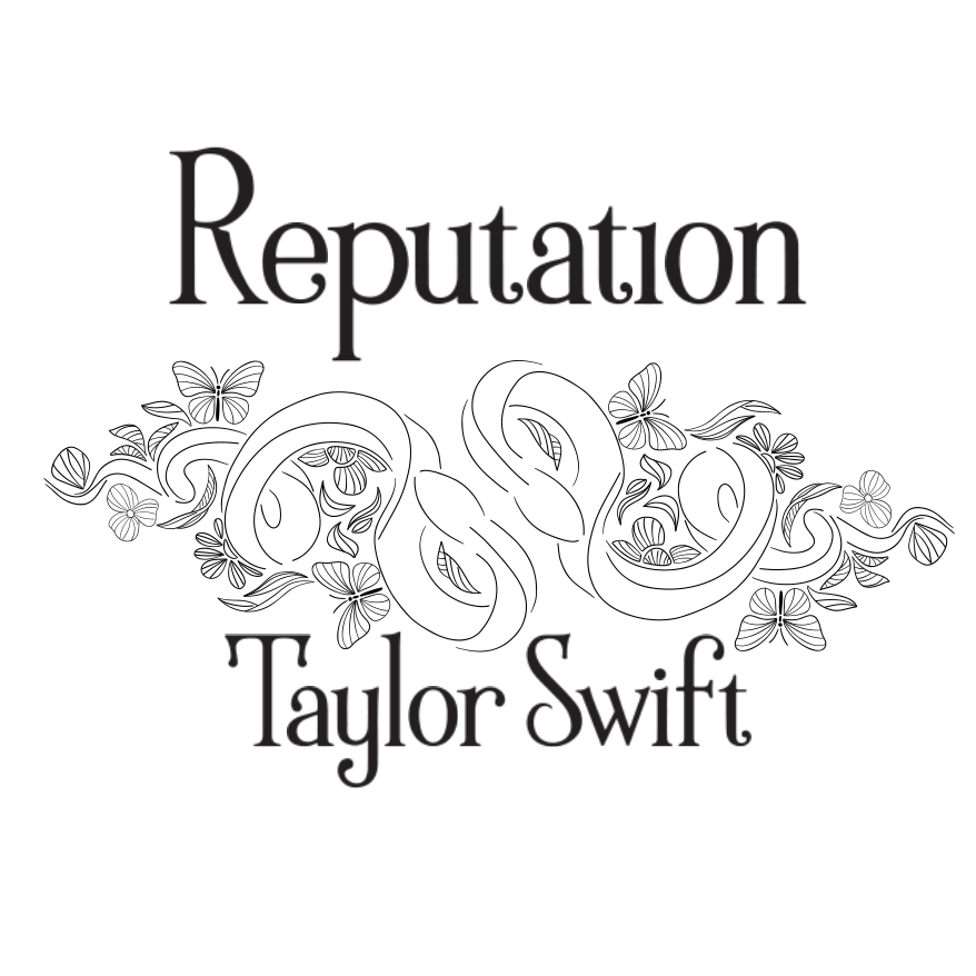
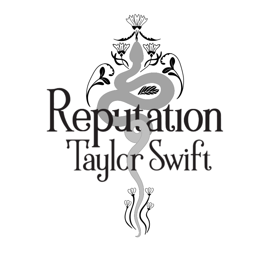
These are the sketches I made to capture my idea for the vinyl cover.
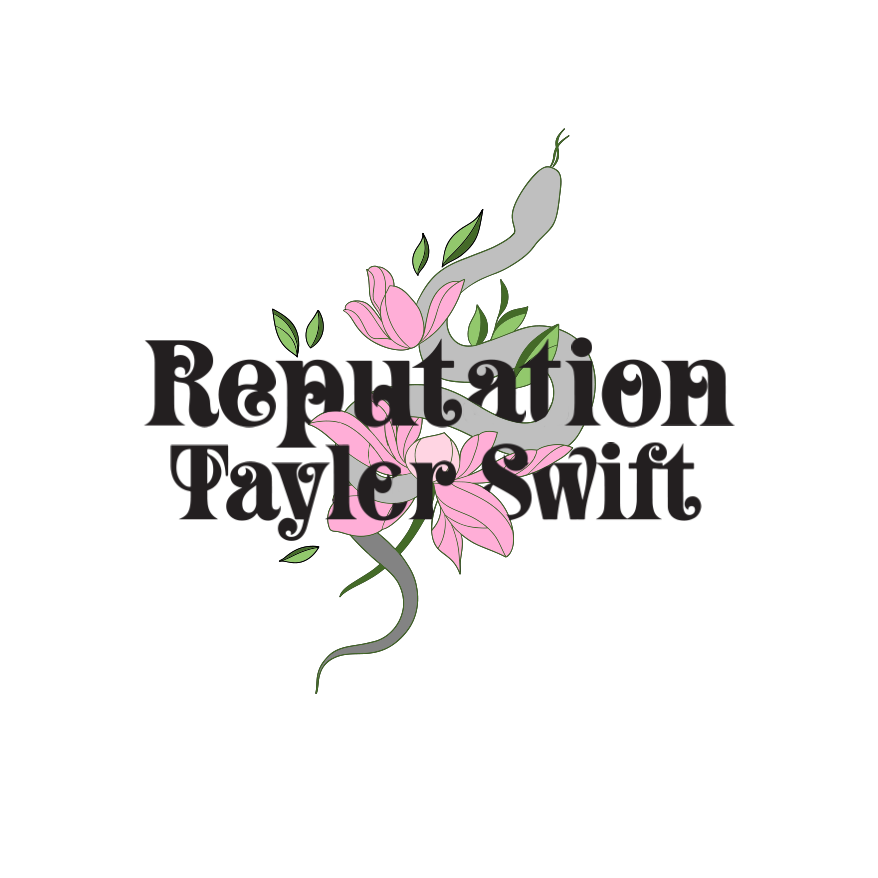
In my proposal, I incorporated typefaces inspired by the Art Nouveau style. However, my teacher, Gabriel, suggested I take it further by creating hand-drawn letters to elevate the design. I took his advice and worked on creating a lettering that reflected the tone Taylor Swift adopted for this album. After several iterations, I arrived at a final version that merged the original typefaces with my hand-drawn letters, resulting in a more cohesive and visually appealing design.
I worked collaboratively on this project using some Adobe software tools for the first time. I used Adobe Fresco on an iPad to create the illustrations for the cover, which I then imported into Photoshop without effort because the file was right there to apply a gold texture. Finally, I used Illustrator to work on the text for the back cover. This project was a great learning experience for me, not only because of the final result but also because of the process. It taught me that we have many tools at our disposal, and we must use them effectively.