“Freedom to Explore” signifies the liberty to pursue new experiences, discover new places, and expand one’s horizons without undue restrictions. I would depict this concept through a lively and bustling art studio overflowing with diverse artists. Each artist is immersed in their unique medium—painting, sculpting, dancing, or writing. The scene is vibrant with color and movement, illustrating the unrestrained nature of self-expression. One focal point could be a large canvas where multiple artists contribute spontaneously, blending their styles into a dynamic mural. This represents the collective power and beauty of individual expression, emphasizing the importance of a space where everyone feels free to share their voice and creativity without fear of judgment.
Freedom to Explore
“Freedom to Explore” signifies the liberty to pursue new experiences, discover new places, and expand one’s horizons without undue restrictions. I would depict this concept through a panoramic landscape that includes a variety of environments—majestic mountains, dense forests, serene beaches, and bustling cities. People of all ages are engaged in different activities. The sky above is vast and open, symbolizing limitless possibilities. This depiction captures the spirit of adventure and curiosity, illustrating how the freedom to explore enriches lives and fosters a deeper understanding of the world and oneself.
Freedom from Expectation
“Freedom from Expectation” represents the release from societal pressures and preconceived notions about who one should be or how to live. To illustrate this concept, I would create a serene, open space where individuals are seenengaging in activities that bring them genuine joy without the weight of external judgment. A tranquil meadow with people painting, meditating, dancing, and simply relaxing can serve as the setting. The absence of rigid structures and the presence of natural beauty emphasize the peace of living authentically. This scene conveys a sense of liberation, where individuals are free to follow their own paths and define success and happiness on their own terms.
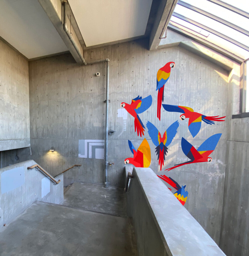
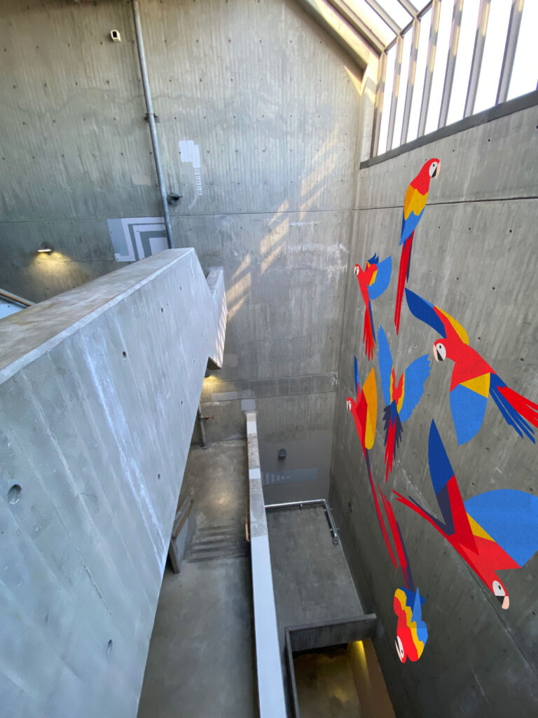
For this assignment, I’ve decided to create a mural featuring macaws. My mom’s last name is “Papagayo,” which means macaw in Spanish, making the animal her favorite. Another reference to our Colombian heritage is the use of the colors of the Colombian flag: yellow, blue, and red. Finally, I’ve arranged the macaws so that when put together, they form the shape of the map of Colombia.
Here are three proposals, each with the same mural but a different location.
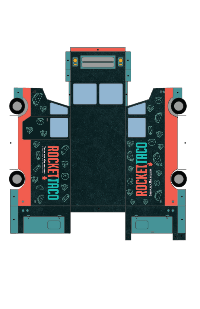
For my blog assignment this week, I chose to create a food truck concept for Rocket Taco, a well-known restaurant in Capitol Hill. My goal was to capture the restaurant’s vibrant atmosphere and unique flavors within the limited space of a food truck.
The food truck’s exterior is adorned with colors that match the restaurant’s logo, making it stand out to passersby. The design of the truck is inspired by space and rocket themes, which aligns perfectly with the identity of Rocket Taco. I used textures that are reminiscent of space to enhance the connection to the theme, creating a cohesive visual narrative that underscores the ‘rocket’ element. Overall, the food truck design generates the same level of excitement and anticipation as dining at Rocket Taco itself.
I have explored the art of illustration to showcase the menu offerings of Rocket Taco. I have paid attention to every detail to bring the true essence of Mexican street cuisine to life. I have carefully crafted each illustration that features mouthwatering tacos, hearty burritos, and other dishes on the menu. The illustrations have captured the essence of the food truck, where a tortilla is gently folded over a flavorful filling, and the crunchy nachos are garnished with savory toppings.
My solution for the Rocket Taco food truck is not just a simple mobile eatery, but rather a complete culinary experience on wheels. By showcasing the essential elements of Mexican street cuisine and staying true to the vibrant tone and aesthetic of the restaurant, the food truck becomes an extension of the Rocket Taco brand. This allows customers to enjoy their favorite flavors on the go, while still experiencing the full breadth of the Rocket Taco experience.
The Blender Project was a remarkable success, thanks to our meticulous planning and careful execution. It was a challenging endeavor as we had to integrate our main character, the prompt, and the dialogue in a balanced manner. However, we managed to pull it off by developing a storyline where these elements complemented perfectly.
At first, integrating our three elements (Bob, the light rail driver, “No soup for you, and toilet paper) into a single movie appeared illogical. However, with our instructors’ support and our team’s creative brainstorming, we developed a concept that matched our goals: shooting an advertisement for a new flavor soup. During the planning phase, we paid close attention to every aspect, from the storyline to the filming timetable, to ensure every detail was noticed.
Collaborating with Keera and Leigha was an incredible experience because our ideas complemented each other immediately. We all agreed on creating a commercial to promote a new soup, and from there, everything fell into place smoothly. We spent time fleshing out the details of each scene, ensuring that they were cohesive and aligned with our vision. Effective communication and foresight were vital in maximizing our time on the day of shooting, leading to a seamless production process.
We had the pleasure of working alongside Kate, Eric, and Julian’s group, and it was indeed a delightful and exhilarating experience. Together, we collaborated to assist them with their shoot, and in turn, they generously supported our project. The act of exchanging help and guidance between us not only added to the overall enjoyment of the project, but also played a significant role in its success. Our combined efforts resulted in a shared wealth of knowledge and expertise, enabling us to gain valuable insights and perspectives.
In conclusion, the Blender Project was a success because of our team’s hard work, dedication, and effective collaboration. We created a visually stunning and compelling film that met our objectives and exceeded our expectations.
My maternal grandparents passed away from cancer. I have personally experienced the devastation and complexity of this disease, both emotionally and physically. I also remember how it affected me spiritually. During my grandmother’s chemotherapy sessions, I saw children undergoing treatment as well. She used to say that it wasn’t fair for these angels. She had lived long enough to enjoy everything life had given her, but these little angels were starting to live. This statement changed my life. After my grandmother passed away, I decided to get involved in organizations that help children with cancer. While I knew I couldn’t cure them of their illness, I knew I could help them break away from their routine and give them one of the best days of their lives.
Donating $25,000 to a nonprofit organization focused on pediatric cancer can significantly impact the lives of countless children and their families. Pediatric cancer is a devastating diagnosis that not only affects young patients but also takes an emotional and financial toll on their loved ones. By supporting an organization dedicated to pediatric cancer research, treatment, and support services, one can advance medical breakthroughs, improve access to quality care, and offer crucial emotional support to affected families.
The funds donated to a pediatric cancer nonprofit can directly support critical initiatives such as funding research for more effective treatments and ultimately finding a cure. Childhood cancers often present unique challenges compared to adult cancers, and specialized research is necessary to develop targeted therapies with fewer long-term side effects. By investing in research, donors can help increase survival rates and improve the quality of life for young cancer patients, offering hope for a brighter future.
Moreover, donations can also assist in providing essential support services to pediatric cancer patients and their families. These services may include financial assistance for medical expenses, counseling and psychosocial support, educational resources, and accommodations for families needing travel for treatment. Such support not only alleviates the financial burden but also helps families navigate the emotional challenges of dealing with a pediatric cancer diagnosis, ensuring they feel supported and empowered throughout their journey.
Footprints of Fight is a hope for families battling pediatric cancer in Washington. Founded by individuals who intimately understand the challenges families face during a child’s cancer treatment, this nonprofit organization is committed to providing invaluable support services to alleviate the burdens of everyday life. With a deeply personal mission rooted in their journey with pediatric cancer, Footprints of Fight offers a lifeline to families, ensuring they can focus on what truly matters: their child’s health and well-being.
By donating to Footprints of Fight, you’re not just contributing to a cause but investing in a tangible support system that directly impacts families navigating the treacherous waters of pediatric cancer treatment. Their comprehensive range of services, including house cleaning, grocery and gas cards, and other essentials, ease the financial strain and emotional toll often accompanying such a diagnosis. This means families can channel their energy into supporting their children through treatment, fostering courage, optimism, strength, and resilience.
The statistics underscore the urgency of supporting organizations like Footprints of Fight. Every day, 720 new children worldwide are diagnosed with cancer, and 250 children lose their lives to this relentless disease. In Washington alone, an estimated 300 families face the daunting reality of pediatric cancer each year, embarking on treatment journeys that can last anywhere from three months to three years. Footprints of Fight recognizes that pediatric cancer affects not just the patient but the entire family and aims to provide sustained support throughout the treatment process.
The organization’s origin story is one of triumph over adversity. Inspired by their son Mason’s battle with cancer, the founders experienced firsthand the power of unwavering support from their community. Now, standing on the other side of treatment with Mason declared cancer-free, they are fulfilling a promise to pay it forward through Footprints of Fight. Their journey is a testament to the resilience of the human spirit and the transformative impact of collective support..
Introducing the new Stanley Dog Bowl – a perfect blend of style and functionality crafted to match your furry friend’s active and playful lifestyle. Made from food-grade, 18/8 stainless steel and coated with a super-durable, colorful powder coating, these bowls are visually appealing and built to last long. With a range of exciting colors, you and your pet will find the perfect match. The Stanley Bowl is versatile and suitable for dry, wet, water, snacks, or treats. Its easy-to-clean design is resistant to stains, odors, and food residue, and it is even dishwasher-safe for added convenience. Additionally, the double-wall insulation ensures that liquids remain cold for longer, making it ideal for outdoor use on hot, sunny days. The non-slip rubber base of the Stanley Bowl features rubber non-skid pads, making it stay securely in place and preventing spills and splashes for a hassle-free dining experience that your pet will love.
As I’ve been exploring Spectrum, Adobe’s design system, I’ve gained knowledge about their meticulous approach to voice and tone. They define voice by applying design principles to language, prioritizing clarity, simplicity, and a human-centric, friendly demeanor while avoiding overly opinionated or trendy expressions. Tone, on the other hand, is viewed as the varied expression of this voice, which is adaptable to users’ emotional states and needs throughout their experience. I’ve come to realize how tone can positively shape interactions by guiding communication to align with the appropriate level of emotional involvement required. Overall, Spectrum’s focus on coherent, empathetic, and adaptable communication highlights their dedication to enhancing user experiences across Adobe’s products.
Color System
In Spectrum, Adobe’s design system, I’ve learned about a meticulously crafted color system that forms the backbone of UI design. It revolves around 11 neutral grays per color theme, meticulously chosen to ensure optimal contrast and prevent color misinterpretation in various workflows. Within each theme, gray-100 acts as the default background, with other gray values generated based on contrast ratios. These grays serve different UI elements, such as background layers, decorative borders, and text content, to maintain clarity and hierarchy in design.
Alos, I’ve learned that Spectrum incorporates 13 colors per theme, each with 14 tints and shades, used sparingly to reinforce hierarchy and communication within the interface. These colors convey contextual information and relationships between content types, aiding categorization and data visualization. Additionally, the system assigns generic meanings to some colors to ensure consistent user expectations.
Semantic colors, like informative, accent, negative, notice, and positive, play a crucial role in enhancing communication by visually signaling meaning. However, it’s essential to remember the cultural and emotional significance of colors globally. Spectrum emphasizes the adherence to international design guidelines for color usage to create interfaces that are accessible, communicative, and culturally sensitive.
Inclusive Design
Inclusive design is at the core of Adobe’s mission, driving collaboration among designers, engineers, and product builders to craft better experiences by embracing diverse perspectives. Within Spectrum, Adobe’s design system, inclusivity is paramount, ensuring readability, usability, and accessibility for all users, including those reliant on assistive technology. Best practices within Spectrum encompass principles such as providing context-sensitive help, accommodating various input methods and screen sizes, respecting user preferences, minimizing distractions, maintaining consistency, involving marginalized users in the design process, and prioritizing comprehensive documentation. Checkpoints for inclusivity cover structure, color, Windows high contrast mode, animation, and interactions, emphasizing logical organization, color accessibility testing, support for high contrast modes, animation moderation, and user-friendly interactions. Spectrum’s inclusive design approach aims to create products and experiences that are accessible, usable, and welcoming to all, reflecting Adobe’s commitment to diversity and inclusivity.
Spectrum, Adobe’s design system
Inclusion
Learning about the inclusion of Apple Human Interface Guidelines involves understanding the fundamental principles of designing apps that prioritize respect and accessibility for all users. It emphasizes the importance of empathetic design, considering diverse perspectives, and using inclusive language to create welcoming experiences. By examining various human characteristics and experiences, including age, gender, race, disabilities, and cultural backgrounds, designers can ensure their apps are not only free from offensive content but also genuinely inclusive. This approach encourages the use of plain language, avoiding colloquial expressions and unnecessary gender references, while maintaining an approachable interface that accommodates users of all skill levels. In essence, embracing inclusivity in app design fosters a more equitable and user-friendly digital environment.
Motion
In Apple’s Human Interface Guidelines, the section on Motion emphasizes the role of fluid and purposeful animations in enhancing user experience across platforms. It highlights the importance of using motion to communicate feedback, provide instruction, and enrich visual interactions within apps and games. The guidelines stress the need for subtle and intentional animations that support user understanding without overwhelming them, while also making motion optional to accommodate accessibility settings. By striving for realism, credibility, and brevity in animations, designers can create seamless and lightweight experiences that complement rather than overshadow the interface. Additionally, the guidelines advise against excessive motion in frequent interactions and suggest considering the use of animated symbols for added context and engagement.
Color
Apple’s Human Interface Guidelines provide valuable insights on how to effectively use color in app design. The guidelines stress the importance of using color to improve communication, brand identity, and user experience while also providing guidance on its careful use, especially in non-game apps. They also cover topics such as adapting colors to different contexts, testing them in various conditions, and ensuring inclusivity for users with color blindness. Additionally, the guidelines emphasize the importance of system colors and dynamic system colors, as well as best practices for color management, including the use of color profiles and wide color displays. Overall, the guidelines serve as a comprehensive resource that highlights the significance of thoughtful color design in creating successful user interfaces.
The Guardian Digital Design Style Guide
Grid and Space
The grid system, characterized by columns of 60px with 20px gutters on desktop, provides a structured framework for organizing information across different screen sizes. The guide outlines specific grid sizes for large screens and utilizes a fluid grid for mobile devices, ensuring consistency and adaptability. Additionally, spacing is strategically employed to mirror the typography placement in print, with rules governing the alignment of display and text elements to maintain coherence across both print and digital mediums, particularly evident in headlines, bylines, and container titles.
Typography
I learned about the typography choices, which include two core typefaces, Guardian Headline and Guardian Titlepiece, along with three additional typefaces. Guardian Headline, designed for optimal readability across platforms, is utilized for headlines, imbuing them with the Guardian’s distinctive voice. Guardian Titlepiece, derived from the Guardian’s logotype, serves for section titling, marked by its high contrast and boldness. Complementing these are the highly legible text types and the sans serif for small sizes or meta information, ensuring a cohesive and visually appealing typographic experience throughout the website and app.
Color Palett
In exploring The Guardian Digital Design Style Guide’s color palette, I learned that it serves as a versatile tool for conveying boldness, playfulness, tastefulness, and sensitivity. The guide emphasizes consistency in color usage, highlighting its role as a navigational aid for readers. The palette strikes a balance between harmonious and contrasting colors, aiming to maintain coherence across the platform. Additionally, color is utilized not only for the user interface but also to signify different types of editorial content and the corresponding editorial pillars. This approach helps to guide users and indicate the tone of voice associated with each piece of content, encouraging a bold, playful, and courageous design ethos throughout the platform.
Our group has recently completed the final assignment for our AR class. For this project, we focused on promoting sustainable businesses. After careful consideration, we highlighted and promoted businesses offering second-hand items. Promoting such businesses would encourage more people to consider purchasing items that are no longer in use. This approach can help reduce waste and promote sustainability while also promoting the idea of reusing and recycling. Moreover, by buying from such businesses, people can save money while contributing to a cleaner and healthier planet.
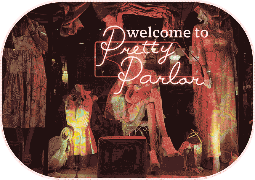
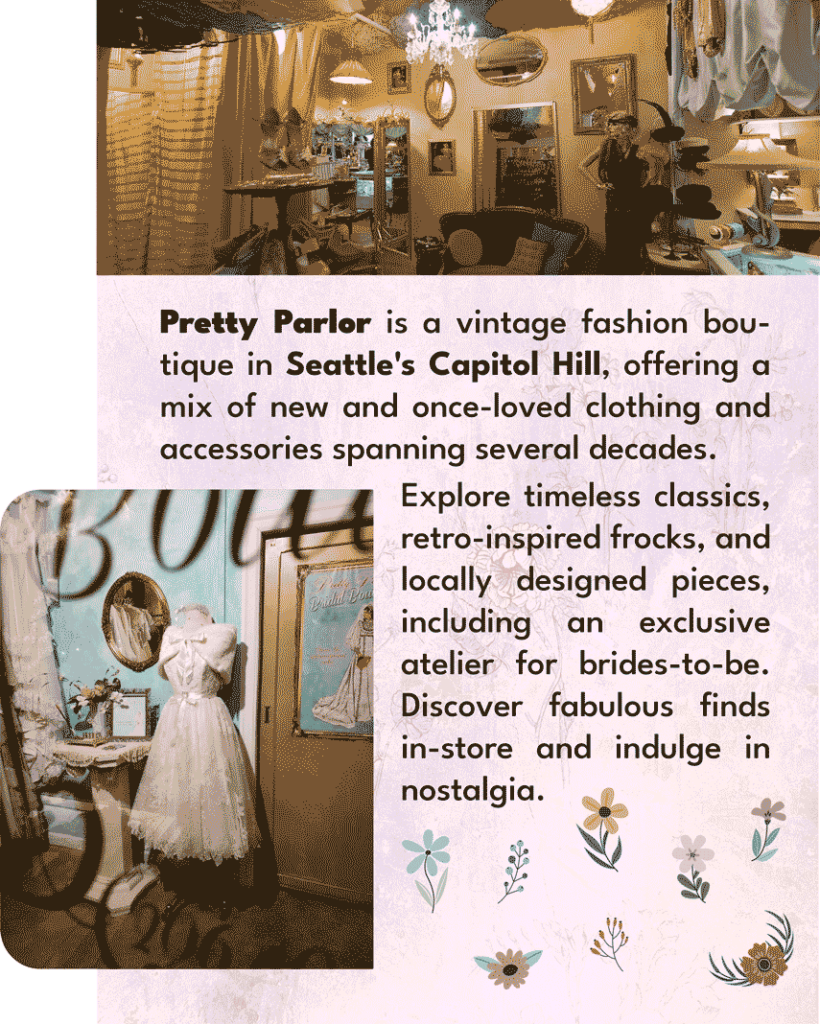
The panels contain essential information about the business, such as the schedule, products, location, and more. I live in Capitol Hill and decided to visit “Pretty Parlor.” It’s not just a typical boutique; it’s a fascinating journey through time and style, celebrating vintage fashion from the 1920s to the 1990s and curated collections from local designers. It offers a whimsical blend of new and second-hand clothing and accessories, including retro-inspired dresses, bridal couture, and limited-edition streetwear. Anna founded Pretty Parlor, and her passion for reviving old-fashioned charm runs deep. It’s a haven where customers can immerse themselves in nostalgic elegance, discover unique treasures, and experience a personalized shopping adventure that transcends mere retail.
To create the panels for Pretty Parlor, I used Adobe Illustrator. For each panel, I followed a specific guideline.
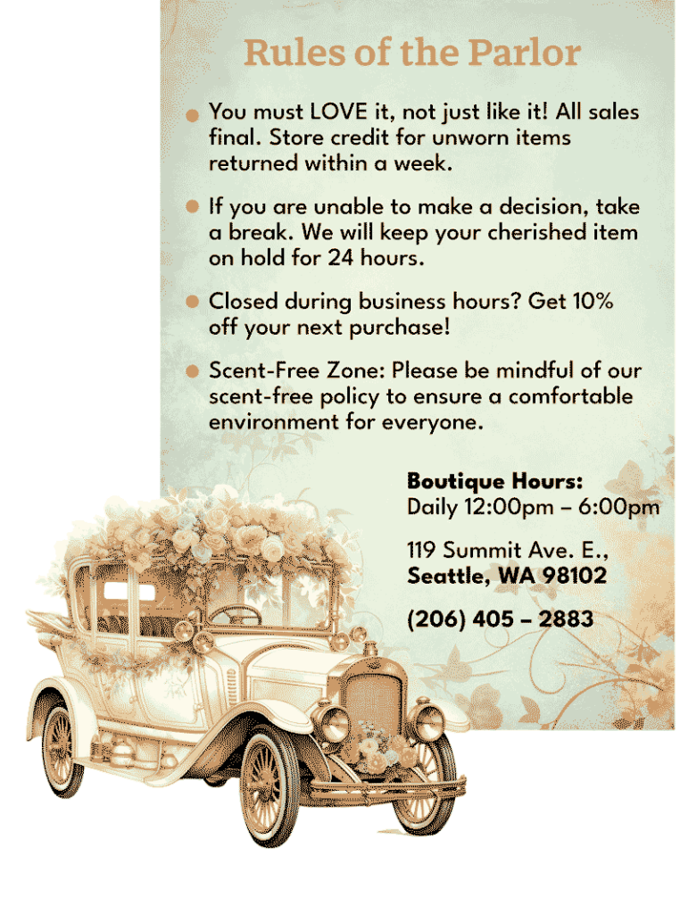
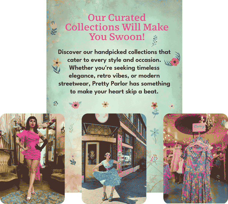
The first panel, “Welcome to Pretty Parlor,” was designed to warmly welcome customers to the store. The second panel, “What is Pretty Parlor?” aimed to give customers an overview of the store’s offerings. The third panel, “Store’s rules,” contained the store’s policies and guidelines to ensure a safe and fair shopping experience. Finally, the fourth panel, “Collections,” showcased the store’s products and services.
To achieve a consistent look across all panels, I chose a cohesive color scheme that used vintage pastel colors, retro patterns, and imagery that reflected the store’s aesthetic. This helped to create a visually appealing and engaging experience for customers visiting the store.
I saved each panel as a PNG file because some images were outside the artboard. However, before uploading them to EyeJack, the app we used to create the AR experience, I had to reduce the resolution of the images and save them using only 16 colors. This was necessary because EyeJack has a restriction of 3MB for assets.
After completing the project, I arranged everything in EyeJack. The process was straightforward to follow. Once I published the project, I received a QR code from EyeJack, which I used to launch the experience from the store using the EyeJack app on my phone. Finally, everything was set up and ready to go.
Here is the final result: https://youtube.com/shorts/viR2mJrVr74?feature=share