Exploring AI-Generated Imagery

The market for AI is rapidly expanding, and many industries have started integrating AI into their business models. Today, I decided to test a free AI image generator to see how accurate the results could be. I chose the topic, ‘Playing Frisbee with a cat at a park.’

Before using the image generator, I provided a detailed description of the image I wanted to create:

A young woman in her mid-20s and her cat are playing Frisbee in a park on a sunny day during summer. She wears a light blue shirt that suits her fair complexion, denim shorts, and white sneakers. Her brown hair is tied back in a ponytail. She has a graceful smile, reflecting her joy in the moment. The woman throws the Frisbee, and the cat leaps to catch it. The cat is a sleek and agile tabby with golden and brown fur. Its vivid green eyes are fixed on the mid-air Frisbee. The cat’s fur appears to ripple with motion. The cat wars a sleek black collar with a small silver bell. The Frisbee is a burst of color, featuring a lively combination of bright blue, neon pink, and yellow hues. The park is full of green grass, and sunlight shines through the trees.

I also sketched my idea before generating the images with AI to have a reference point.

Round 1
“A realistic and vibrant image of a young woman in her mid-20s and her cat playing with a frisbee in a park on a sunny day during summer.”

Image generated with Adobe Firefly

The generated image appears realistic, and it is set in a park. However, the woman is not playing Frisbee with the cat.

Round 2
“A realistic image of a young woman in her mid-20s throwing a neon pink frisbee, and her cat, a tabby with golden brown fur and green eyes, leaps to catch it. They are playing on a sunny day at the park.”

Image generated with Adobe Firefly

When I added more details to the prompt, the AI generator took a different direction. The image is no longer realistic, and what was supposed to be a neon pink Frisbee is now a ball. Moreover, the generator excessively used the neon pink color, such as flowers, sneakers, and the shirt.

Round 3
“A realistic image of a young woman in her mid-20s throwing a neon pink frisbee, and her cat, a tabby with golden brown fur and green eyes, leaps to catch it. She wears a light blue shirt, denim shorts, and white sneakers. They are playing on a sunny day at the park.”

Image generated with Adobe Firefly

Conclusion

This was an interesting exercise, but unfortunately, Adobe Firefly could not generate an image of ‘Playing Frisbee with a cat at a park’ as intended. The more I added details to the prompt, the more it deviated from reality, resulting in inaccurate and unrealistic outcomes, such as a woman with six fingers on her hand. While AI can be helpful in many daily applications, free image generation still has a long way to go before it can accurately produce specific ideas.

Unveiling Apple’s Studio Line: A Game-Changer for Graphic Design and Visual Media

Get ready to experience the ultimate digital workspace with the incredible Studio Display! Boasting a massive 27-inch 5K retina monitor, this beauty is powered by Apple’s A13 Bionic chip, delivering stunning visuals that will leave you breathless! But that’s not all – the Studio Display is also designed for audio production, with advanced color capabilities that will make your work truly stand out! And when you pair it with the Mac Studio computer, you get pro-level workstation performance in a compact design, complete with background noise isolation, a high-quality camera, and numerous connectivity ports. Say goodbye to boring workspaces and hello to the future of digital creativity with the Studio Display and Mac Studio computer!

Strengths:

  • The Studio Display is a high-quality display designed for professionals who work with graphics, visual media, and content creation. Its 5K resolution and accurate color make it an ideal choice for these professionals.
  • This device has a great display that works really well with MacOS. It’s also very quiet, which is awesome if you need to focus on your work. Apple thought a lot about how to improve the user experience for professionals. This means you can concentrate on getting your work done more efficiently.
  • The Studio Display is equipped with advanced features that improve its video conferencing and content creation capabilities. These features include a 12-megapixel camera, six surround-sound speakers, and three studio-quality microphones, all integrated into the device.
  • The screen is made from recycled materials, which is eco-friendly. This supports Apple’s goal to be more sustainable and makes it a responsible choice for professionals who care about the environment.

Weaknesses:

One of the downsides of the Apple Studio lineup is that it comes with a premium price tag, which may restrict access for some users who are unable or unwilling to pay the higher cost.

Another potential drawback is the limited upgradeability of the SSD on the Mac Studio computer, which may not be suitable for users who prioritize expandability as a key feature. Furthermore, there are significant concerns about the webcam’s functionality, as highlighted in Review 3, which suggests that users may need help with usability issues when using this feature.

Comparison with Other Products:

The Studio Display offers exceptional color accuracy and unique features but faces tough competition from more affordable and versatile monitors like the Dell U2723QE. Its lack of support for HDR and limited ergonomic options may impact its competitiveness in the broader market.

Final thoughts:

The Studio Display is a top-quality screen that offers professional color reproduction and various integrated features, making it an invaluable tool for graphic design and visual media programs. Thanks to its seamless integration with MacOS and commitment to color accuracy without needing external reference monitors, it stands out from its competitors. While the premium price might be a consideration, students and professionals in these fields would benefit substantially from its features.

The Apple Studio lineup displays innovation in display technology, providing an excellent solution for graphic designers and visual media professionals. However, pricing and limitations in upgradeability may be drawbacks. Nevertheless, the Studio Display’s color accuracy, integrated features, and design make it an excellent choice for people seeking top-tier performance. Investing in this technology for your program would significantly enhance the capabilities of students and professionals in graphic design and visual media, fostering a creative and efficient work environment.

From a Mechatronic Engineer to a Graphic Designer

As a mechatronics engineer, I have devoted countless hours designing and building intricate and complex systems. However, while I have a solid technical background, my true passion lies in design. I am constantly inspired by the power of visual communication and its ability to convey complex ideas and elegantly. I am eager to combine my technical expertise with my creative talents to bridge the gap between these two fields and transform my career path toward graphic design. With my experience in mechatronics, I have gained a unique perspective on problem-solving, attention to detail, and working with various tools and technologies. These skills, combined with my creativity and passion for design, will enable me to contribute meaningfully to graphic design.

Throughout my career in mechatronics engineering, I have always been surrounded by complex equations and intricate physics concepts. However, amidst the precision of these calculations, I have developed a subtle passion for design that has been slowly taking root within me. My journey thus far has been diverse and multifaceted, encompassing teaching, research, and even exploring the world of art.

Despite my achievements in these fields, I knew my path needed to evolve and expand further. This led me to venture into web development and design, a significant career shift that required a great deal of soul-searching. Nevertheless, I was determined to pursue this new path, knowing that it would allow me to combine my technical expertise with my creative flair.

Today, I am entirely focused on creating visually stunning and functionally efficient web applications. I am committed to delivering excellence in both form and function, constantly seeking new and innovative ways to enhance user experiences. My passion for design continues to grow, and I am excited to see where this journey will take me next.

What sets my vision apart is the integration of engineering rigor with an artistic soul, which is unique to me. My vision is about creating visually appealing designs and using design to solve real-world problems. The graphic design program’s emphasis on problem-solving, strategy development, and effective typography aligns perfectly with my belief that design can be a powerful tool for communication solutions. I possess excellent critical thinking and logical reasoning skills and am committed to continuous learning. Rather than a hindrance, my perfectionist tendencies motivate me to evolve and become a better designer and engineer, prioritizing balancing quality with efficiency.

In summary, enrolling in Seattle Central College’s graphic design program is a learning experience and a transformative journey, where my past experiences shape my present pursuit. I am acquiring skills and shaping a future where my blend of art and technology leads to in-depth and purposeful innovations.

Designing a New Horizon in New Zealand

When my time at Seattle Central College ended, I would like to explore the world beyond the Pacific coast, in the stunning landscapes of New Zealand. My desire was professional and personal, as I sought meaningful connections and a high quality of life. I am excited to explore this extraordinary destination and all the opportunities it offers.

I came across two exciting job opportunities in New Zealand that caught my attention. The first is with Onside Limited in Christchurch, where they are redefining biosecurity through digital innovation. The role of Product / Digital Designer aligns perfectly with my passion for design and technology and will allow me to work on diverse projects where I can craft impactful interfaces.
The second opportunity is with Juvare in Wellington as a Front-End Web Developer. Here, I will have the chance to contribute to resilience solutions for various sectors, which aligns with my desire to make a real-world impact through technology.
Moving to New Zealand is not just a professional decision for me but a personal one as well. The country offers a moderate cost of living, a supportive work environment, and a balanced lifestyle. Additionally, living closer to family, especially my two-year-old niece, is priceless and adds another dimension to this career move.

Pursuing a career in New Zealand holds a great magnet, especially when compared to Seattle. The opportunity to live and work in such a beautiful environment while maintaining a healthy work-life balance is truly enticing. Moreover, the lower cost of living in New Zealand can alleviate some of the financial stress of pursuing a career. And let’s remember the excitement of immersing oneself in a new and intriguing culture. Overall, it’s easy to see why New Zealand is such a compelling choice.

Life Log

October 21
7:00 – 7:15 AMI woke up and made the bed
7:15 – 8:00 AMI meditated. I like to start my day with a meditation/prayer session
8:00 – 9:00 AMI exercised, focusing on my legs and abdomen
9:00 – 9:55 AMI had a FaceTime conversation with my brother. We discussed his short-term plans to move to New Zealand
9:55 – 10:56 AMI cleaned the studio. I vacuumed the carpet, cleaned the bathroom, and organized the kitchen
10:56 – 11:30 AMI took a shower, got dressed, and followed my skincare routine
11:30 – 11:44 AMI left for Trader Joe’s
11:44 – 12:00 PMI arrived at Trader Joe’s to do some grocery shopping
12:00 – 12:19 PMI returned home 
12:19 – 1:00 PMI prepared my breakfast
1:00 – 1:24 PMI had lunch
1:24 – 1:32 PMI prepared the laundry
1:32 – 1:40 PMI went to the laundry room
1:40 – 1:45 PMI cooked my lunch and 
1:45 – 1:48 PMI washed the dishes (I don’t have a dishwasher)
1:48 – 2:10 PMI organized the groceries I bought in the kitchen
2:10 – 2:16 PMI went to the laundry room to dry the clothes
2:16 – 3:19 PMI worked on my “Interactive Design” project, integrating images and colors into the Yale School of Art website that I’m redesigning
3:19 – 3:33 PMI went to the laundry room and folded the clothes
3:33 – 4:05 PMI had lunch and washed the dishes
4:05 – 4:15 PMI brushed my teeth
4:15 – 4:20 PMI took out the trash
4:20 – 5:00 PMI headed to the Capitol Hill lightrail station to go to work
5:00 – 11:00 PMI worked
11:00 – 11:50 PMI returned home
11:50 – 11:59 PMI went to sleep
October 22
00:00 – 7:00I slept
7:00 – 7:15I woke up, made the bed, and brushed my teeth 
7:15 – 7:47I meditated
7:47 – 8:07I took a shower
8:07 – 9:15I prepared my breakfast, had breakfast, washed the dishes, and brushed my teeth
9:15 – 9:30I went to the Capitol Hill light rail station to go to the chapel
9:30 – 10:46I attended mass in downtown
10:46 – 12:00I walked around Pike Place Market
12:00 – 12:25I got home
12:25 – 12:38I cooked my lunch
12:38 – 1:11 PMI did FaceTimed with my mom
1:11 – 1:43 PMI had lunch, washed the dishes, and brushed my teeth
1:43 – 2:32 PMI went to the Capitol Hill light rail station to go to Sandy’s house in the U District
2:32 – 3:00 PMWe headed to a pumpkin patch called “Swans Trail Farms”
3:00 – 3:40 PMWe walked around the farm looking for pumpkins to carve
3:40 – 4:55 PMWe had a photo session near the cornfield dressed as ghosts
4:55 – 6:00 PMWe bought some snacks and had a meal
6:00 – 6:43 PMWe returned to Seattle, and I went back home
6:43 – 8:05 PMI worked on my Illustrator project #1, creating vectors for my 6 icons based on my sketches, to send a final email to Jason before the project presentation
8:05 – 9:55 PMI worked on the Yale website again
9:55 – 10:10 PMI brushed my teeth
10:10 – 11:59 PMI slept
October 23
00:00 – 5:30I slept
5:30 – 5:28I woke up, made the bed, and brushed my teeth
5:48 – 6:28I did meditation
6:28 – 7:00I worked out
7:00 – 7:50I began working on project #2 in Illustrator, modifying the shadows of a photograph of an object to print multiple photos of the same object
7:50 – 8:40I took a shower and got ready for school
8:40 – 9:00I walked to school
9:00 – 10:00I attended the interactive design class with Erik. Each group presented their progress on their web pages
10:00 – 10:15We took a break
10:15 – 11:30Erik explained many of the properties of Flexbox, and we applied them through a game of arranging some frogs on the screen
11:30 – 1:30 PMI had a meeting with Reid to define the tasks each of us would work on for the progress of the Yale web page project next week
1:30 – 2:00 PMI printed several icons for the Illustrator class, choosing the line thickness
2:00 – 3:13 PMI worked on project #2 for the Illustrator class, modifying levels in a photo of an object and repeating the process several times. Then, I printed the results
3:13 – 3:25 PMI did FaceTime with my mom
3:25 – 3:35 PMI printed the 6 icons according to Jason’s specifications for the project #1 for the Illustrator class
3:35 – 353 PMI left the college to go to QFC to buy eggs and avocados and then returned home
3:53 – 5:00 PMI cooked my breakfast and lunch, had breakfast, did the dishes, and brushed my teeth
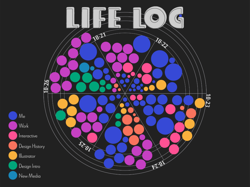
5:00 – 6:00 PMI worked on my Blog Assignment #3, deciding how to present the data collected during the week
6:00 – 7:00 PMI worked on a presentation about the Art Nouveau movement (Design History project #2)
7:00 – 8:11 PMI had dinner, did the dishes, and brushed my teeth
8:11 – 10:08 PMI worked on the visual proposal for my Blog Assignment #3
10:08 – 11:59 PMI brushed my teeth and went to bed
October 24
00:00 – 5:30I slept
5:30 – 5:50I woke up, made the bed, and brushed my teeth
5:48 – 6:45I practiced meditation
6:45 – 7:45I worked out
7:45 – 8:00I cooked my breakfast
8:00 – 8:40I took a shower and got ready for school
8:40 – 9:00I walked to school
9:00 – 9:19Review the categories of San-serif and serif fonts
9:19 – 10:00Each table found one example of a piece of media that in some way illustrates a value or belief that is present in our contemporary culture
10:00 – 11:02Each table presented their examples
11:02 – 11:12Break
11:12 – 12:01Lecture about graphic design in the modernism era, focussing in the Japanese influence
12:01 – 12:45I had my breakfast
12:45 – 1:15 PMMeeting with my group to discuss our progress in the Art Nouveau presentation
1:15 – 1:25 PMMeeting with Gabriel to talk about the progress of the Art Nouveau project
1:25 – 2:00 PMUploading my information about the Graphic art in the Art Nouveau to the slides
2:00 – 2:10 PMI talked with my mom
2:10 – 2:43 PMI worked on my sketches for project #2 of the Illustrator class 
2:43 – 4:23 PMI worked on my sketches for a logo I am designing for Project #3 for Intro to Design class
4:23 – 4:33 PMI went home
4:33 – 5:20 PMI had my lunch. I brushed my teeth and I got ready to go to work
5:20 – 6:00 PMI went to work
6:00 – 10:30 PMI worked
10:30 – 11:15 PMI went home
11:15 – 11:59 PMI got ready to go to bed + I slept
10-25
00:00 – 5:45I slept
5:45 – 5:55I woke up, made the bed, and brushed my teeth
5:55 – 6:30I practiced meditation
6:30 – 7:15I worked out
7:15 – 7:30I cooked my breakfast
7:30 – 7:50I took a shower and got ready for school
7:50 – 8:40I worked on my sketches for a logo I am designing for Project #3 for Intro to Design class
8:40 – 9:00I walked to school
9:00 – 10:20We presented our project # 1. Each person explained the process, and we gave feedback to each other
10:20 – 10:35We had a break
10:35 – 11:31Jason did a presentation showing the width shape tool, curvature tool, and blend tool in Illustrator
11:31 – 12:15I had breakfast
12:00 – 12:45I had my breakfast
12:15 – 1:29 PMJason did a presentation showing the rotate tool in Illustrator
1:29 – 2:50 PMI worked on my sketches for a logo I am designing for Project #3 for Intro to Design class
2:50 – 3:00 PMI went home
3:00 – 4:30 PMI worked on the website of the Yale School of Art
4:30 – 5:20 PMI had my lunch. I brushed my teeth and I got ready to go to work
5:20 – 6:00 PMI went to work
6:00 – 10:30 PMI worked
10:30 – 11:00 PMI went home
11:00 – 11:59 PMI got ready to go to bed + I slept
October 26
00:00 – 5:30I slept
5:30 – 5:40I woke up, made the bed, and brushed my teeth
5:40 – 6:30I practiced meditation
6:30 – 7:00I worked out
7:00 – 7:20I cooked my breakfast
7:20 – 7:40I took a shower and got ready for school
7:40 – 8:00I walked to school
8:00 – 9:00I worked in the Info Central office at the SCC. I replied to the emials and the voicemail messages
9:00 – 9:30Jill did a presentation explaining what we will do during class. She showed how the project progression would be.
9:30 – 10:15We worked in groups to define the mission of the Third Place books and the audience for the place. Then we worked in pairs, sharing our sketches and choosing just one to move forward.
10:15 – 10:30We had a break
10:30 – 10:40We define the client combination, the tone, and the designer tools used 
10:40 – 11:00Jill explained what the next process in the logo design was and taught us how to find the heart of the story in our logos
11:00 – 11:49We did the second round of sketches. We choose one to move forward
11:49 – 12:15We shared our new logo with the table to talk about opportunities for improvement
12:15 – 12:45I had my breakfast
12:45 – 1:55 PMI talked with my dad
12:55 – 1:15 PMI worked on project two of the design history class: I chose two vinyl covers to redesign
1:00 – 2:00 PMI did more sketches for the Third Places Books’ logo
2:00 – 4:30 PMI worked in the Info Central office at the SCC. I did a round around the BE and the SAM buildings checking the info central board and posting some information on them
4:30 – 4:40 PMI went home
4:40 – 5:20 PMI had my lunch. I brushed my teeth and I got ready to go to work
5:20 – 6:00 PMI went to work
6:00 – 10:30 PMI worked
10:30 – 11:00 PMI went home
11:00 – 11:59 PMI worked on my Blog Assignment #3, and I posted the blog on my website

My First Music Poster :)

Last week, I was given a challenging assignment for my New Media class at Seattle Central Creative Academy. The task was to design a poster that would promote “The Empress of’s” performance at the “Capitol Hill Block Party” festival, and the twist was that I had never designed a music poster before.

Who is Empress of?

First, I would like to share some information about the artist Lorely Rodriguez, “Empress Of.” She is a singer, songwriter, musician, and record producer based in Los Angeles. Her outstanding abilities and distinctive approach have significantly impacted the music industry. She has released three albums so far: “Me” in 2015, “Us” in 2018, and “I’m Your Empress Of” in 2020.

Empress Of’s debut album, “Me,” includes the song “Standard“. In 2018, she released “Us,” and continued to collaborate with other artists, contributing to DJDS’ “Why Don’t You Come On” and a cover of Lana Del Rey’s “Love“. In 2020, Empress Of released “I’m Your Empress Of,” featuring the single “Give Me Another Chance“. Notably, she founded her record label, Major Arcana, allowing her to release music independently.

The Design Process

This assignment was a completely new experience, and I felt excited and nervous about it. I aimed to create something that would stand out and accurately reflect the essence of the festival. To help me achieve this, I drew inspiration from this year’s festival poster. I aimed to maintain the same graphic style, including the color scheme and typography, to maintain the festival vibe.

My goal was to highlight the “Empress of” herself. To achieve this, I selected a photo of Lorey and used Photoshop to add lovely shades of pink and magenta. This gave the poster a burst of color that immediately drew attention to the main attraction. For the background, I used another photo and a bit of repetition to create an aesthetically pleasing canvas.

To complete the project, I focused on the typography. I used Illustrator to accurately replicate the text style featured in this year’s festival lineup promotional poster. I aimed to create a poster that seamlessly integrated with the festival’s visual identity, making it feel more cohesive.

I stepped outside my comfort zone and enjoyed creating a visually appealing music poster.