Captain’s Log
Star Date: 10.18.2023
According to the Info Density/Audience graph that was presented by Joe Hallock, I would most likely want to be somewhere in the middle of the graph (with some projects to the bottom-left of the graph and then some to the top right).
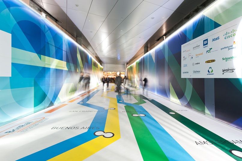
As an aspiring graphic designer, I’ve wanted to professionally get into a field where visual arts and graphic communication meet: like environmental graphic design. It has been my understanding that environmental graphic design would be designing a space (e.g. a retail pop-up or a museum exhibit) where the walls, the fixtures, and a lot of the space is curated to create a certain atmosphere or experience. This would include wayfinding. On the graph, I would consider this pretty close to the center of the graph (near where the example of “Museum Exhibit” is labeled) and would include the bottom-left part of the graph as well (near where “Road Signs” is labeled).
On the side of my professional career, through freelancing, I’ve wanted to make event posters for my friend’s/community’s events. This would be closer to the center of the graph and to the right (as the posters would be for a specific audience).
I would also aspire to donate my time and skills to various organizations or non-profits that may need event posters, visual design, infographics, and/or various things. Maybe for protests or for fundraising. Depending on the organization and the time I can invest/donate, I’d love to be apart of a cause that is dear to me.
After graduating from the program, I suppose I’ll see what sort of jobs/careers are actually available; it’s also possible I won’t be able to get into the career I desire until I’ve gone through enough positions to build the necessary résumé/portfolio. But for now, this is what it’s looking like.
