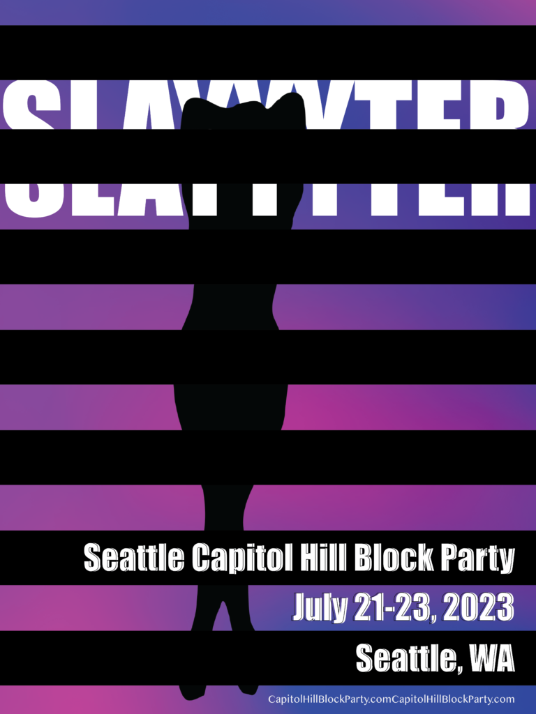
I created a band power for the artist Slayyyter.
When I researched about her, I felt she might vintage type things because her music videos look like they were filmed in the style of the 2000’s.
Her album jackets and music videos also emphasized her body.
I listened to several songs and I wanted to use gradations color for background because I thought gradations color matched with her. But I didn’t want to use over 4 colors, so I chose only 2 colors for the title and contents. And I used woman’s silhouette because I was influenced by her albums and videos.
An image of blinds was placed in front, so that the silhouette and the singer’s name could be partially seen. I think this can provide curiosity to people.