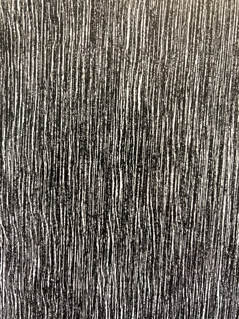
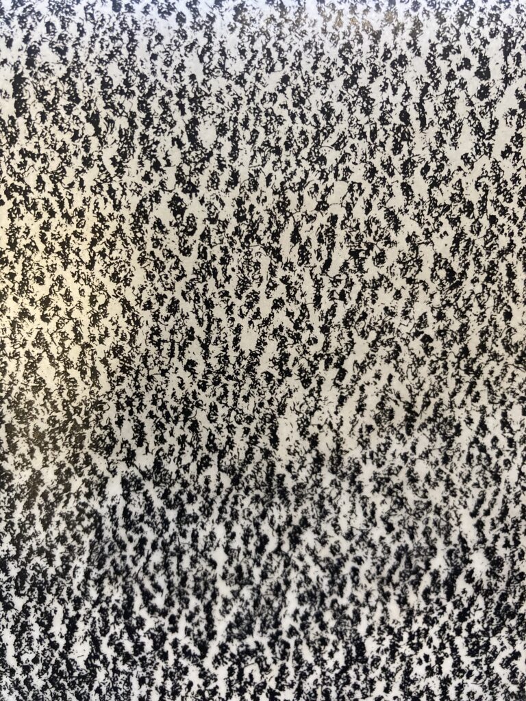
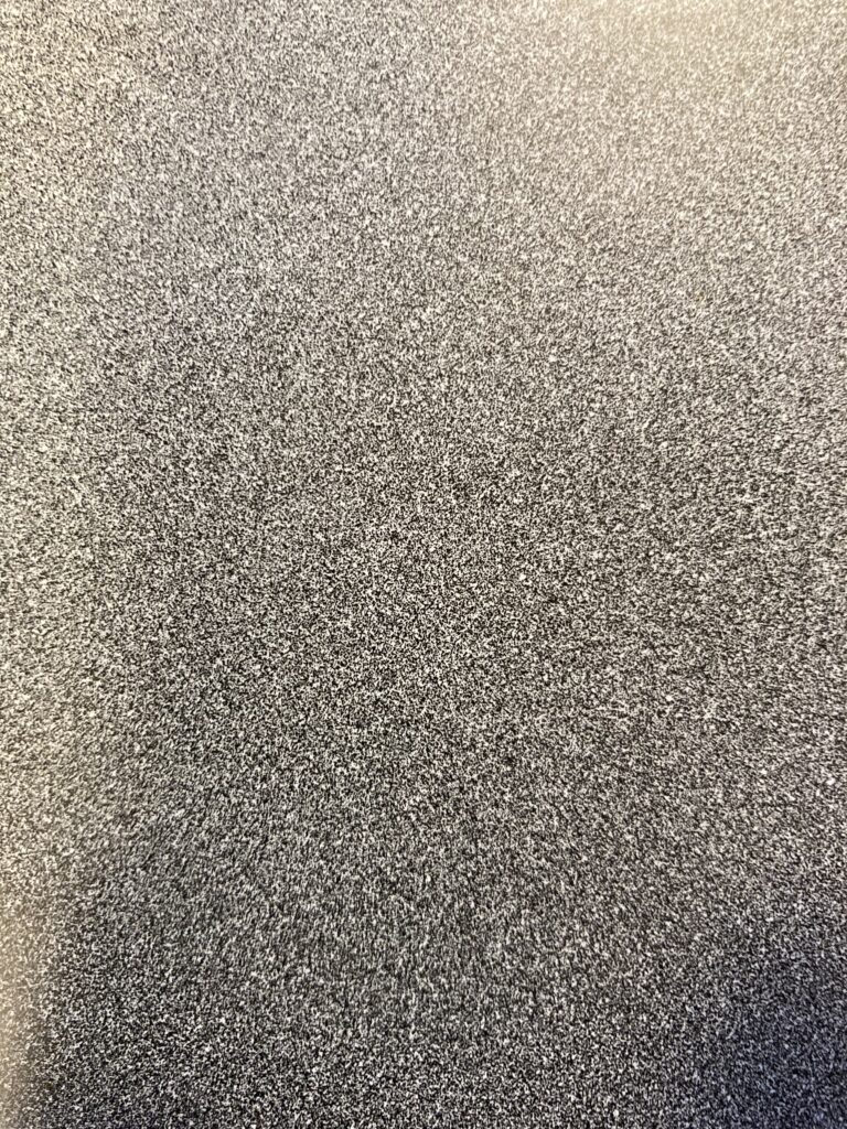

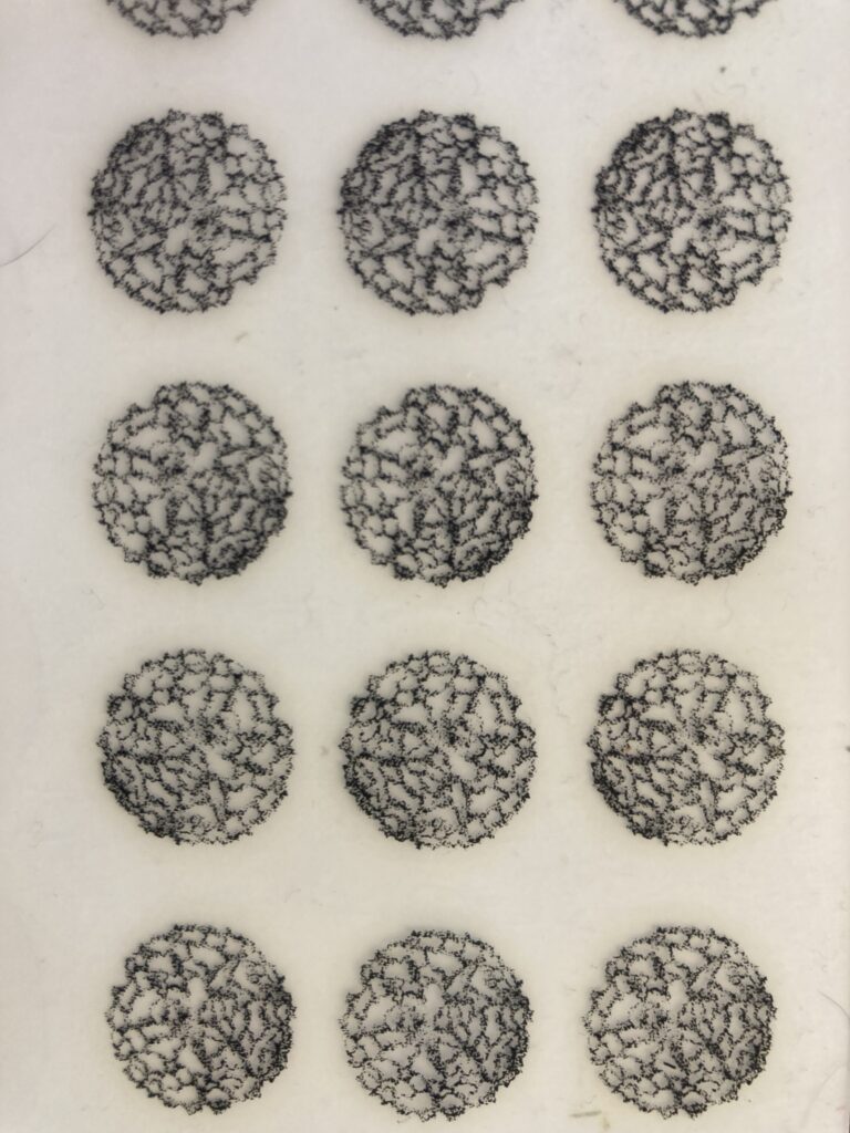

For today’s blog assignment we have been asked to upload photos of textures, patterns and/or shapes we find inspirational. I decided to dig into my Letraset/Zip-a-tone archive for this one. Textures, patterns and shapes abound. Using tactile design tools brings me joy. I amassed a collection of Letraset rub on transfers some years ago after initially discovering a few sheets at thrift store. I mostly have typeface sheets, but I have one box full of textures, dot tones, and image based transfers. I also just love looking through the typefaces. Holding a physical object made specifically for design is inspirational to me.
I am a cartoonist, and Zip-a-tone textures and dot patterns are fairly common in comics. I remember wondering how these patterns were achieved when reading Marvel books as a kid. Katsuhiro Otomo’s Akira is filled with Zip-a-tone digital camo as there are a lot of soldiers in the series. I love the pages that have a ton of soldiers marching. They got a lot of mileage out of those camo sheets.
My first artistic love was punk rock. Letraset played a big part in the design aesthetic associated with punk. Raymond Pettibon’s Black Flag show flyers are particularly dear to me. He used Friz Quadrata rub on letters for a lot of his work and composed the black flag logo using four letter Is. Letraset isn’t the easiest thing to use. The letters crack, warp and bend all the time. There’s a lot of room for human error. These common imperfections made it the perfect vehicle to communicate punk’s aesthetic.
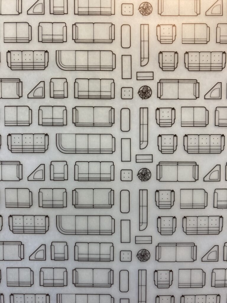
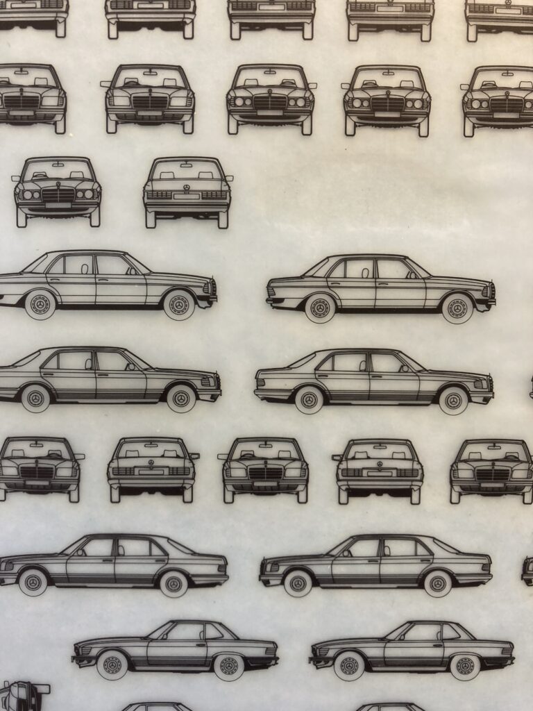
Adding greyscale to images using dots is cool, but what I really like are the crazy patterns and textures found in some of these sheets. I also have some image based sheets mainly used for architectural diagrams. I like using the repeating images to form patterns. In the past I made collages using repeating images by collecting stacks of grocery store or office supply ads and cutting the same image out of each ad. Rub on transfers provide me with the same kind of repeating imagery with less waste. That being said, I covet these sheets. There is a finite amount of them in the world and they can be expensive. They were made to be used and I use them, but once I finish a sheet there is a strong possibility I will never find another one.