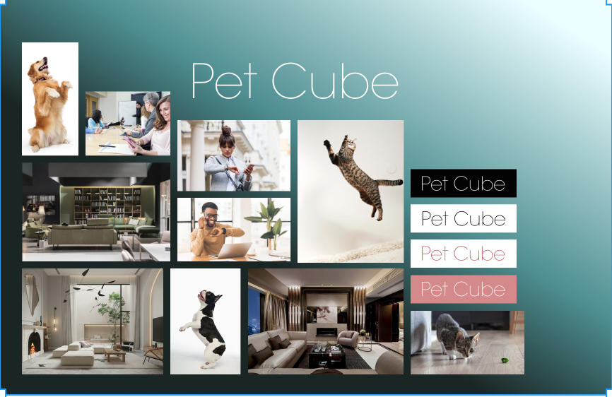
Hello and welcome to the blog. I’m here today to talk to you about our branding strategy for Pet Cube. Pet Cube allows busy pet owners to check in with their pets via webcam. You can check in on your pet from anywhere, talk to them, and even toss them treats at customizable distances! With that in mind we’re targeting the busy professional with expendable income who loves their pet, but just isn’t able to spend as much quality time with them as they’d like. As you can see from our mood board we’re planning to use imagery that is relatable to our target demographic: Energetic pets in sleek modern homes interacting with Pet Cube. The marketing campaign will include Pet owners going about their busy day and checking in on their furry friends when they have a spare moment. For typography we’re going with the lightest weight of Avant Garde. It’s elegant, it’s readable and it’s legacy has carried over into a lot of fonts used to sell high end luxury merchandise. Our color options range from classic, high contrast black and white combos, and muted, metallic teals and blush pinks often associated with luxury products. You work hard, you deserve the best, and so does your pet.