Categories
Uncategorized

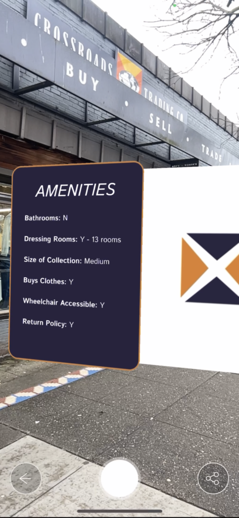
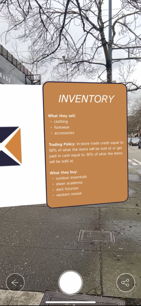
Crossroads Trading AR Panels

Point of Interest: Thrift Stores

How I created it: Our group set up a shared Figma file to work on our panels simultaneously so we could supply the same type of information to the viewer of our panels. Then for the GIF in the middle panel, I recreated Crossroad’s logo in Adobe Illustrator and laid out 20 art boards with the triangles of the logo moving away from center and then back to center. I exported those art boards out of Illustrator and then imported them into photoshop and used the frame animation feature to create a GIF.

Assets: Panels are png files and animation is a GIF file.

Video of Panels in Action:

Categories
Uncategorized

Blog Post #3 Game Review

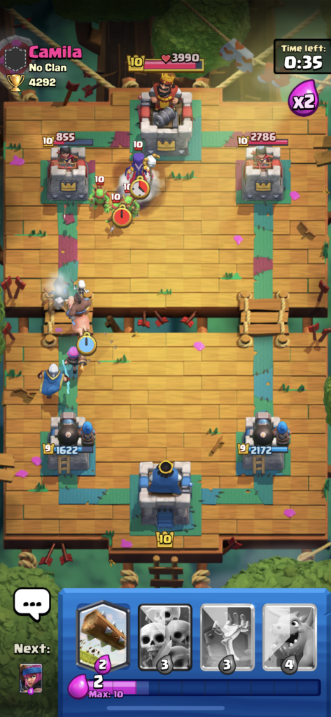
Clash Royale (image to the right)

Clash Royale is a free mobile tower defense game. You play against other players online in 1v1 or 2v2 matches. You deploy characters to the battlefield expending “elixir” which is always slowly recharging. You win by destroying your opponent’s main tower or by doing more damage to their towers when the time runs out. Its a game of timing, placement, and patience. I would say Clash Royale’s target audience is kids aged 10 all the way up to young adults who still like video games in general. This is the only remaining game on my phone because it is so good. What makes Clash Royale so great is the replay-ability, the variety of winning strategies, and how you can always get better especially as they add new characters. The fact that there is a pro Clash Royale league is a testament to how well this game was made. There is much to say about how well made Clash Royale is but what I personally like the most is how its free and its extremely replay-able and rewards you for getting better.

Categories
Uncategorized

Blog #2 Swiss Army Knife

Like a Swiss army knife, us designers have tools in our arsenal we use to be successful. Here I will be outlining what tools I currently have, what needs development, and finally the tools I don’t have that I want to learn to succeed after my schooling at SCCA.

TOOLS I HAVE

Visual identity design skills. I have the technical skills to create a full visual identity for a brand. That includes logo creation, color, type, packaging mockups etc.

Basic Figma app prototype design. I can use Figma to bring app screens from sketches to an interacting prototype. I have a good feel for flow, layout, and usability when creating an app as well.

TOOLS THAT NEED DEVELOPMENT (disclaimer: all of my skills could always use development)

Photoshop for photo editing. I know how to use a good amount of the photo editing tools in photoshop but I don’t know how to use them very well. I can’t create a beautifully warm photo that looks retro using photoshop yet but I would love to learn how.

Photoshop for cut outs. When selecting an object from a photo, especially if that object is human, its hard to perfectly select the object without leaving white residue around the object that you can see when the cut out object is on a new background. I can make an ok cut out but not super high-level.

Type modification. When creating logos using type, often custom or modified type is used. I am not confident at all in my type modification skills if the font isn’t made up of straight lines. So when it comes to modifying script fonts, I am in deep water so I would like to learn how to add an extra swoop or tail to a letter if you know what I mean.

SKILLS I WANT TO LEARN

Indesign. I do not know how to use Indesign what so ever. I know it can be used for large scale layout making and organizing of elements. I know that will be a useful skill to learn for magazines, and other print products.

Web Flow. Web Flow is a program used to create websites without having to code. I would love to be able to make high-level websites with Web Flow. There are so many fun designing to be done within websites that I would love to get involved in especially for my own website so Web Flow is definitely a program I want to become capable at.

3D modeling software. I am interested in industrial/product design and I would love to be able to bring something from sketch to a 3-d modeling software to a 3d printer one day. As well as using it to aid in designing furniture and architecture.
Categories
Uncategorized

Project 3 AR App UX Review

DSLR Camera App UX Review

Usability:

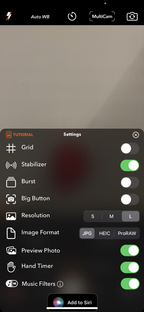
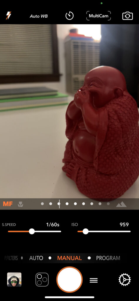
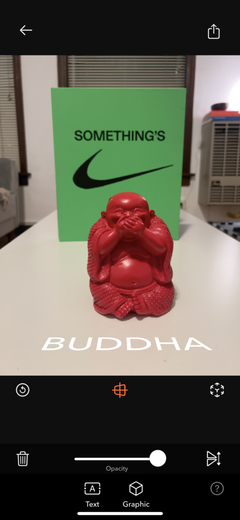
The usability was intuitive on the default mode of “auto” and the “manual” mode to its right. With just a swipe between these modes and ease of adjusting shutter speed, iso, and focus in manual mode, I give these features a high usability score. Then for more customizations for how you want to take your photo, you can hit the “settings” button which will pull up a menu with lots of nice features you can enable and disable. The UX felt mostly standard and familiar. Where I encountered troubles was when I was delving into the gimmicky modes the app has. You access these modes by pressing the hamburger menu where they are listed in that menu. I am not a fan of the hamburger menu here because you have no idea what the hamburger menu contains before hitting it. But in there, there are a bunch of gimmicky modes such as the AR Portrait mode where you are supposed to be able to take a photo and then place text between say the person you photographed and the background behind them and it uses the lidar of your phone to complete this task. When I tried this feature I simply could not figure out how to do that with the text. So the usability of the AR Portrait mode was not up to par as there was not enough explanation of its capabilities and how to use them. So overall, the UX is pretty good, just when moving on to the non-standard features that this app advertised heavily in the app store was clearly not given as much time energy and priority in this app than the standard features. So, in that case, I believe this app is not whole, it either needs to drop the special features or implement them in a way that they do not feel like an easter egg that you had to explore to find.

Categories
Uncategorized

Blog Assignment #1 (ai image generation)

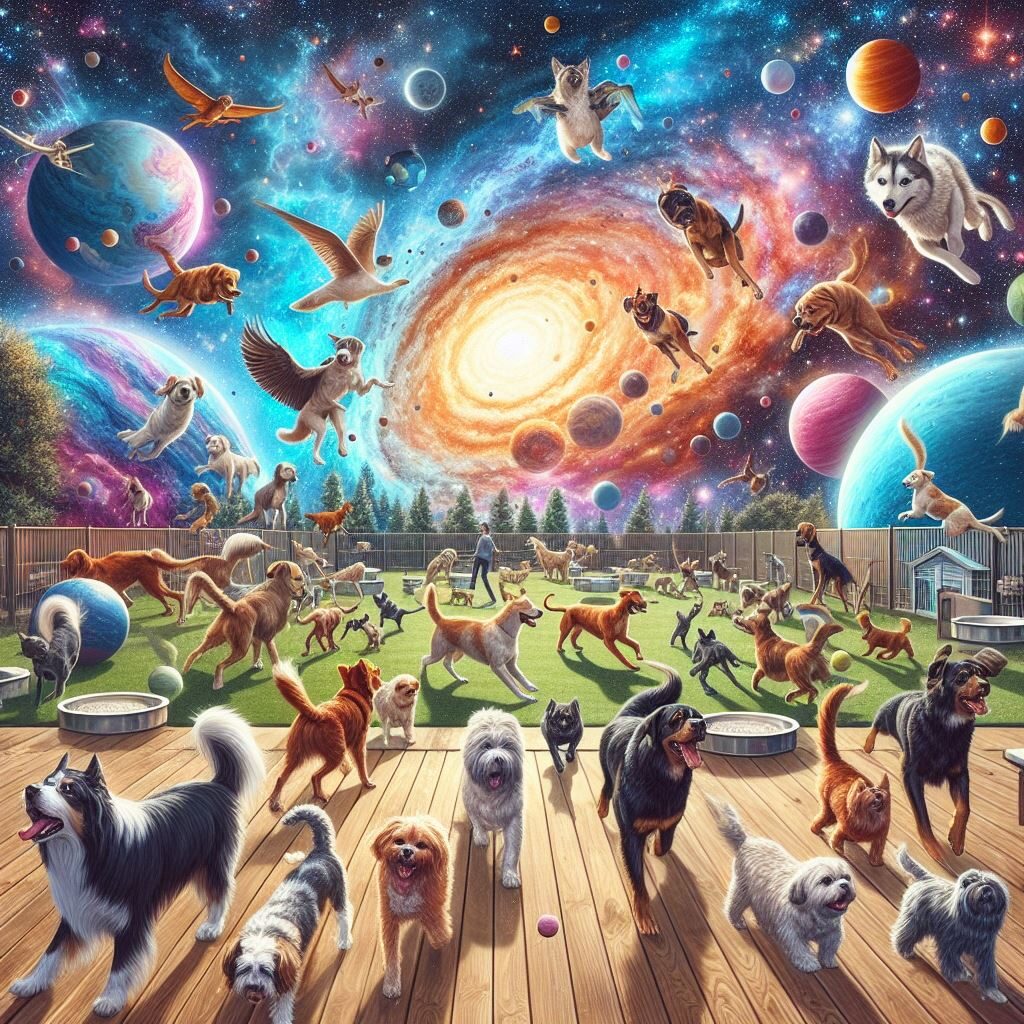
Prompt: Pet Friendly Interstellar Vacation

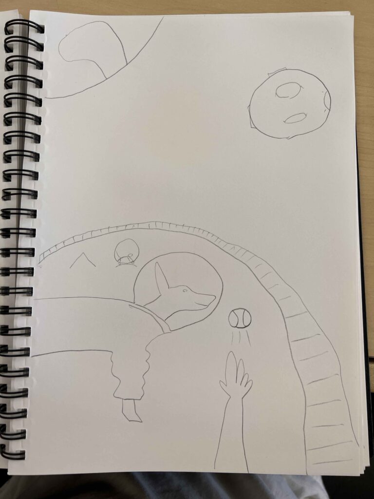
Description of What I Want the Image to Look Like: I want to create a dog park with dogs in space suits in space, with the moon and Earth in the background.

Sketch:

Ai Software: Microsoft Bing Image Creator powered by DALL-E 3

Generation 1, Prompt: “a dog park in space”

Prompt #2: “A dog park in space with earth and the moon in the background”

Prompt #3: “a dog park in space where the dogs wear space suits with earth and the moon in the background”

So Microsoft Bing’s Ai Image Creator exceeded my expectations. It was really easy to use, I just needed to connect it to my outlook account to get started. The images all were high quality at 1024 x 1024 pixels. You give the program a prompt and it created 4 options for you to choose from. Then, it gives you the option to download as a jpg, share, save, and customize. The download feature is super useful. I feel like I got pretty close to my sketch after prompt #2 but the dogs weren’t wearing space suits. So I added space suits in prompt #3 and it lost the layout of the dog park that I liked from 2 and changed it to a smaller one. But, all in all I believe it got pretty close and with further prompt edits, I could get even closer so I’m satisfied with my experience. What I don’t like is that there is really no control you have over what the software will generate, the image will be different every time and you can’t make edits to an image it already created for you. It’s a get what you get type of deal. My honest opinion about this kind of software is that I don’t like Ai generated images and I personally don’t want to use them even though this Bing Ai image creator is quite cool and surprised me.

Categories
Uncategorized

AR Poster

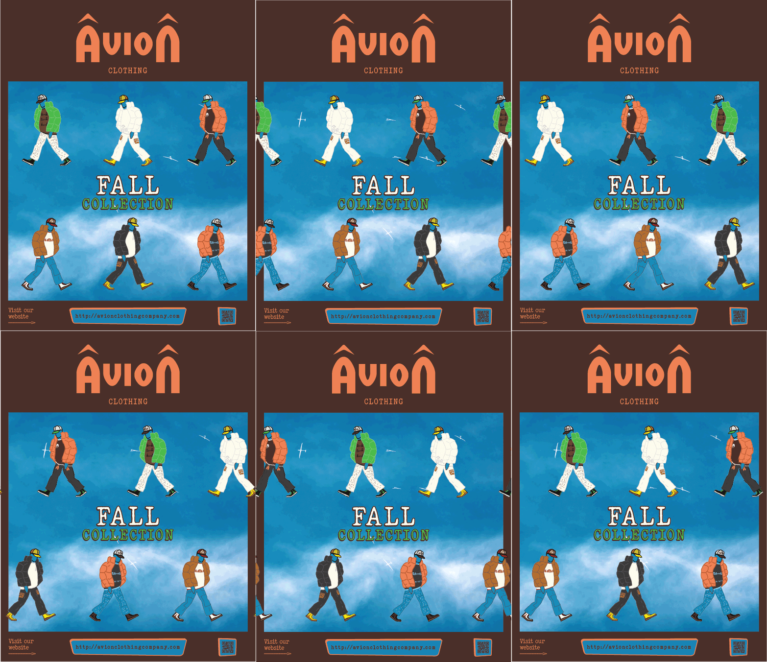
When learning about augmented reality posters, I tried to think of possible use cases for them. My mind went right to advertising posters you find on the street where adding an AR feature to them could liven them up and make them more fun. So, I decided to take an old portfolio project of mine where I created a series of advertising posters for a clothing brand I made up, and add some sort of movement to them.

I decided to add movement by putting the models on figurative conveyer belts that move in opposing directions in a perfect loop. I created a gif of this using Adobe Photoshop and Illustrator. First by making 17 art boards in illustrator moving each model half in inch in one direction until they complete one loop. First I only did 8 art boards but the final product was totally not smooth enough so I doubled the frames. Once I created the frames in illustrator, I threw them in photoshop and used the timeline feature to create a gif out of them. From there, I just had to give the EyeJack Creator app my gif and it was done and I was happy with the product.