Categories
Uncategorized

Blog Post #6 Super Bowl Commercials

Here are 5 Super Bowl commercials I watched

  • Lindt “Life is a Ball”
  • CeraVe “Michael Cera”
  • Dove “Adolescent Women’s Body Confidence”
  • He Gets Us LLC
  • Pringles “Chris Pratt”

My 2 Commercial Reviews

CeraVe “Michael Cera”

This commercial shows actor Michael Cera acting as a conventionally attractive model that skin care products typically use for their ads. Since Michael Cera is known to be nerdy and goofy, him acting as a sexy model adds a comedic element to the ad. Not only does this add a comedic element, it also broadens CeraVe’s demographic by basically saying skincare is for everyone not just to the most conventionally attractive people.

2 Pros

  • Funny and unexpected to see Michael Cera in a skin care commercial *engaging*
  • Increases inclusivity by using Michael Cera as a model

2 Cons

  • No attention given to a specific product or feature that makes CeraVe a special skin care brand
  • No information given to why CeraVe is an effective skin care product

He Gets Us LLC “jesUS”

This commercial is for a pro-Jesus campaign called “He Gets Us” where it just promoted Jesus to everyone. This commercial showed people of very different demographics washing each-other’s feet and at the end said Jesus washed peoples’ feet too or something like that. This campaign is to united people rather than divide and to show worshipping Jesus is not a discriminatory matter, its for anyone.

2 Pros

  • Shock and Awe: dramatic scenes of people you would never think watching each others feet.
  • Clear messaging at the end: after the slideshow of pictures completed text showed up on the screen explaining the inclusivity of worshipping Jesus and finding God.

2 Cons

  • No call to clear call to action, unsure whether its a movement I could donate/contribute to in any way.
  • There were multiple “.coms” listed at the end, so I was unsure where to go to if I wanted to learn more.
Categories
Uncategorized

Blog Post #4 Using the BAR Method

Background

The image you see on the left is the first draft of a logo I was developing for Third Place Books which is a bookstore in Ravenna. Third place books is a cafe and a bookstore in one place meant to be a place for people to stay while they’re away from home and off of work. So the goal for their new logo was to evoke a welcoming yet upscale feeling while using imagery that communicates the selling of books and coffee. 

Actions

First I filled a notebook page with logo sketches and picked 3 of the strongest ones and with further review with my classmates narrowed that down to one. I then digitized that sketch which is the image to the left. There are books and coffee cups, even 3 books to tie in with the name of the establishment. But what was missing was the welcoming attitude, the corners were sharp and there was a general lack of character. I struggled to iterate further on this version of the logo. Then, after watching a video my professor Jill recommended, I learned to not think so literally and to focus on feeling instead. I decided to then step back and take a whole new direction. I began in Illustrator this time instead of in the sketchbook. I somehow quickly stumbled upon a few iterations that looked very similar to the version you see on the image on the right. Playfully tilted coffee cups in front of lively organized books. This iteration felt much closer to the welcoming yet upscale feel I was looking to find. I then took this new iteration to class and sent it through reviews and refinement until it looked like what you see on the right.

Results

After completing this logo project I learned a couple things about my design process. I learned that it’s not good to rush the sketching, ideating, and brainstorming phase. You do not want to try to force an idea to work because you think you have sunk too much time into it to pivot. Secondly, I learned to not think too literally and to generally relax more to let the ideas flow out of you instead of judging what you have not even put on the page yet. There is a zone that I found myself in when creating the winning idea that I was not in when creating my first sketches. A focused, clear, and free mind is required to create quality ideas and through this project, I have learned what this zone is and how I can enter it.

Categories
Uncategorized

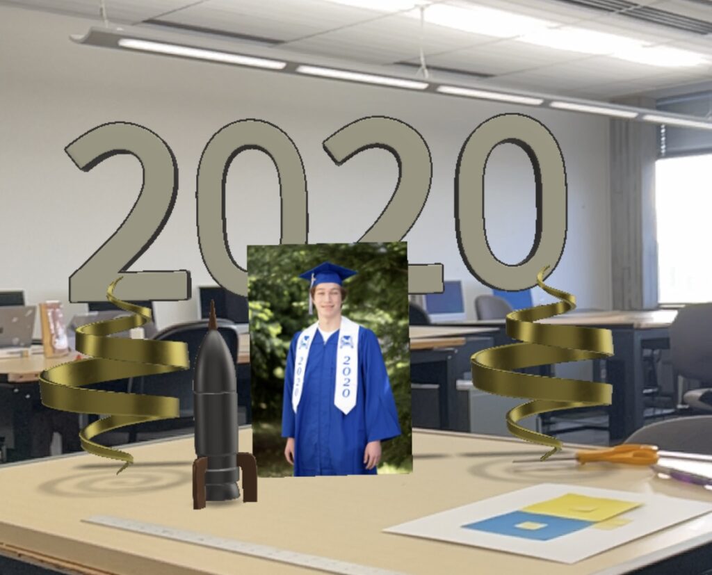
Adobe Aero AR Graduation Card

For this assignment we used Adobe Aero to create a augmented reality version of a card with at least two elements the user can interact with. I chose to create a graduation card for my own graduation of high school. The ribbons on the left and right both spin in place infinitely on opening the file. Then, the 2020 once tapped, moves up while scaling up then moves back down while scaling down. Finally, the rocket once tapped spins with moving up to represent where my future is heading. I had difficulties trying to do what I wanted to do though. I imported text from Adobe Illustrator as png’s that said “happy” and “Graduation” and they worked when building the scene, but once I actually played the card through the Aero app, the text disappeared. I could not figure out how to fix that issue so I was forced to ditch the text. At least the rocket works well!