DSLR Camera App UX Review


Usability:
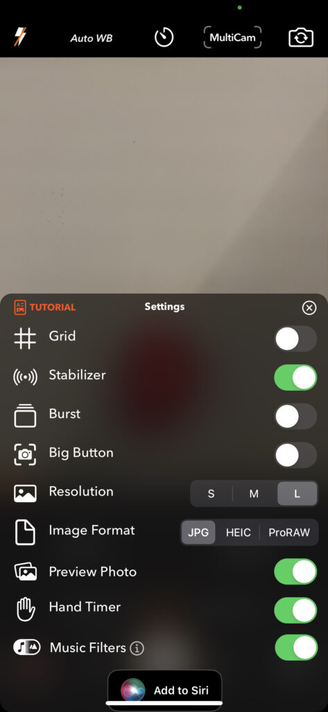
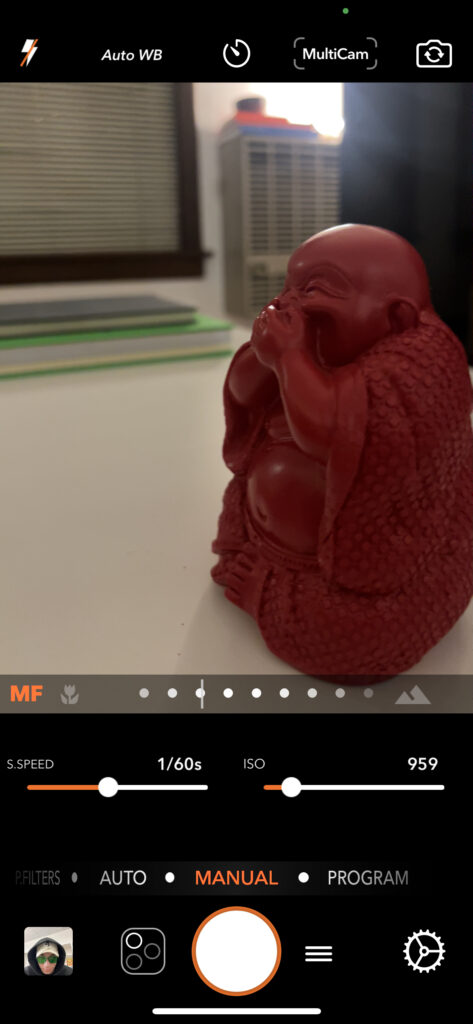
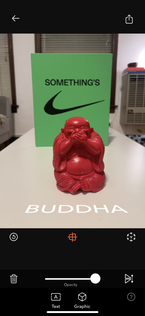
The usability was intuitive on the default mode of “auto” and the “manual” mode to its right. With just a swipe between these modes and ease of adjusting shutter speed, iso, and focus in manual mode, I give these features a high usability score. Then for more customizations for how you want to take your photo, you can hit the “settings” button which will pull up a menu with lots of nice features you can enable and disable. The UX felt mostly standard and familiar. Where I encountered troubles was when I was delving into the gimmicky modes the app has. You access these modes by pressing the hamburger menu where they are listed in that menu. I am not a fan of the hamburger menu here because you have no idea what the hamburger menu contains before hitting it. But in there, there are a bunch of gimmicky modes such as the AR Portrait mode where you are supposed to be able to take a photo and then place text between say the person you photographed and the background behind them and it uses the lidar of your phone to complete this task. When I tried this feature I simply could not figure out how to do that with the text. So the usability of the AR Portrait mode was not up to par as there was not enough explanation of its capabilities and how to use them. So overall, the UX is pretty good, just when moving on to the non-standard features that this app advertised heavily in the app store was clearly not given as much time energy and priority in this app than the standard features. So, in that case, I believe this app is not whole, it either needs to drop the special features or implement them in a way that they do not feel like an easter egg that you had to explore to find.