Categories
Uncategorized

Assignment #3 . Spring 2024.

If I would have $25,000 of spare cash on hand I would choose Cancer Pathways Non – Profit Organization in Seattle, WA.

This topic is close to my heart because my mom was diagnosed with cancer when I was 8, and she died when I was 13.

Cancer Pathways Organization helps people with cancer. When someone is diagnosed with cancer, it touches not only that person, but also everyone around them. Programs are designed to educate and empower anyone  – including youth, teens, young adults, survivors, caregivers, and others! This non Profit Organization  provides programs at no cost because of the generous support of their donors.

As a child who had parent diagnosed with cancer, it influenced my life forever and my childhood memories.

My Mom was diagnosed with 4 stage breast cancer. And I wish people in Ukraine have more resources of aducation about cancer, and also have more resources to prevent or diagnose cancer on early stages.

I think people who is fighting cancer need tone of support, financial, emotional as well as family of a person who fights cancer.

having my mom being in a hospital for the 5 years she was fighting cancer before it took her life took my time spanding with her. I dont remember much happy time with her and family together. My father was very supporting . he was fighting for her life. It taught me the sense of famaly and relationships I want for myself. Having partner and husbent who will be supportive in any situation in life. Because life is not always about being happy and having all put together. Sometimes unfortunate events happened and you have to deal with the new reality.

I remember my mom loosing her hair, and crying and going through a lot of pain and desperation. As a kid for me it was very painful experience. I wanted to help and I did not know how.

As a person who had a family member died from cancer it is a 50 % higher risk of a cancer. So i need to m,ake sure to check my health more often and be on top of things regarding to this topic.

I always wanted to help people who fights cancer and espessialy kids.

I feel happy that non Profit organizations like this exists.

Thank you.
Categories
Uncategorized

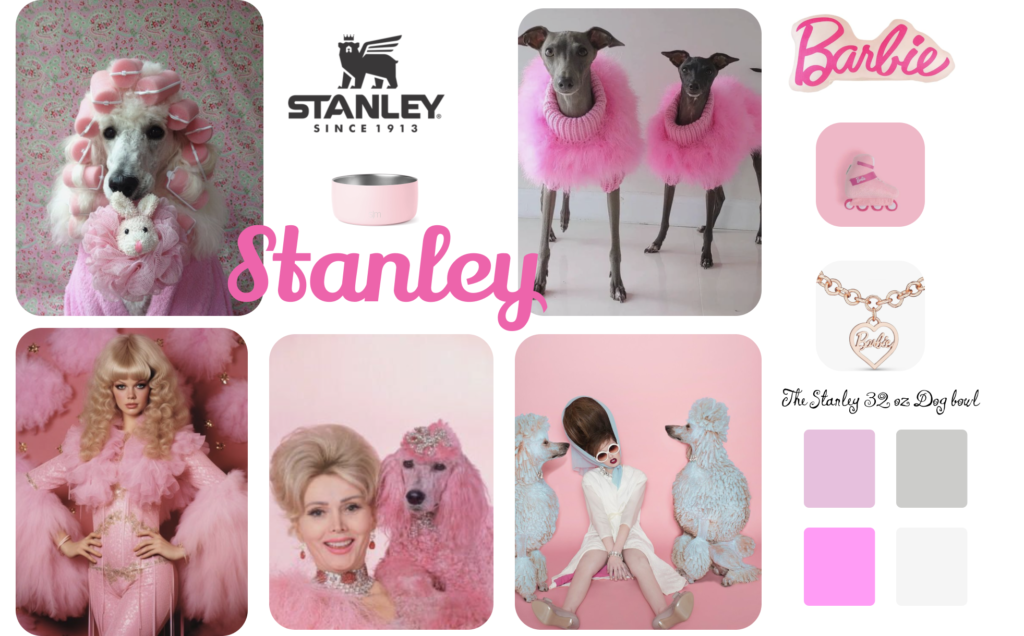
Blog assignment #2 Spring quarter .Stanley

The Stanley 32 oz Dog bowl

For a Barbie-style mood board inspired by a trend movie in 2023, wanted to incorporate pink colors, vintage style, nostalgic and beverly hills housewife vibe:

  • Vintage Color Palette: soft, muted tones like dusty rose, antique gold, faded teal, and creamy ivory as the foundation for my color palette. These colors evoke a sense of nostalgia and elegance.
  • Barbie Elements: subtle Barbie elements such as silhouettes of Barbie dolls or iconic Barbie accessories like high heels, bows, or pearls. These touches will infuse the photoshoot with a hint of playful femininity.
  • Dog with a colored hair: for the actors, we can use pet safe die color to make the dog hair colorful.
  • Accessories: vintage-inspired accessories like antique keys, pocket watches, or ornate frames to frame the dog bowl designs and tie the theme together. These accents will enhance tghe photoshoot vintage charm.
  • Backdrop: using a vintage-inspired backdrop such as faded floral wallpaper, or lace fabric to set the scene for STANLEY photoshoot will reinforce the nostalgic atmosphere.

Thank you:)

Categories
Uncategorized

Blog Assignment #1 Spring Quarter 2024

I visited 3 of the folowing websites:

1. Google Material Design

2. Apple Human Interface Guidelines

3. Microsoft Fluent Design System

GOOGLE

In Google Material Design is the latest version of Google’s open-source design system, made for design and build beautiful, usable products with Material. In their Website I noticed:

  • The have structure of hierarchy from the left to the right. So on the left they have the Ikons for home, get started, develop, styles, foundation, blog, etc. For User experience that decision were made based that reader tends to read from left to right.
  • Google using the iconography to make it more interactive and visual , easy to read and navigate on the website.
  • They are using beautiful pleasing to eye graphic design images as well as repetitive sets of rounded squares, cards. Made the design feel unite and predictable, meaning you can notice they are using same set of styles
  • Google also let the user know that they have they sets of fonts and they have link which forwards you to the google font page.
  • The building blocks of all UI elements are very cohesive and good looking.
  • also they have their coding system explained.

APPLE

The HIG contains guidance and best practices that can help you design a great experience for any Apple platform.

On this platform my observation was:

  • The design on a website has a ot of room, and their information layout stay close to the center. I think because user vision constrain on the center first, so the use containers to constrain information in the center.
  • they use smaller boxes in their layouts, more like the actual ikons, it gives that feeling at list.
  • in comparison with Google, which uses more light color pallets and more soft, apple uses more vibrant color on their sets of imageries.

MICROSOFT. Fluent 2

Microsoft’s design system, enabling more seamless collaboration and creativity than ever. Move fluidly from design to development, between apps, and across platforms.

  • Using mix of vibrant colors in their images, giving you more interactive and engaging experience. The color palet on the imagery not consistent. But over all it make me feel excited, i like those images.
  • they have less body copy , information then Apple(Had a lot of text) which make it easy to get a sense of their product.
  • they also use containers to show all body copy more on the center vas well as a rounded corner windows/ layout boxes.