Author: Ty (page 2 of 3)

AR APP – UI/UX Review & Blog Assignment

So for my AR module I was to review and critique a AR or VR app or experience. I decided to bundle my review with my blog assignment on recording through a bit of a working process.
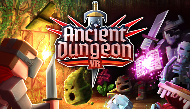
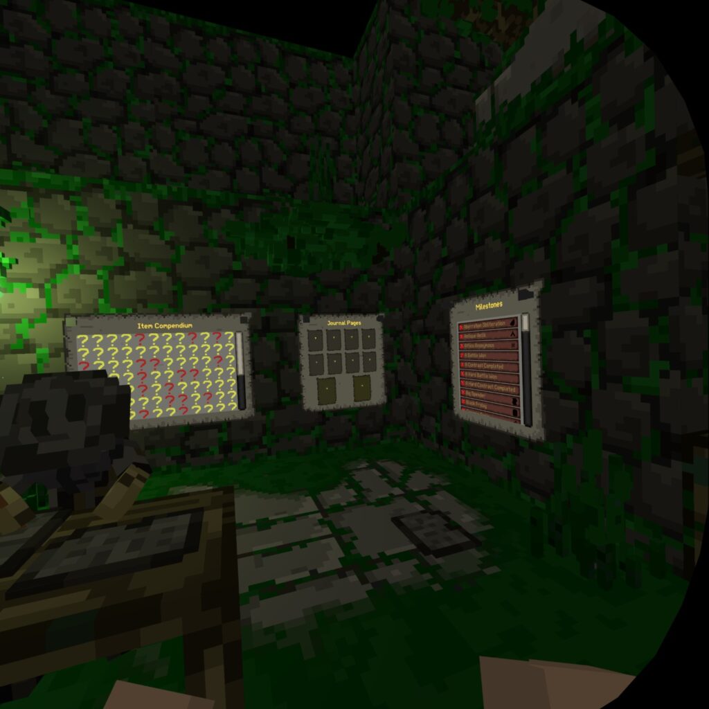
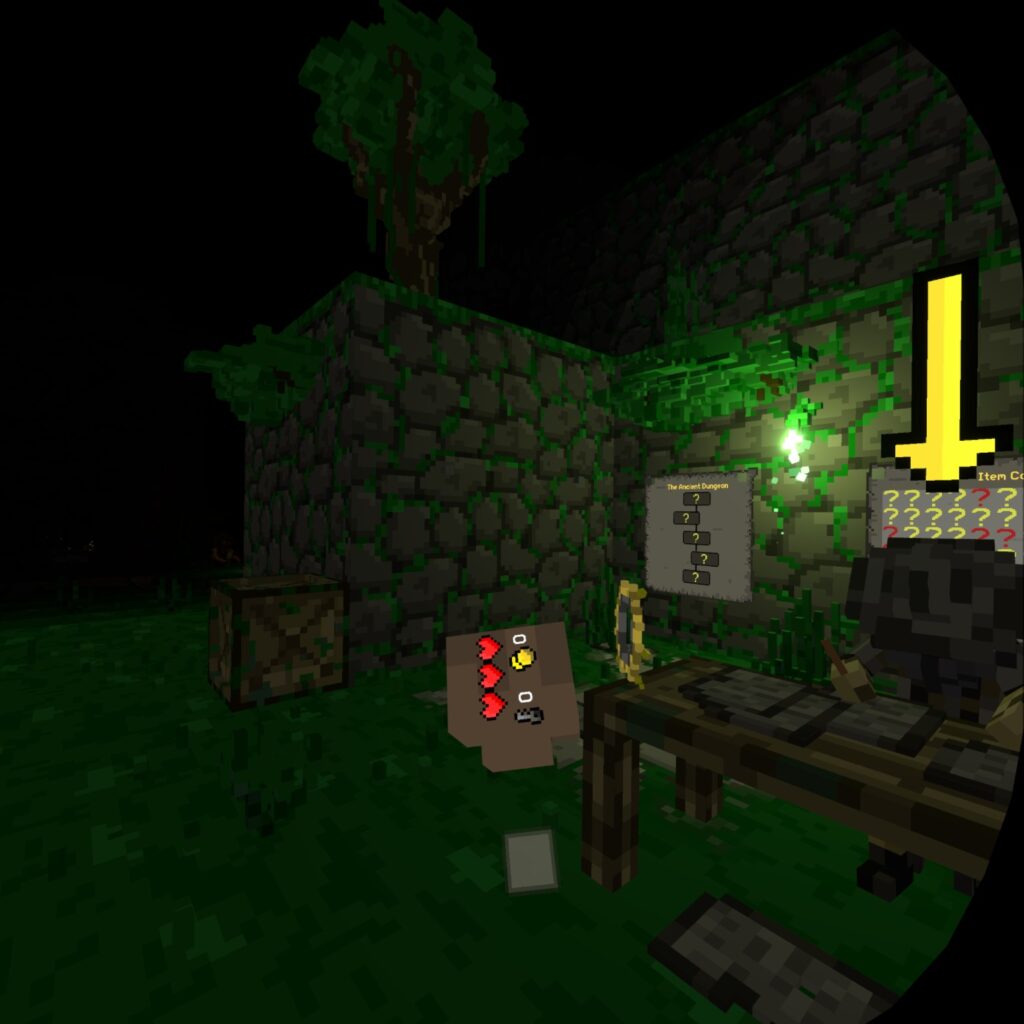
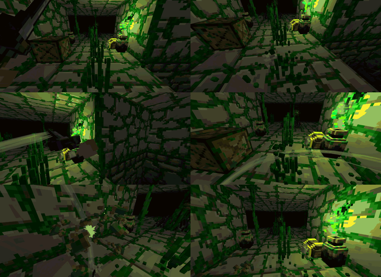
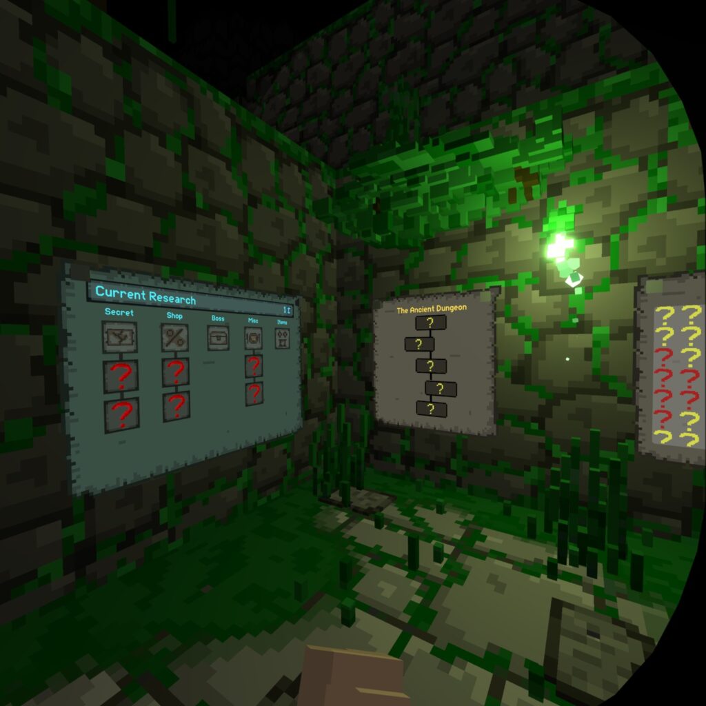
Ancient Dungeon, a rougelike VR game with a Minecraft aesthetic

Jumping in to review

So I started by looking at the games UI/UX elements. Everything was kept pretty minimal for a more immersive experience. In fact your health-bar is on your hand which is a bit unwieldly in the heat of combat so that should be added somewhere more visible like the bottom of the screen. Also the starting hub has information plastered over 3 walls you have to constantly turn your head back and forth to read the important information, would be much nicer on just one wall possibly.

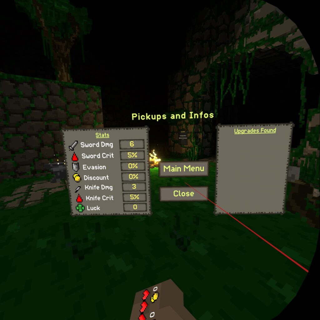
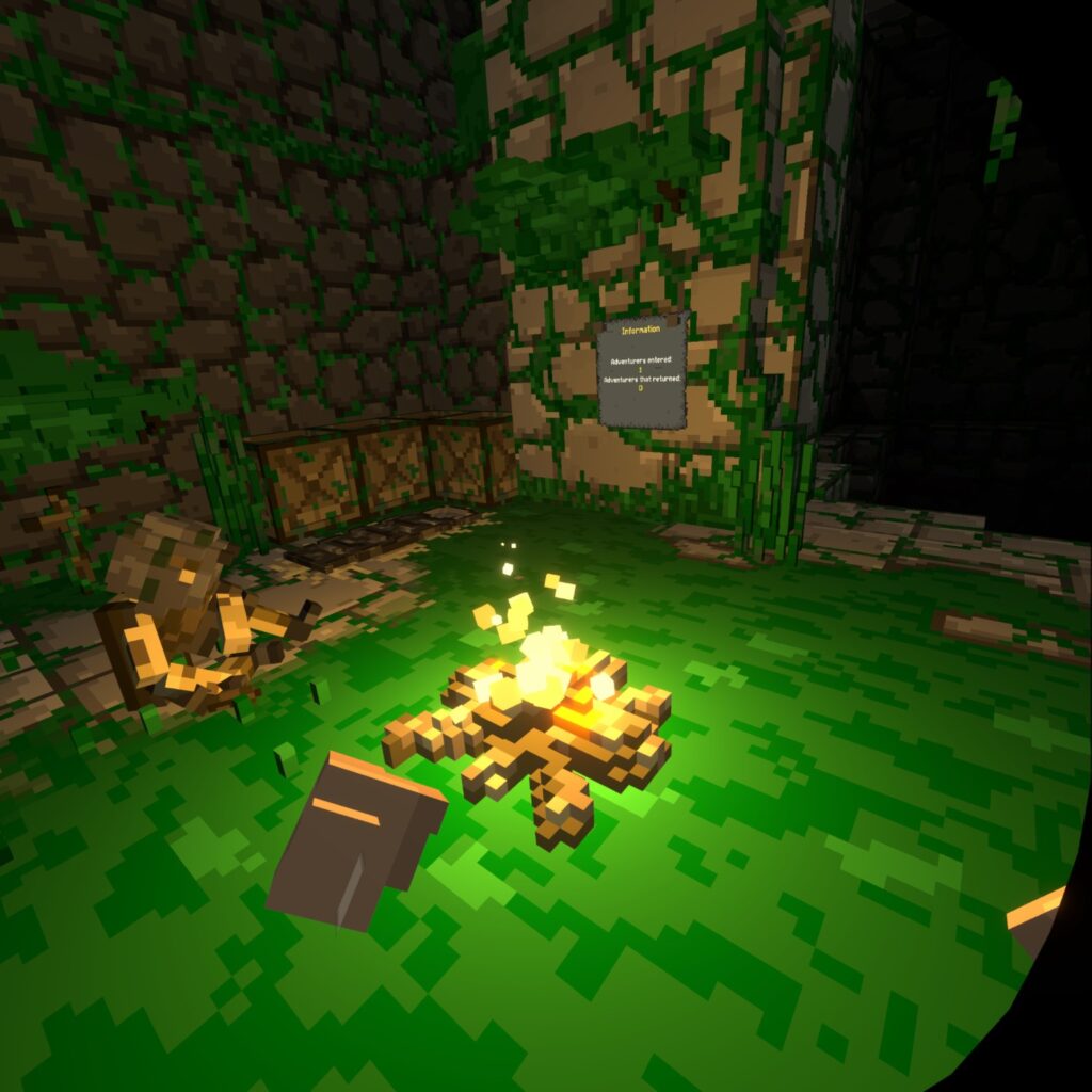
Its nice that there is a simple pause menu with relevant stats and inventory. Also the sign at the front gate tracking your runs is a good touch too. The game itself is super satisfying with everything being destructible in real time.

Small video progress

https://drive.google.com/file/d/1xayGTg8Op1B7-OAWkB1NucOelU5Xizh_/view?usp=sharing

Here is me going over a bit of the project as I work through it as per the blog assignment.
Shoes with Super Powers

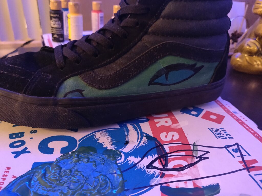
So for our next assignment we were to created a modified shoe with a super power for people who attend the Seattle Central Creative Academy. I chose to modify a shoe by painting it into the form of a dragon, advertising luck and fortune for those who wear the shoes.

WIP of the “DragonCoin” Shoe

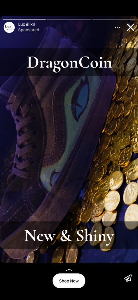
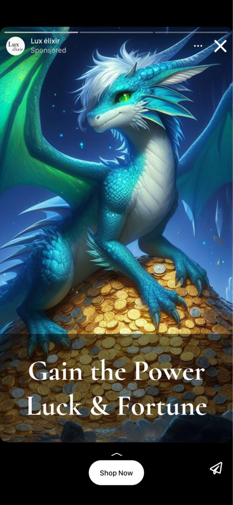
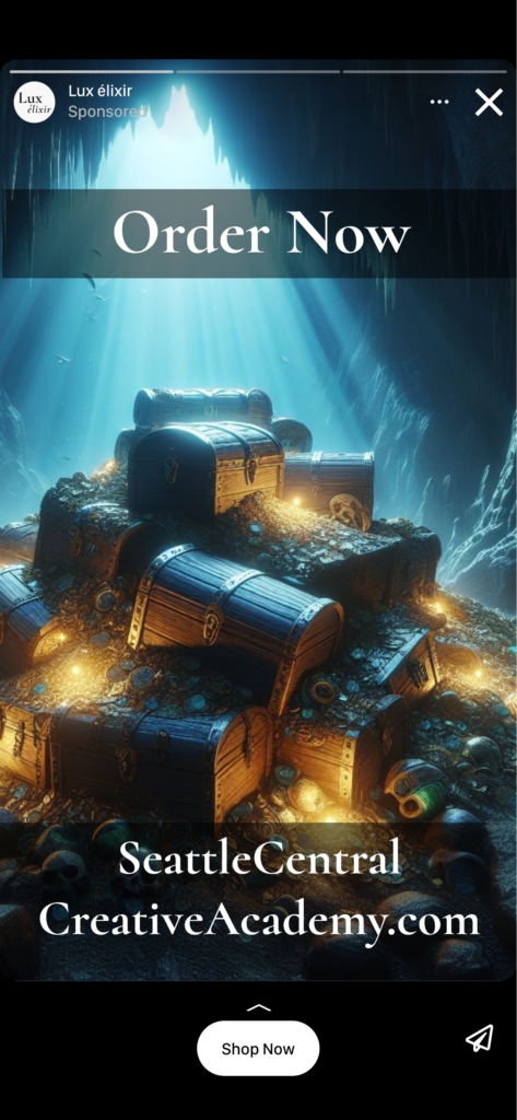
Here is the final result of my DragonCoin shoe set as it were an Instagram story ad. I ended up using photoshop and big AI to help fill in the gaps of the background to help display my shoe and make other random graphics for the 3 part ad.

Adobe Aero Project

My next venture into augmented reality was with Adobe Aero. It was an interesting experience for sure, full of frustration and funny moments too.

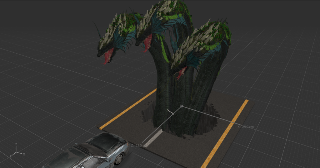
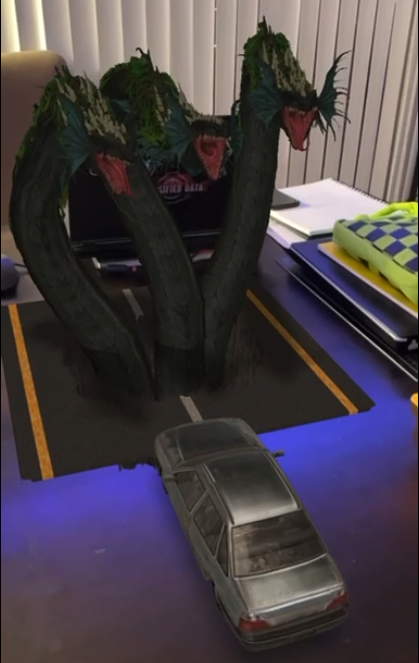
The Wyrm

Parsing through the pdf tutorial was pretty frustrating at first as there was a small glitch in the software concerning “back and forth” looping animations. Turns out you have to set the play value to 2 before “back and forth” became available.

After solving the problem with the glitch learning the software was pretty straightforward. (Thank you random youtube commenter!)

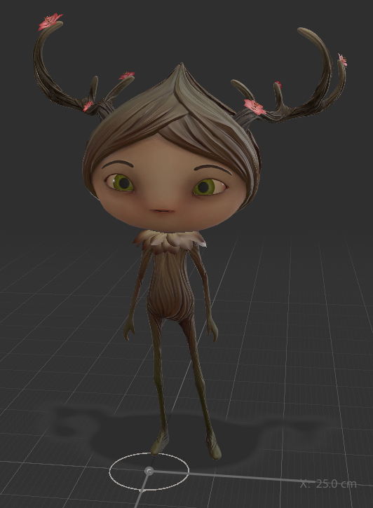
Strange stock things

I originally was going to use the stock animations and models that came bundled with the software but after looking at the creatures and people I decided on trying my hand at importing premade fbx files with animations. After watching a few videos and working out some file comparability issues I was able to bring in some interesting models and animations and just told a story with interesting things I could find.

After setting up my animations, triggers and movements I added the last part, the sounds and text. I had a pretty enjoyable time parsing through random stock sounds as some are pretty hilarious.

Overall the entire process was daunting at first but after getting into the flow the project was really fun and interesting to see things come to life from the digital world into our reality.

A Little Occult World

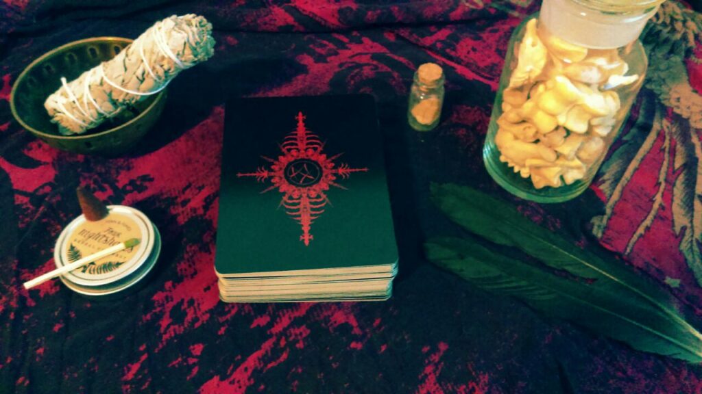
The Book of Azathoth tarot cards are a Lovecraftian inspired tarot card deck with hand drawn details. It is a very occult object and I wanted to clearly illustrate that through my photography showcasing a world of dark mystic mystery.

The deck itself is clearly the centerpiece of the composition. Sage is a classic occult tool used in many types of rituals and practices. Next is a small cone of dragons blood incense atop a container of nightshade balm. To the right is a small container of stone from my home, a large glass jar of assorted bones and a couple of crow feathers. I made sure to lay everything out on the very piece of cloth that a wrap around the tarot deck when not in use. The cloth itself is the remnants of a shirt given to me from a good friend long ago.

Every element in the picture was carefully chosen, all occult objects of mine that hold great sentimental value, not just things bought from the store but objects accumulated over time through friends and events.

AR Poster Project

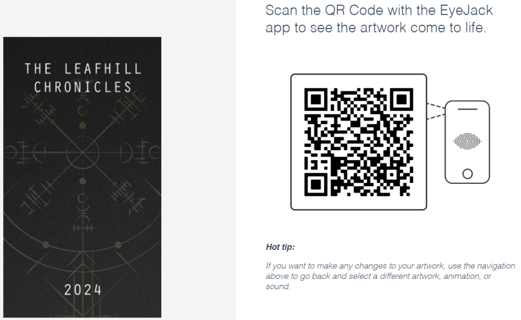
For this project I was to use the Eyejack app and create an animated poster. I’ve never worked with the Eyejack software before so it was pretty fun putting together a small video to showcase what Eyejack could do. The software works really well to seamlessly show off augmented reality.

How It came to be

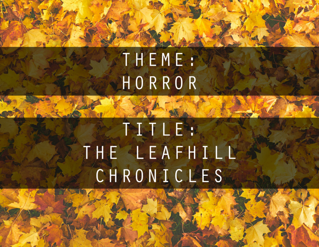
So for my poster idea I threw around a few concepts; a record album that transformed into a music video, a band poster that came to life with creatures and finally a movie poster that turned into an actual trailer. I ended up settling on the movie poster idea and went with my love of horror.

Creation Software

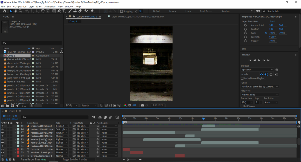
I can’t say I have too much experience with filming a project, so I went with what I knew for now, AfterEffects. The bulk of the video footage was done by me just using my phone. I convinced my friend Jaye to take on the brief role of the monster. After I got the raw footage done and into AfterEffects I started to really polish it up with royalty free music, sound effects, stock footage, photography and illustrations.

All wrapped up

Overall the project was really fun, working with my friends to put together something small and armature in a short horror trailer. I can’t say I ran into any problems other then just editing all my footage into something usable. The Eyejack app worked flawlessly and I have no complaints there. I do look forward to working with Eyejack again in the future.

Super Bowl Ads

I didn’t actually watch the Super Bowl but ended up viewing the ads on youtube.

Here is a list of the 5 ads I watched.

Paramount plus
Skechers
Doritos
Hellmanns
Oreo

Out of the ads the most interesting to me was the Paramount plus ad with the least interesting being the Hellmann’s ad.

The paramount plus ad promoting the app featured Star Trek’s Sir Patrick Stewart, Miami Dolphins quarterback Tua Tagovailoa, Nickelodeon cartoon “Hey Arnold,” Peppa the Pig and Drew Barrymore and Creed. The cast was trying to throw a rope up a cliff to get to the top while arguing to to throw Arnold.

Pro’s include the humorous banter between the cast and the nostalgic bump from everything including having the band Creed, which played at a past superbowl.

Con’s or things they could have improved on would be a quicker pacing and more lines from “Hey Arnold”

Hellmann’s mayo ad was Kate McKinnon with her mayo cat, a cat that can say mayo like a cat would meow. The story is she quickly grows to fame with her cat before the wave ends.

For the pros the story was flashy, quick and painted a picture well of quick rise to fame from a wave of popularity like a meme. 

The cons where they showed Kate eating mayo out of a jar with a spoon, raw which is disgusting and unforgivable. Also the whole story is pretty unfunny and cringe.

Personal Projects

Personal projects I would love to pursue when I get more time.

  • Miniature painting (Chaos Warhound)
  • Bloodborne cosplay
  • Fan music video
  • Promotional band posters
  • Character sculpting in zbrush
  • Clay sculpting figure statues
  • VR avatar & world creation
  • Music collaboration
  • Pickling project
  • Silkscreening

If I had to pick one personal project out of my brainstorm list I would go with a fan music video. I’ve had some ideas for music videos for awhile now I would love the extra time for a fan-made side project.
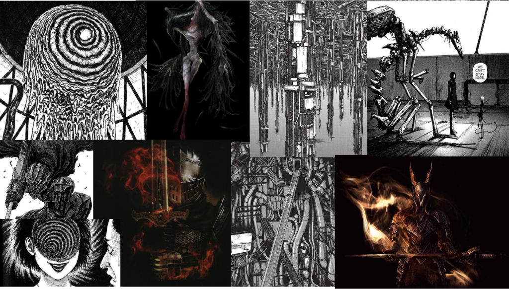
It would be a good experience for myself and my portfolio as I would gain more experience in Adobe AfterEffects, editing and animation. I would love to expand my skill set into simple animation in my videos. For my project I would make a dark dystopian far away future with slight fantasy elements style animation.

Here is a concept with moodboard elements of my potential side project.

Portfolio BAR

For my final AfterEffects project I made the fictitious brand Wild Wolf Grill. I would say I’m pretty proud of the final result of my video.

https://drive.google.com/file/d/1frluKVy4VXNkdhBDohZmLKZy8CKjwj0m/view?usp=sharing

The idea didn’t come to me easily at first. The possibility of using any type of advertising was pretty daunting. I have a love for animals so I knew I wanted to sneak in some type of animal.

It started with exploration, mulling around what type of advertisement I wanted for the project. I thought of all the restaurants I knew and flipped through their websites. After my initial exploration and deciding on a grill house style, I set out researching different grill commercial videos on Youtube, mainly the Outback Grill. I studied the typography placement and flow of the videos and how they were shot. The research gave me a guideline for my design. I wanted to incorporate wolves as the forced connection into the commercial and spent hours scrolling through stock footage.

After all my research and component gathering I went through AfterEffects and tied everything together with music, effects and text. The finished product came together nicely and was compressed before being shipped off to the google drive.

It seemed to be a popular video amongst my friends and family. I aimed to create a silly very over the top grill experience and the video usually gives people a good laugh. The creation of the video had an impact on me by showing me how fun editing and tying all sorts of elements together really was for me. The process felt natural and I hope to do more video editing with AfterEffects in the future.

The AfterEffects software had a steep learning curve at first, but after sticking with it and taking small steps I was really able to jump into the software and look forward to what I’ll make next.

Here to Slay Review

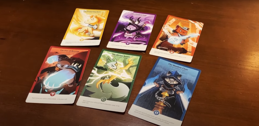
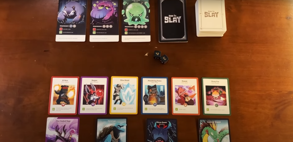
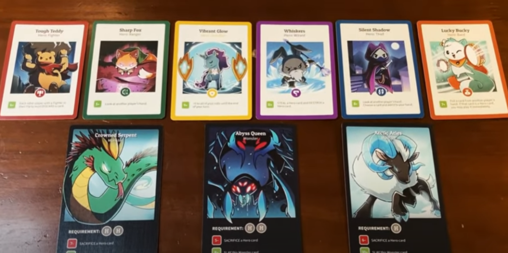
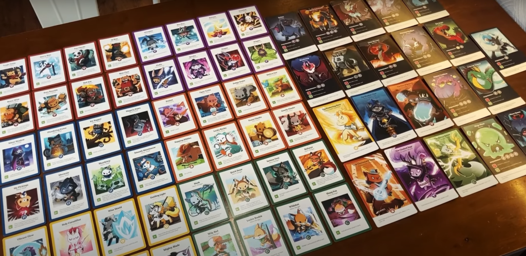
The game I chose to review is “Here to Slay” a multiplayer strategy card game. I played this game a few times in a 6 player environment.

The game seems to be targeting an audience of people who enjoy cute animals, card games and multiplayer games with random elements.

The game is played by choosing a single hero at the start that gives you a static buff, after that you are dealt a hand. You have 3 action points to spend each turn. You can spend your points to do a combination of things each turn, (1) draw a card, (1) play a hero, (1) activate a hero, (2) attack a monster or (3) draw a new hand.

The game is won by defeating 3 monsters or having all six classes of heroes on your side.

Parts of the game I enjoyed include the whimsical art, the social multiplayer aspect, the cards that can be played in response to another player’s actions/turn and the elements of randomness.

Tools & Skills

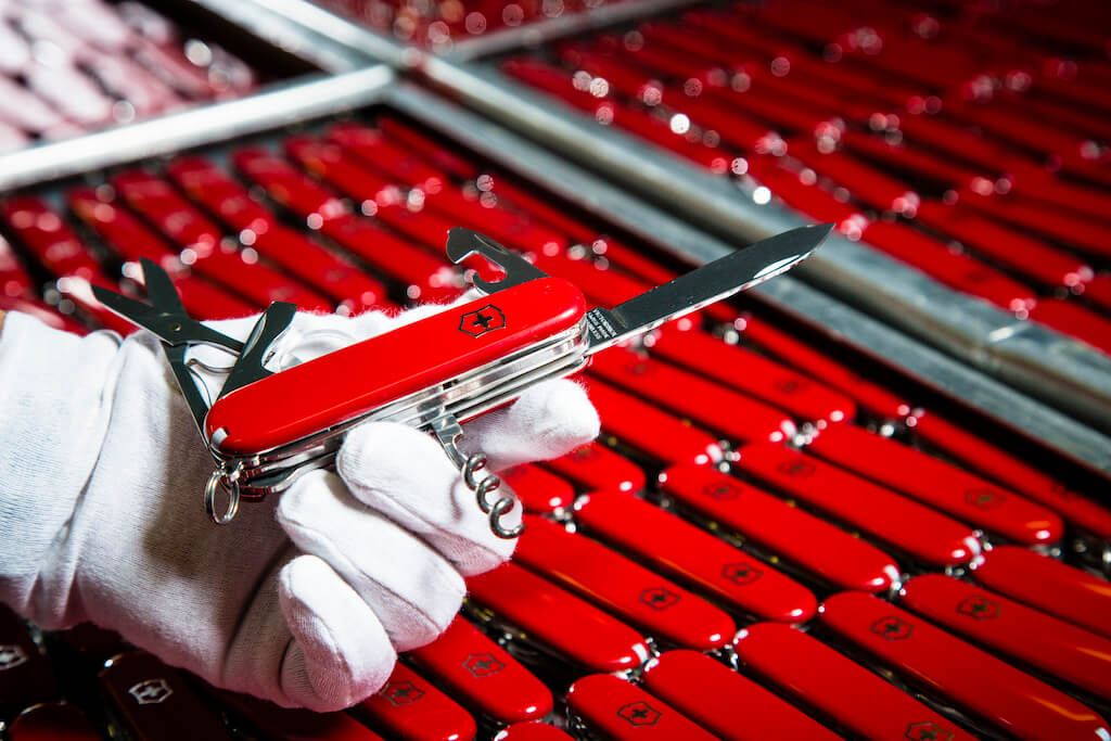
Swiss Army Knife: a sharp tool and design icon - DesignWanted : DesignWanted

Are designers akin to a Swiss Army Knife?

Everyone has tools and skills. Some are more developed (sharper) then others. I’ll be doing an introspective to see what tools I posses tor the graphic design field. What need work and which ones I would like to learn.

Tools I have

Free Purple and Pink Diamond on Blue Background Stock Photo

The tools I feel strongest with are photoshop texturing skills, Illustrator, 3D rigging, weight painting and sculpting.

Tools to Develop

Free Silhouette of Person Standing Near A Doorway With Bright Light  Stock Photo

Some tools that I need to develop more are my Zbrush sculpting, color theory, and object lighting.

Tools to gain Learn

Free Close Up Photo of Woman with Black Curly Hair Stock Photo

For tools that I wish to pick up along the way; I hope to learn 3D rig animation, real time object scanning, and motion capture.