Category: Uncategorized (page 1 of 3)

Freedoms and Art

“Freedom to Express, Freedom to Explore, Freedom from Expectation”.

Freedom to Express

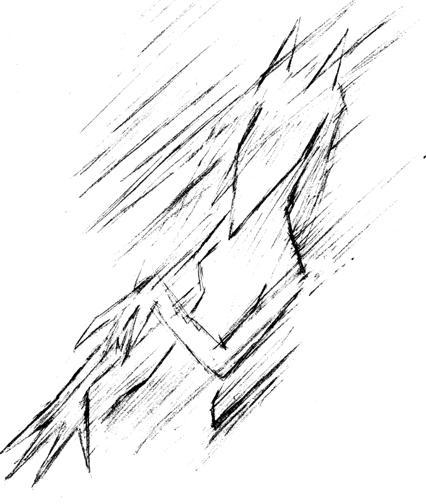
Freedom to express yourself, your feelings, your art. It’s the freedom to let shine the aspects of what really make you who you are. You express yourselves through art, fashion, writing, your words. For expression I would depict it as a raw piece of art, something physical, rough and real. I would want to convey the intensity of emotion with physical medium, paint, markers, heavy lines. Messy and guttural.

Freedom to Explore

The freedom to explore, seeking out more, curiosity, new ground, unknown and within grasp. I believe we should always set aside a moment to explore every so often. You can explore the world, your inner self, others, the world contains so much. I would want to depict the concept with generous amounts of negative space, I want the feeling of something small in a place so big, like our small planet in our vast universe, it would show an edge of unknown being pushed back, it’s like an expanse of knowledge, a light in the dark.

Freedom from Expectation

The freedom of expectation, everyone is used to certain things, weather those expectations are place on other people, places, art, media, all things, it’s important to remember to let go of expectations, it goes hand in hand with the freedom of expression, showing things out of the norm, and with the freedom to explore as well as you let go of expectations that could otherwise be holding you back. It’s just that, to be able to predict the expected is safe and easy, where there is much to be gained by peeling the preconceived notions back to push youserlf, your work and others around you.

Krakens Jersey Design

For our assignment we were to design a Krakens Jersey for a list of causes or events. For my design I chose the Lunar New Year, which is represented by the dragon this year. I chose to go for a traditional white and red design while incorporating the Krakens blue colors into the design.

Front of Jersey

Back of Jersey

Stock Image Credits

Image by Gordon Johnson from Pixabay
Image by SpiderM from Pixabay

Family Inspired

For our project we were to design a installation in our school staircase that was inspired by our mothers. For my design I chose elements that resonated with my mom. My Mother always loved cats, specifically black cats, and the color red. I went with a design that was inspired by cat’s eyes with black and red elements. I went with a mural format and drew the eyes flowing up the staircase. She always loved the weird and strange as well so I went with an abstract approach.

Food Truck Design

For my food truck design I decided to work with Burger King’s new retro branding style. The company most recent rebrand from 2021. Their identity underwent a massive makeover, with complete rebranding strategy and everything, the first time in about 20 years. Burger King’s new brand identity was created by the Siegel + Gale design agency which makes use of orange, yellow and brown colors. In fact it’s more of a throwback more then anything as it goes back to 2 older versions of the logo designed between 1969 and 1999. The brand is clearly jumping into modern nostalgia retro influenced design and identity.

Burger Kings new brand identity aims to conjure memories of better days and childhood. Clearly aimed at the 35+ years old audience, the result is a classic between classics, with a touch of modern. Almost like a hipsters Burger King.

With my design I wanted to literally make a burger on wheels. Incorporating the bold simple colors of the brands look. Everything has a simple colorful feel to it so I tried to keep that same vibe with the trucks design. Each color of the tuck is a part of the burger, the buns, lettuce, tomato and ketchup, mayo, pickles, and meat patty. The design stays with the playful feel of the burger company. The logo is clearly displayed so people know there’s a load of burgers cursing along until its reached it destination, setting up and assembling delicious Whoopers for anyone curious enough to approach or perhaps drawn to the location from the specialty flavor wafting fans built into the top of the vehicle. The fans were a recent and last minute feature added by the company to help improve customer attraction, clearly seen on the top of the vehicle where graphics are never usually seen, so no need to design graphics for the top of the vehicle.

The Blender Project

Looking back on the experience, It was a pleasure to work with Shinyu and David 100%. We all worked together without issue, able to use what we were each strongest with. We took our random prompts and created something true to our original vision of creating a light-hearted and silly video without too much flair.

We collaborated easily in the initial creation process and quickly threw together a concept without anything stopping us. It was from the start that everything went smoothly and I would definitely love to work with them again!

After going through our initial creation and brainstorming steps we moved onto storyboarding and with David’s expertise we go things together nicely. In fact thanks to David’s skills in recording and video me and Shinyu couldn’t have done it without him!

While David was dealing with the actual video creation and editing, Shinyu and I focused on the graphic collecting props, dealing with document write-ups and graphic design elements to help set the stage for our video. Shinyu created an excellent coffee poster and cup inspired by the elements of our earlier 1st year project.

With everything in place combining all of the elements listed above, we created our video easily and quickly as a cohesive group. We worked together well as a team and pushed out an awesome video each of us had fun hanging out and creating while also being proud of.

Looking back I hope to work with Shinyu and David again in future projects and anticipate to see the kind of work each of them created in their own future path in classes and modules. Our teamwork and general flow between each of use really worked well together and it was an all around stressless project. There was a lot of fun shooting the video too on set which was new for me and Shinyu.

Again big thanks to David for shooting the video and editing it specifically!

Gender Justice League

If I had $25,000 dollars of cash I could donate to any one Seattle-area non-profit organization I would choose the “Gender Justice League” I mainly chose a organization that was queer aligned and choose one around helping transgender people. I’ve received help from queer centric organizations in the past and donate back to them but being able to gift a large sum of money like that would be phenomenal.

Image of a house with the trans flag colors and GJL icon

A little bit more about Gender Justice League, not only doe’s the bulk of the organization advocate for trans rights by regularly advocating for trans rights in anyway they can, they also offer direct services, and safe trans places for those in need. Gender Justice League even fights against growing Seattle issues like gentrification, homelessness and housing accessibility, reproductive justice, labor rights, and unemployment.

Two advocates at a rally

I think it’s is super important that a trans person should get the basic care they need like medication, medical procedures, therapy, housing, food. Like all basic needs in life, a person should never be denied the bare minimum to simply exists with a healthy state of mind. It’s thanks to organizations like Gender Justice League that these rights are fought through activism or even provided. With organizations like these trans folk down on their luck and in need can get the help they need without being treated like an outsider or worse.

A crowd at the annual Trans Pride march

I would love to be able to help an organization like the Gender Justice League in their effort to make a better world for other trans people like myself. Not only would the money help the organization go a long way in offering more services and help to others in need, it would in turn be helping a core community of Capitol Hill and more. Capitol Hill has had a thriving queer community thanks to caring people but also because of helpful non-profit organizations too.

Stanley Drinkwear Moodboard

Introducing the Stanley 32oz Dog bowl. On your next outdoors adventure, bring the rugged and reliable Stanley 32oz Bog Bowl with you, to keep your faithful companion hydrated or energized! Built from the same reliable, durable and rugged materials our other Stanley products are, the Stanley 32oz Dog Bowl is not only perfect for any camping expedition, it’s still the same fashionable Stanley brand you’ve come to know and love. So grab you fluffy companion and pick up the Stanley 32oz Dog Bowl for your next trip!

For my moodboard I decided to use a complementary color pallet of moody oranges and blues. Evoking the campfire glow while having a deep blue for night skies and deep water. The theme was camping and outdoors with your faithful canine companion.

3 Design Systems

Design systems are a perfect for having a shared library of consistent assets, tone and style between multiple people on a team and multiple teams in themselves. They prove to be invaluable tools for larger organizations and corporations to have a consistent recognizable brand.

Deep dive on 3 websites

https://material.io/

Material design is the design system made by google. It is a highly flexible set of tools that can be used for any brand that wishes to utilize the google aesthetic. Flexible and adaptable are the two main components of this system. It is a vast system with a clean and accessible feel to every part.

https://brand.uber.com/

Visual elements from Uber's design system

Uber has also created it’s own distinct design system. It has a very distinct and stylistic tone with its corporate memphis style icons. It specializes in having easy to use basic building blocks that can be further customized by other sub-brands. Every part of the system is tied closely together to create the perfect branding consistency, color, typography, iconography, tone and much more are all accounted for.

https://www.audi.com/ci/en/renewed-brand.html

The Audi logo, typography and digital presence from their design system

Audi has it’s own distinct style in its design system as well. Audi embraces a more sleek and luxury approach to its system then the more friendly accessible systems I explored before. Audi also helps designers with their system by displaying both proper and improper uses of components when designing. The system seems to embrace bold imagery and typography more then laying out basic building blocks, as their system is highly specialized towards their own brand.

The Black Box Problem

This week we were given 6 different categories; Order, Increase, Bold, Congested, Tension and Playful, that we had to solve with 4 black boxes.

I wanted to make the effect look a bit different then just plain boxes so I utilized the clipping mask feature to make parts of large squares not visible when I forced them over the edge. I Also at times, wanted to utilize negative space for extra effects on some solutions.

Slight spoilers but below are my intended solution meanings for each of the 6 final designs.


My final order was comprised of two gate-like structures. Increase was a square ramping up in size. Bold Was a large black object that would stand out. Congested was multiple boxes caught up in an incline. Tension was a water faucet with a small drop. For playful I did a small present or type of face.

Eyejack AR Points of Interest (POI)

Grouping with my classmates Diana and Mavis we we set out to create Eyejack POI AR overlays. The goal was to create 2 frames and one animated element to help enhance the location you visit. For ours we were adding addition elements to enhance park goers experiences at specific locations.

I chose Cal Anderson Park in Capitol Hill. It was a close by location to me and I was interested in creating colorful rainbow elements to show Capitol Hill’s pride.

The last component used was an animated pride flag to add a bit more fun to the experience! The frames themselves were created in Figma and easily exported to Eyejack.