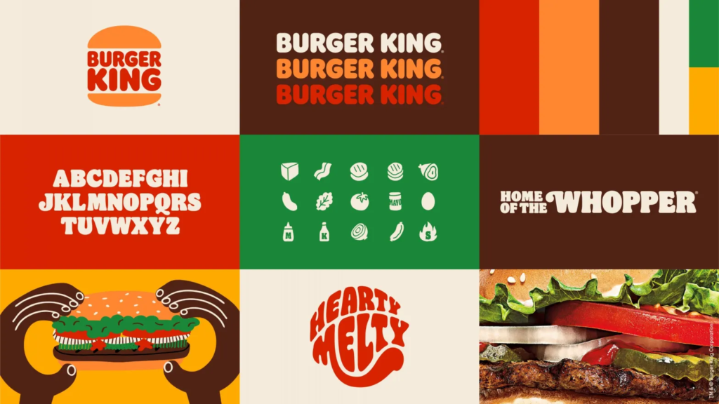
For my food truck design I decided to work with Burger King’s new retro branding style. The company most recent rebrand from 2021. Their identity underwent a massive makeover, with complete rebranding strategy and everything, the first time in about 20 years. Burger King’s new brand identity was created by the Siegel + Gale design agency which makes use of orange, yellow and brown colors. In fact it’s more of a throwback more then anything as it goes back to 2 older versions of the logo designed between 1969 and 1999. The brand is clearly jumping into modern nostalgia retro influenced design and identity.
Burger Kings new brand identity aims to conjure memories of better days and childhood. Clearly aimed at the 35+ years old audience, the result is a classic between classics, with a touch of modern. Almost like a hipsters Burger King.
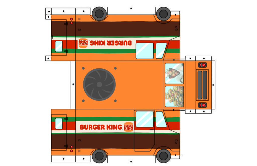
With my design I wanted to literally make a burger on wheels. Incorporating the bold simple colors of the brands look. Everything has a simple colorful feel to it so I tried to keep that same vibe with the trucks design. Each color of the tuck is a part of the burger, the buns, lettuce, tomato and ketchup, mayo, pickles, and meat patty. The design stays with the playful feel of the burger company. The logo is clearly displayed so people know there’s a load of burgers cursing along until its reached it destination, setting up and assembling delicious Whoopers for anyone curious enough to approach or perhaps drawn to the location from the specialty flavor wafting fans built into the top of the vehicle. The fans were a recent and last minute feature added by the company to help improve customer attraction, clearly seen on the top of the vehicle where graphics are never usually seen, so no need to design graphics for the top of the vehicle.